Good web design is something that can be seen and interpreted in an instant, but it can be difficult to consider what’s truly good or bad design. We consider great web design to be user friendly first, offer valuable information in a clean way, and the site should load extremely fast. Design for design’s sake can be a mistake on the web: unless design is contributing to a better user experience and conversions, it’s not working the way we need. In 2019 we’re seeing specific trends emerging in web design, all of which keep in mind better ways to deliver content, translating to a better user experience. Here’s some of the top web design trends of 2019.
- Animated Graphics
72% of customers would rather learn about a product or service by way of video (Wordstream). But what if you don’t have the budget or time to throw together a video? You can likely get your point across with an animation.
 “The best and most exciting web design trends we have seen this year has got to be the rise in animated illustrations,” says Craig Murphy, Managing Director of ALT Agency. “It's really bringing a new dynamic to websites [and] it helps a website separate from the competition [while being] more personal and steps away from the corporate to allowing brands to showcase who they truly are.”
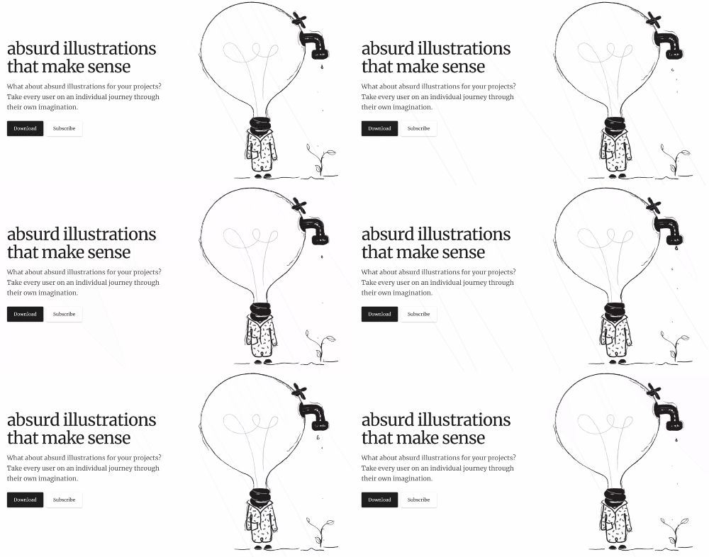
GIF example from Absurd.Design.
- Broken Grid Design
Most websites are built with a framework that heavily relies on a grid. Consider tastefully breaking out of that grid to draw attention to your website through unexpected design that interests your users. One of the reasons it’s so powerful is “It gives UI UX designers creative freedom to roam around and make their brand stand out,” says Dhaval Sarvaiya of Intelivita. “When you have a broken grid, you have items that are pushed around on a plane in a way that makes the grid feel less rigid.” However, this trend may not suit enterprises well: Dhaval suggests “larger brands with a lot of content still use traditional grid based structures.” But, as brands start to explore different designs to captivate their users, we may see a rise in broken grid design.
- White Space
Many businesses focus on what’s “above the fold” (bottom of the screen) on the homepage, but numerous studies show that users will scroll down the webpage out of habit to see what other information you have to offer. David Sanchez of Mammoth Web Designs suggests using white space to your advantage: rather than cramming information above the fold, carefully select what you’d like to share, and use white space to visually separate other features as the user scrolls down the website.
- Engaging CTAs
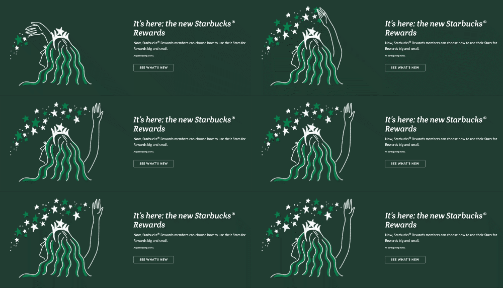
 Think outside the box! Mara Calvello of G2Crowd says that she appreciates it “when websites combine a CTA with an eye-catching image. Starbucks does this on their homepage. They draw you in with a delicious photo of some of their menu items, and they then get you to click with engaging text.”
- Motion Design
While this is closely related to animated graphics, motion design considers an orchestration of a page, rather than just a few animated images. Christian Rennella, Design Director of oMelhorTrato, says that the idea of motion design is that "the design “responds immediately to the user’s actions [in a way that] seems natural like how things move around you in real life.” One example is this password design:

One of the most important things to consider when looking into implementing motion design for your website is that motion should communicate to the user even better, which makes it easier for the user to understand your work, according to Christian. Additionally, motion design is incredibly engaging: Christian notes that their conversions have increased over 20% since implementing motion design 5 months ago, which translates into a near $3M annual revenue increase.
- Accessibility
While the standards for accessibility should be at the forefront of design, they can unfortunately be afterthoughts. Matthew Berman, President of Emerald.Digital, has seen an uptick in ensuring that websites are accessible. But, it’s more than just design: “Accessible websites need to offer information that can be consumed in more than a purely visual interface,” says Matthew. “Sites must accommodate keyboard navigation, screen readers, incorporate semantic HTML markup, and maintain a readable color contrast.” Adhering to these standards improves web experiences for all. Enterprises and global brands should especially ensure their sites are accessible: Matthew says that “smart companies are now looking to comply with calls for equal web access, and will be looking to avoid a costly lawsuit with negative PR repercussions.”
Hero Photo by Matthew Henry
