Uh oh… 404, page not found! The worst error, right?
Wrong! 404’s are an awesome opportunity to get creative with an underestimated page on your site. With some creativity, you can turn that annoying error into a fun opportunity to engage to your traffic. In this list, we’ve curated a list of 40 of the top 404 pages and designs on the internet today.
What is a 404 Error?
Error 404 Not Found is a HTTP response code that indicates a browser was able to communicate with a server to try and retrieve a page, but the server could not find what was requested. Often times these are encountered when a person is looking for a page that does not exist, or they are clicking a link to a page that no longer exists and wasn’t redirected elsewhere. Links that don’t lead anywhere are known as 'dead links' or 'broken links'.
Are 404 Errors Bad for SEO?
404 errors are pages that does not exist, so Google does not index them. In that way, you are not penalized for people trying to search for things on your site that don’t exist. However, if you have pages on your site that are linking to bad pages or 404s, that’s more impactful on your SEO rankings. In that way, Google’s crawlers read bad links and determine a site isn’t as cleaned-up as other sites might be. This is why it’s so important to redirect URLs that you’re deprecating, rather than deleting pages outright, because redirects will help bridge the gap and prevent bad links on your website.
Designing a 404 Page
Designing a 404 page can be overwhelming, but you’re sure to find some inspiration from the examples we’ve pulled. Whether you’re going for something clean and sleek or interactive and fun, there are a few best practices you should heed when designing a 404 page.
Best Practices for Designing a 404 Page
Explain what a 404 is. A page that just says “Oops, 404! Go back!” is not helpful to most people. Explaining that the page they’re looking for has either moved or no longer exists, and offering alternatives like a search bar, menu, or other navigation is key to ensuring the user experience on a 404 page is good.
Less is more. You don’t have to go crazy - often times an engaging page that has sleek, clean design will be ideal for a user to get back on their feet on your site. Include a few routes back to the main site, and ensure that your 404 showcases your brand’s personality. Use a 404 as an opportunity to turn a frustrating situation into a funny one: users may remember your site better for it.
Branding! Obviously, your brand should seep through everything it touches, and a 404 page is no exception. Use your creativity to craft a page that’s on brand and aligned with your website’s creative guidelines.
40 Examples of 404 Pages
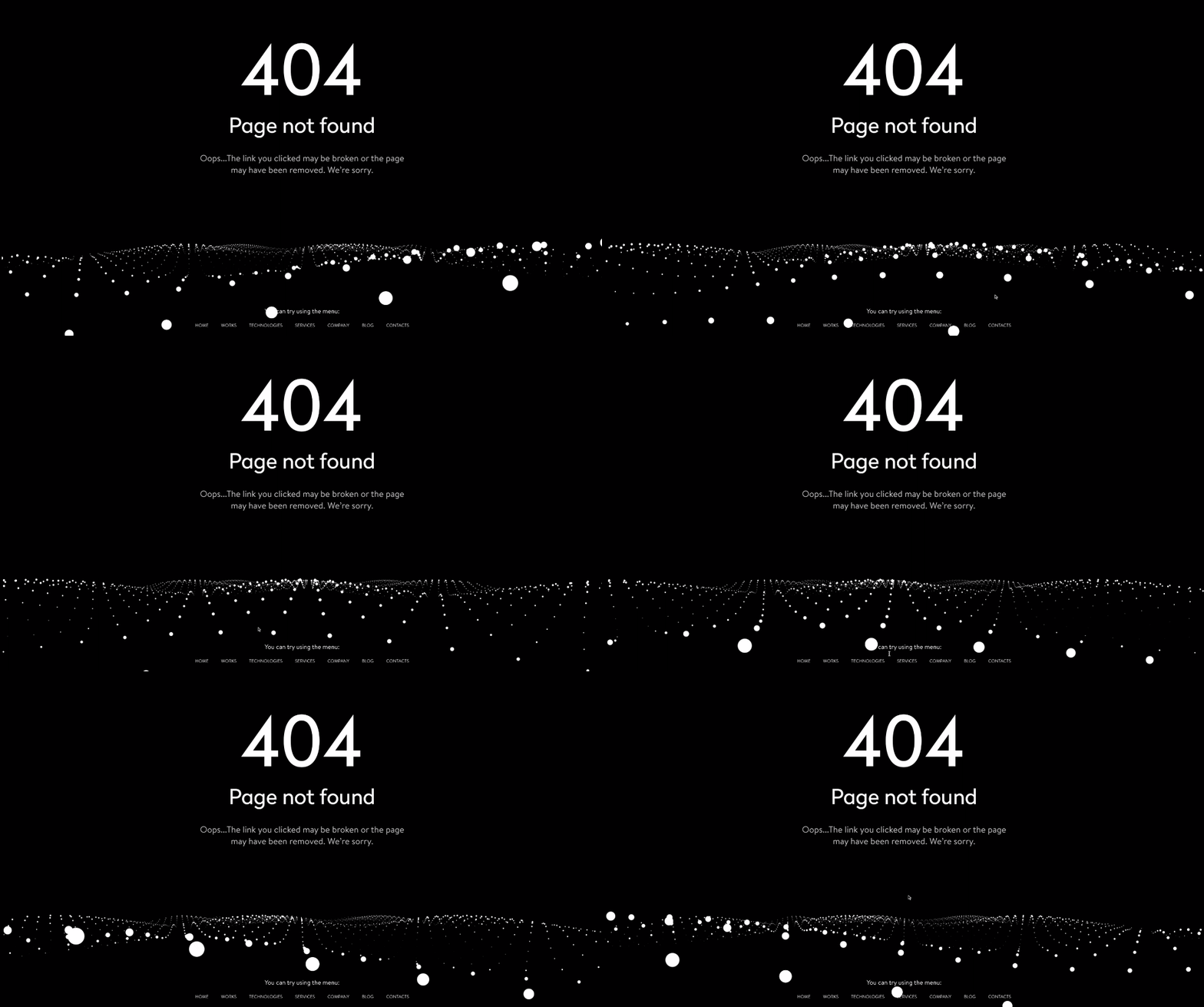
Yalantis’ sleek, minimalist black and white design is extremely eye catching. What’s more fun is this 404 page is actually interactive! Dragging your cursor across the dots moves the wave in different directions. Who knew a 404 could actually be fun?
Additionally, the 404 includes a menu on the page to make for easy navigation back to the main part of the site. This is an extremely important detail that makes for a great user experience, as opposed to leaving your user lost on the 404 page.
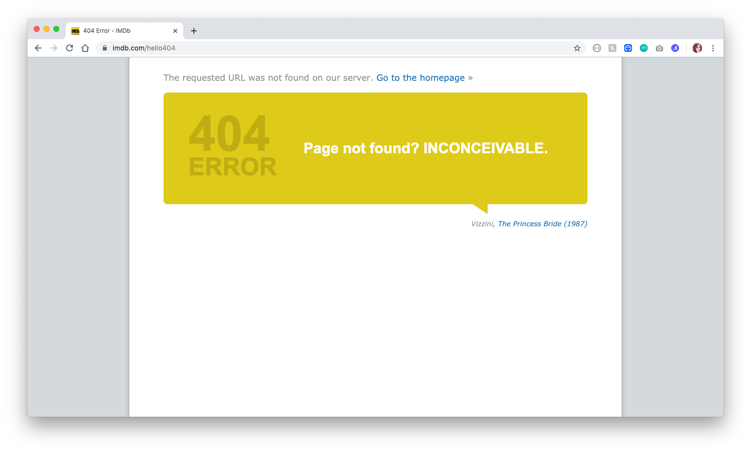
IMDB incorporates their site’s purpose of being a movie database by just barely altering quotes from movies to apply to a missing page that are sure to make you giggle. Refresh the page a few times and you’ll find each load is a different quote, some from Pulp Fiction, The Princess Bride, The Shawshank Redemption, and more.
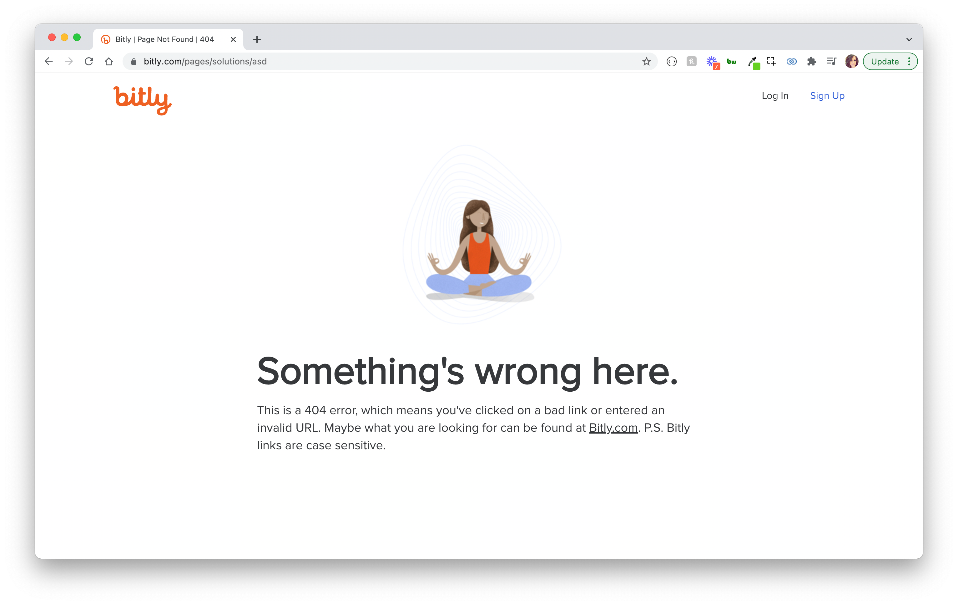
Ommmm. Keep it Zen to help people find their way back to the page they're looking for. It also includes the friendly albeit important reminder "P.S. Bitly links are case sensitive," providing a possible reason why you've encountered a 404.
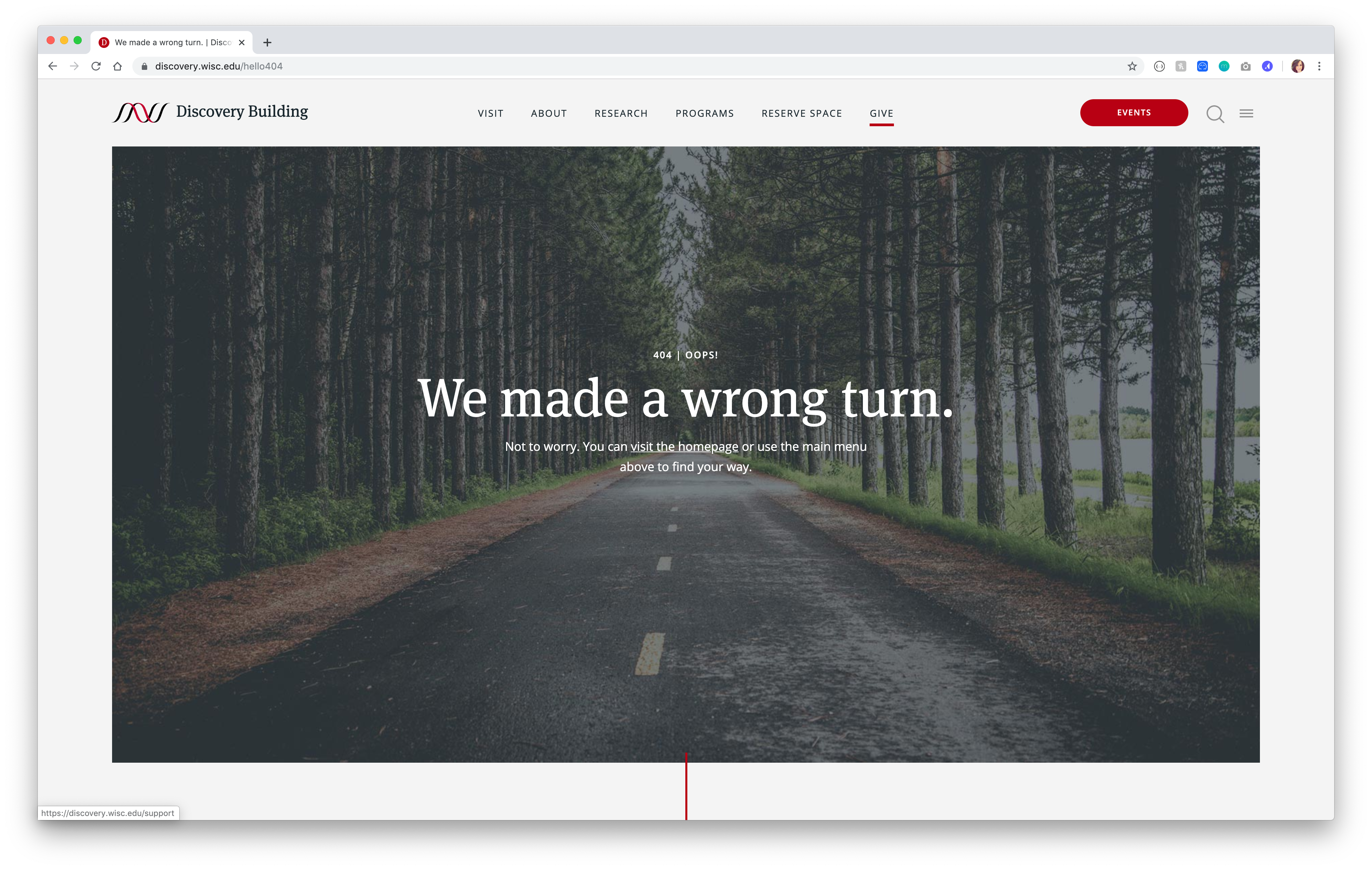
The 404 for the Discovery Building is extremely elegant. This design includes beautiful imagery of a path and a cheeky “We made a wrong turn” message. The page also includes the full navigation, which is extremely helpful for navigating back to wherever you were looking to go.
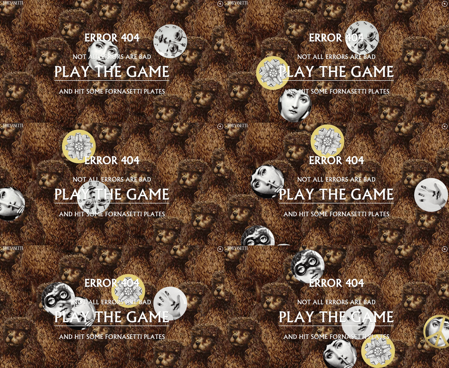
The 404 page of famous artist Piero Forsanetti is a beautiful surprise. Prompted by “Not all errors are badm,” you’re thrust into a fun interactive game. Check it out and see what score you get!
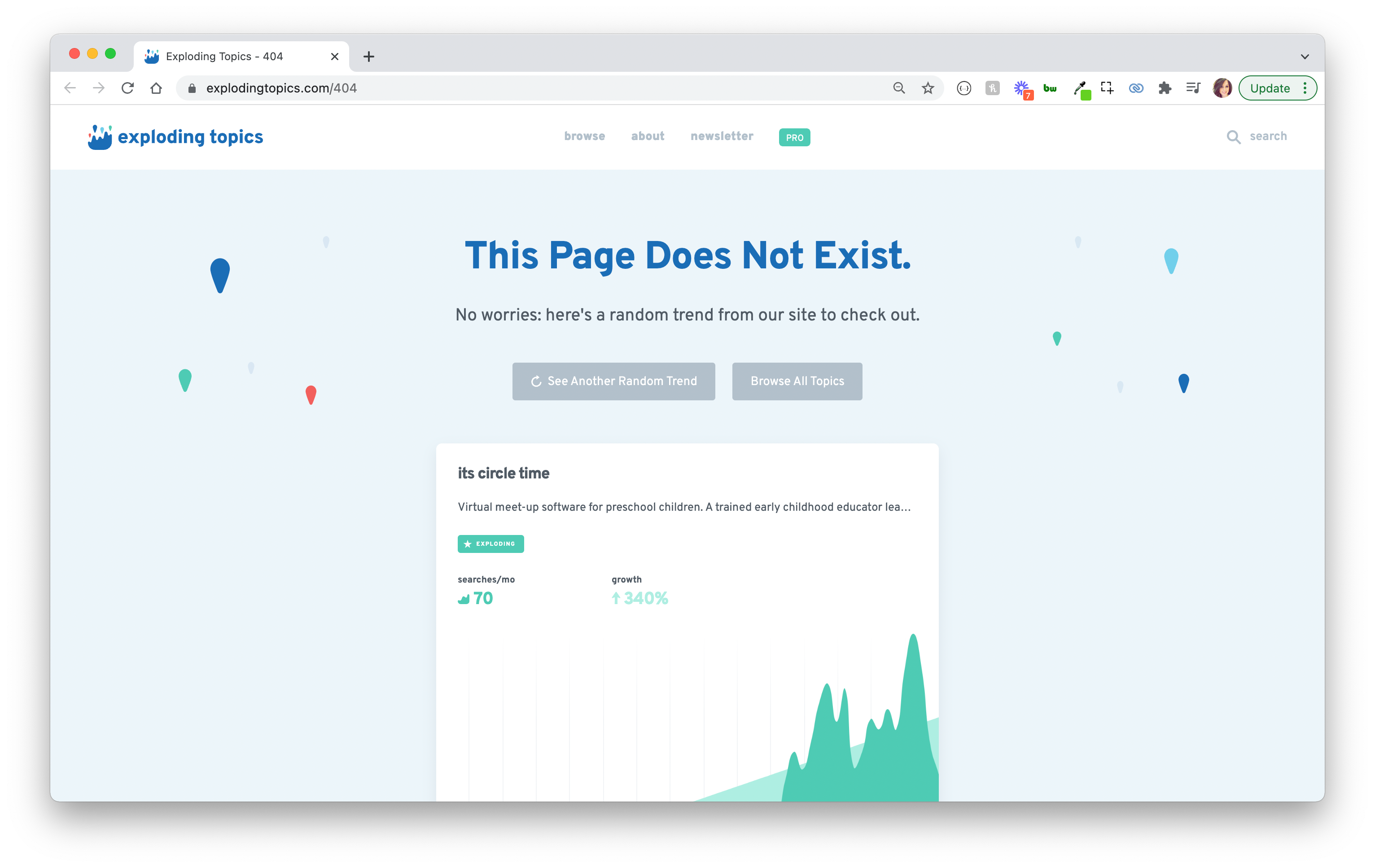
Lost your way on Exploding Topics? Luckily, you'll run into a random trend or topic on this awesome, engaging 404 page, leaving you with a fun tidbit of information before you go back to find the content you were looking for on-site.
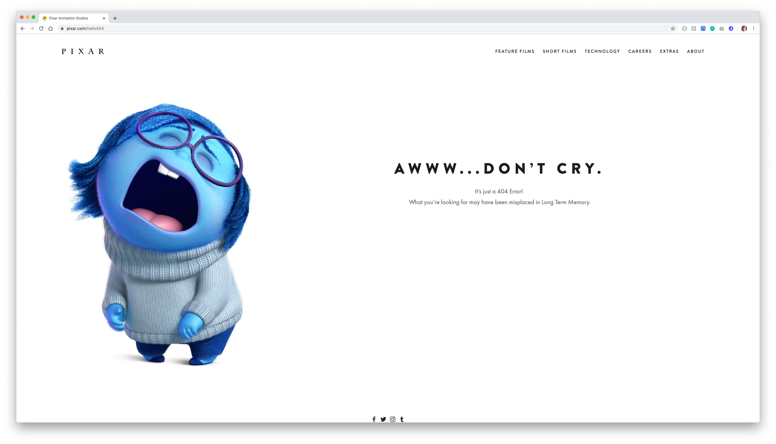
Animation studio Pixar’s 404 page features a character from one of their movies, Inside Out, known for crying, with the cheeky message “Awww… don’t cry.” It’s crisp design and on-brand content makes this 404 page a winner.
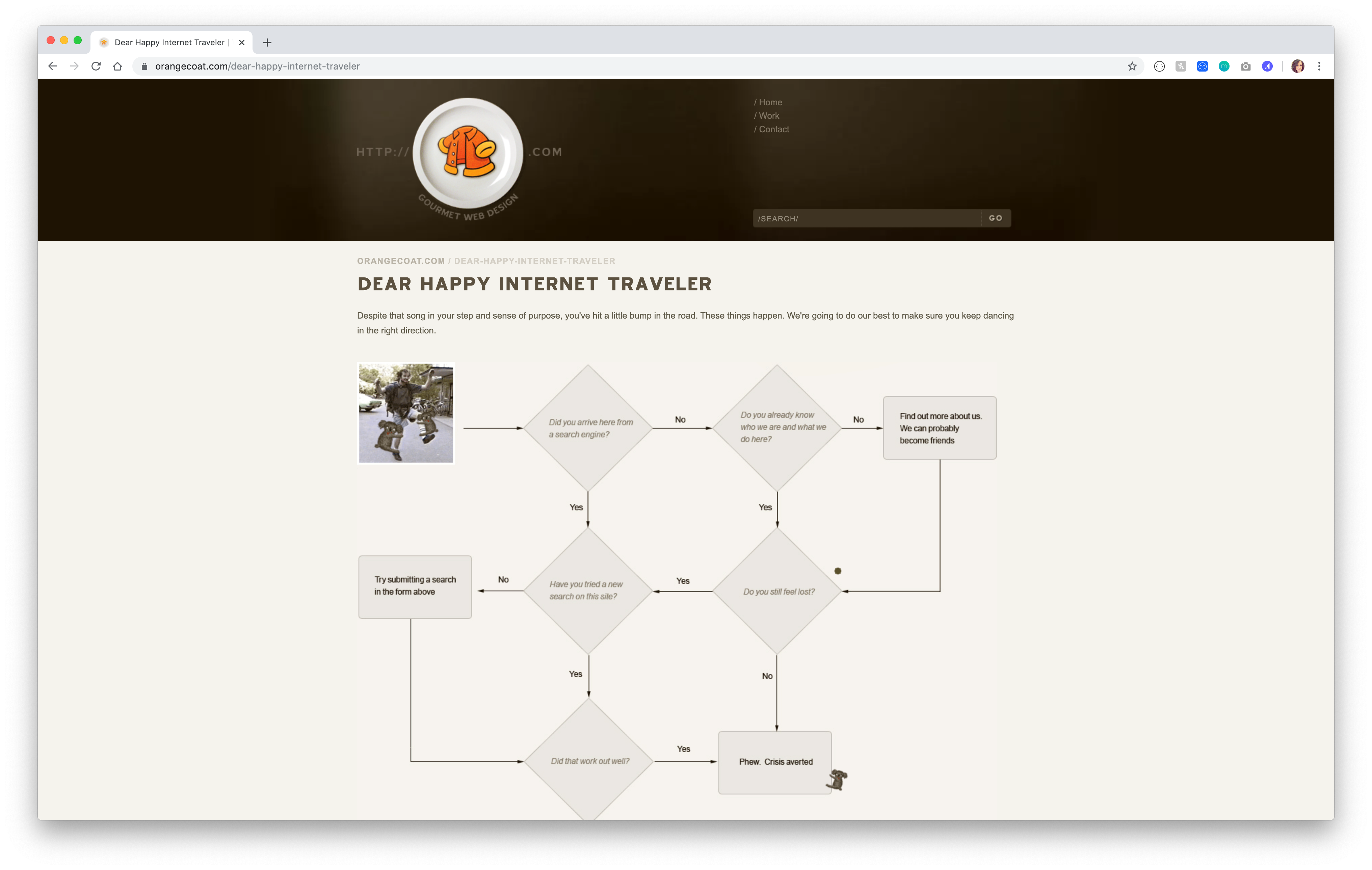
Orangecoat is a design firm based in Greenville, South Carolina focused on web design and marketing that helps entrepreneurs start companies and guiding established companies' web strategies. Their awesome designed 404 page features a graph that directs the user’s experience.
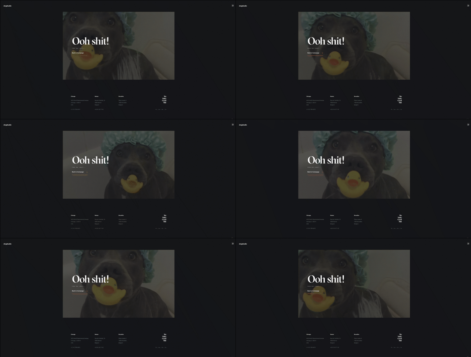
Design company Dogstudio’s branding is on point with their 404 page. Their page includes a random GIF of a dog looping in the background of the page. Refresh the page and you’ll get a different dog GIF, too!
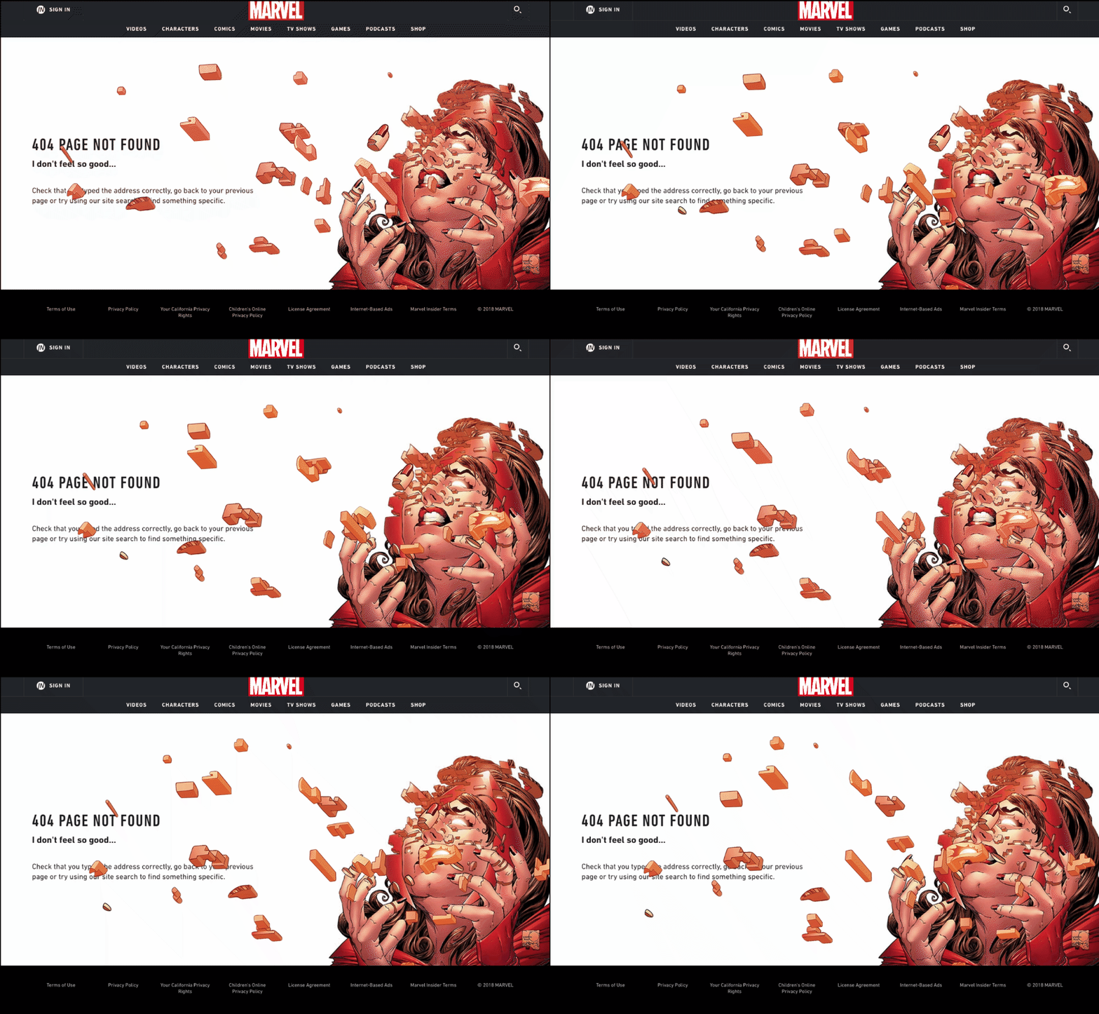
Marvel’s 404 page is epic. Each page includes intricate designs that are either interactive or have animation of some sort. And, like a few other showcased 404 pages, there are a few different variations that show up randomly on refresh. See which one you get!
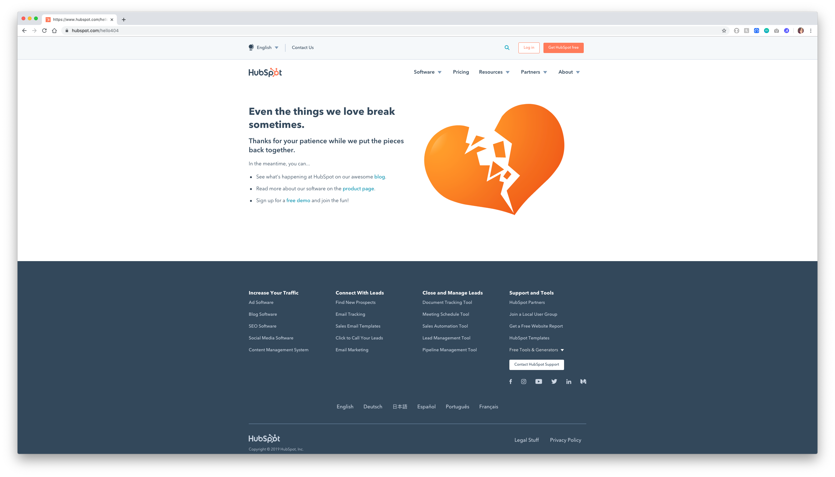
This adorable 404 page gives you the feels, even though it’s for a website marketing a CRM platform! This 404 page features cute imagery, sweet messaging, and some helpful tips that even lure traffic to signing up for a free demo of the platform. This page puts the fun in functional.
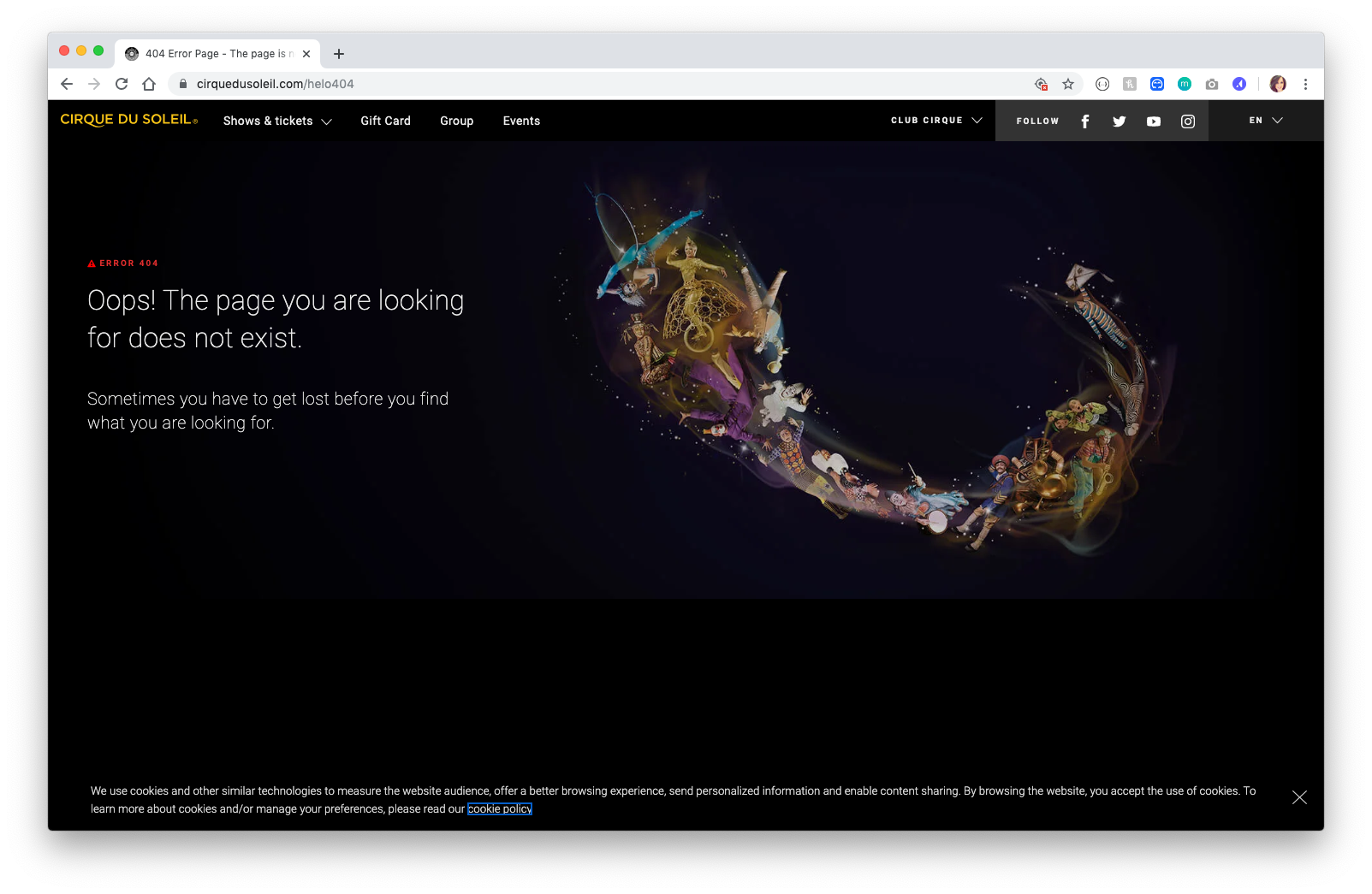
Cirque Du Soleil’s 404 page boasts clean design that attracts the eye to the colorful image of the acrobats. Accompanied by the sweet words “sometimes you have to get lost before you find what you are looking for,” this 404 is very on brand with the artistic acrobats and entertainment team. This 404 page also includes a navigation at the top of the page to help guide traffic back to the site to find what they were looking for in the first place.
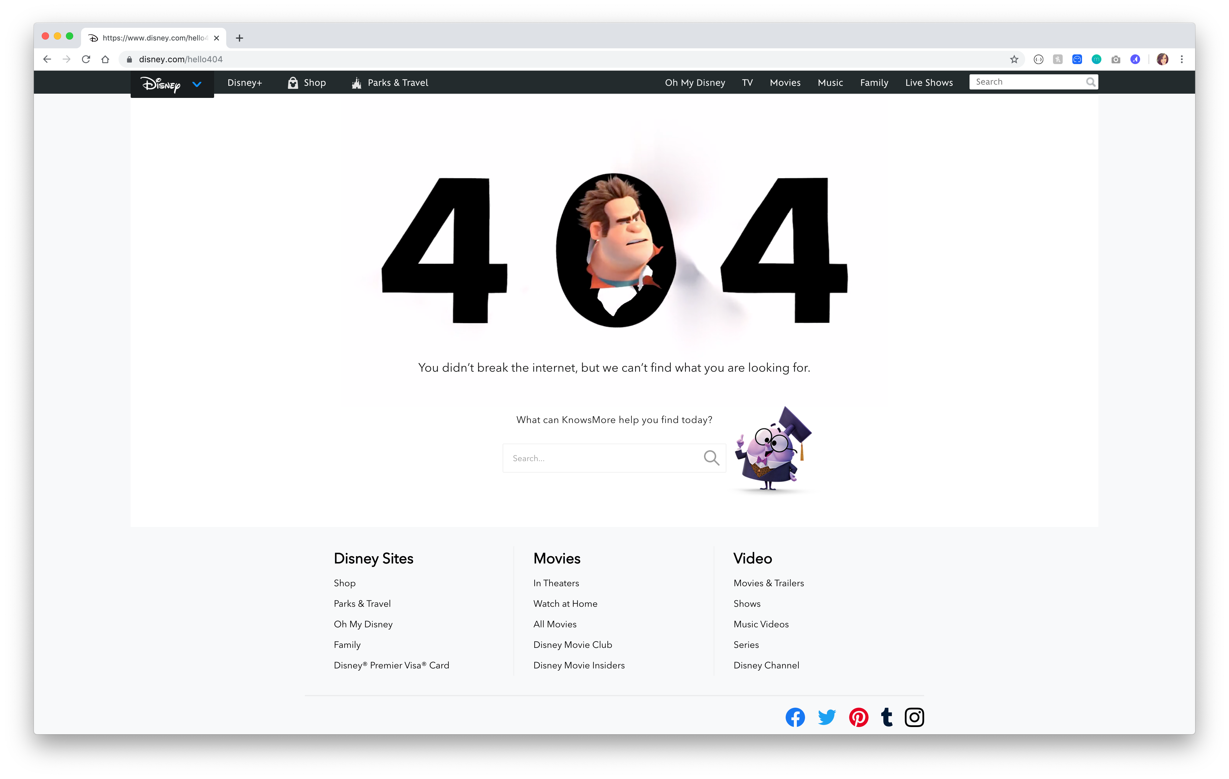
This fun 404 page features one of Disney’s contemporary characters, Wreck It Ralph, seemingly punching a hole through the page because he’s lost. Incorporating their characters in a fun way that’s also in line with the storyline of the movie is a fun way to design a 404 page!
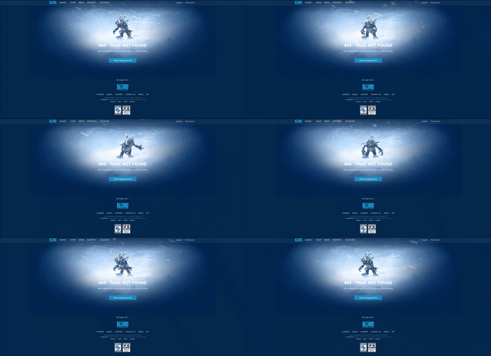
Blizzard Games’ 404 page includes a rescue merloc to guide you back to safety. Featuring it’s graphics in tune with the games company, this 404 page is on brand. Of course, we love to see the navigation at the top to make that merloc’s job a little easier. Mmmrrgmgrrrgmml!
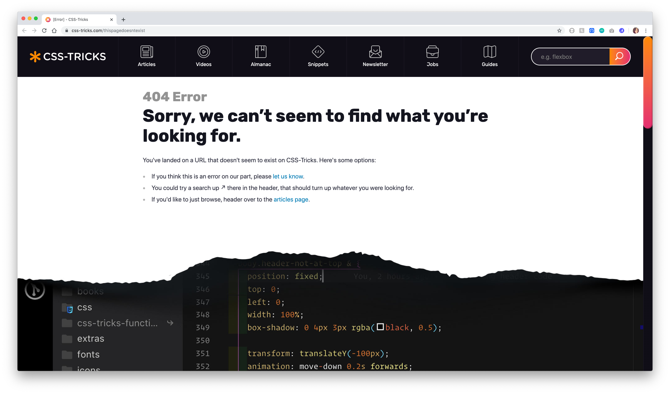
This cute 404 error page on CSS Tricks has a special place in our hearts as we’re a team of developers at our core. This fun page features a page that’s ripped at the bottom, seemingly exposing the CSS of the page underneath. What’s a more fun CSS trick than seeing the CSS itself?
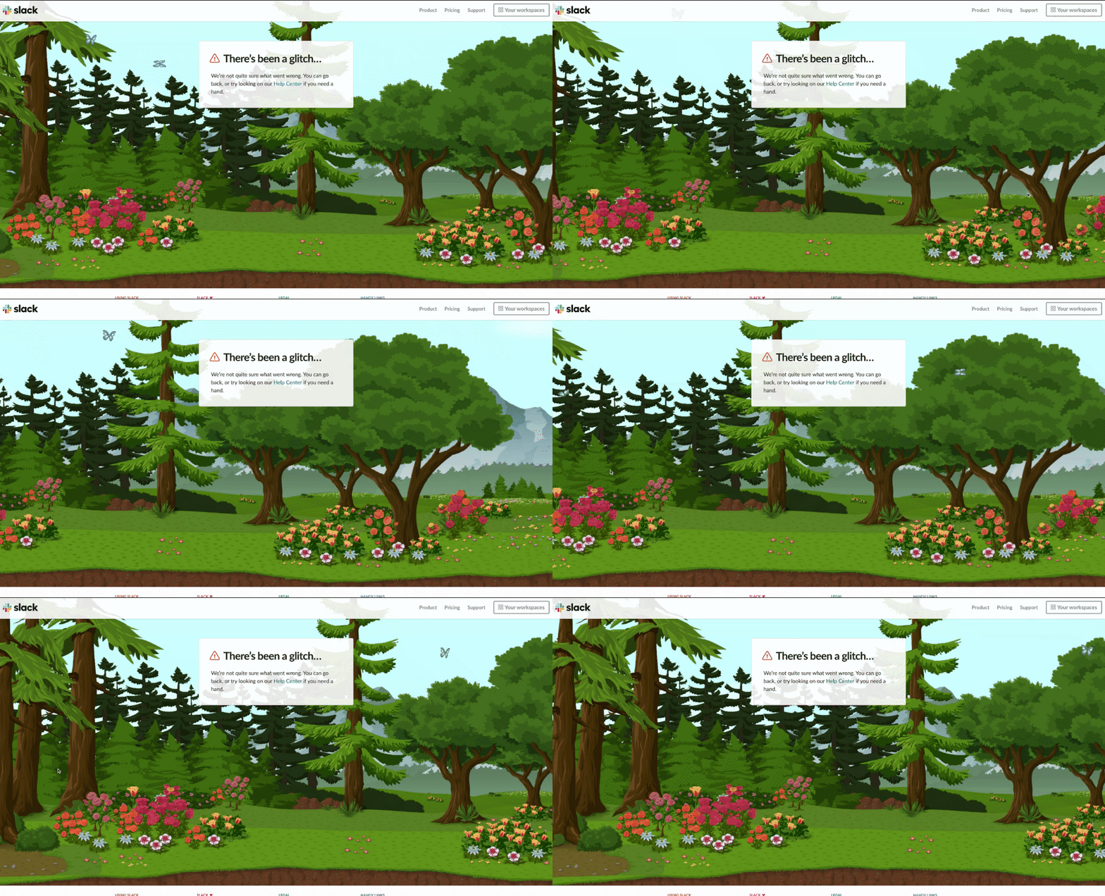
Slack’s adorable 404 page features an interactive background that makes a 404 a serene experience. This is also on brand because if Slack ever encounters an error in the app, the screen that appears is the same experience. Check it out for yourself!
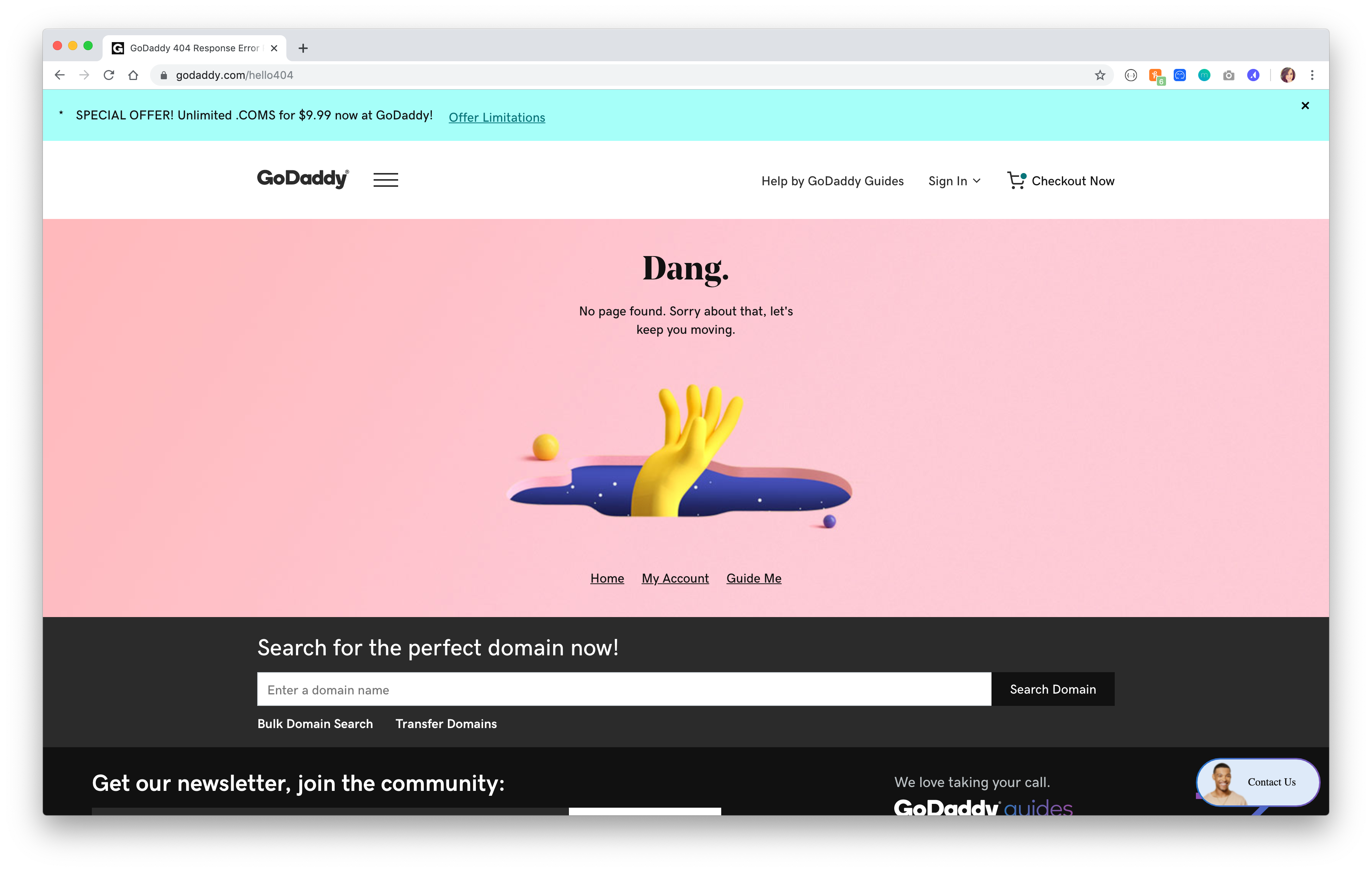
GoDaddy’s 404 page features a cute illustration, but that’s not what caught our eye in particular. What makes this 404 page great is it keeps you on task: GoDaddy sells domains, and under the hero is a CTA for users to search for the domain they wish to purchase. Brilliant.
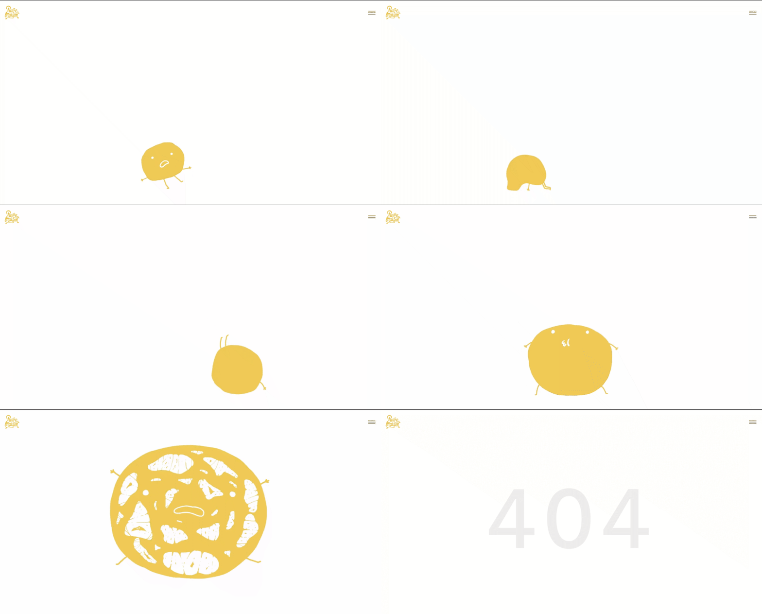
Purée Maison is a French creative agency that specializes in communication strategy. Throughout the website, you’ll see animations of little characters, and the 404 page is no exception. This surreal 404 page captures a little character who’s hit a wall (like you’ve hit a 404). The clean design includes a mobile navigation on the right side, which helps in navigating back home.
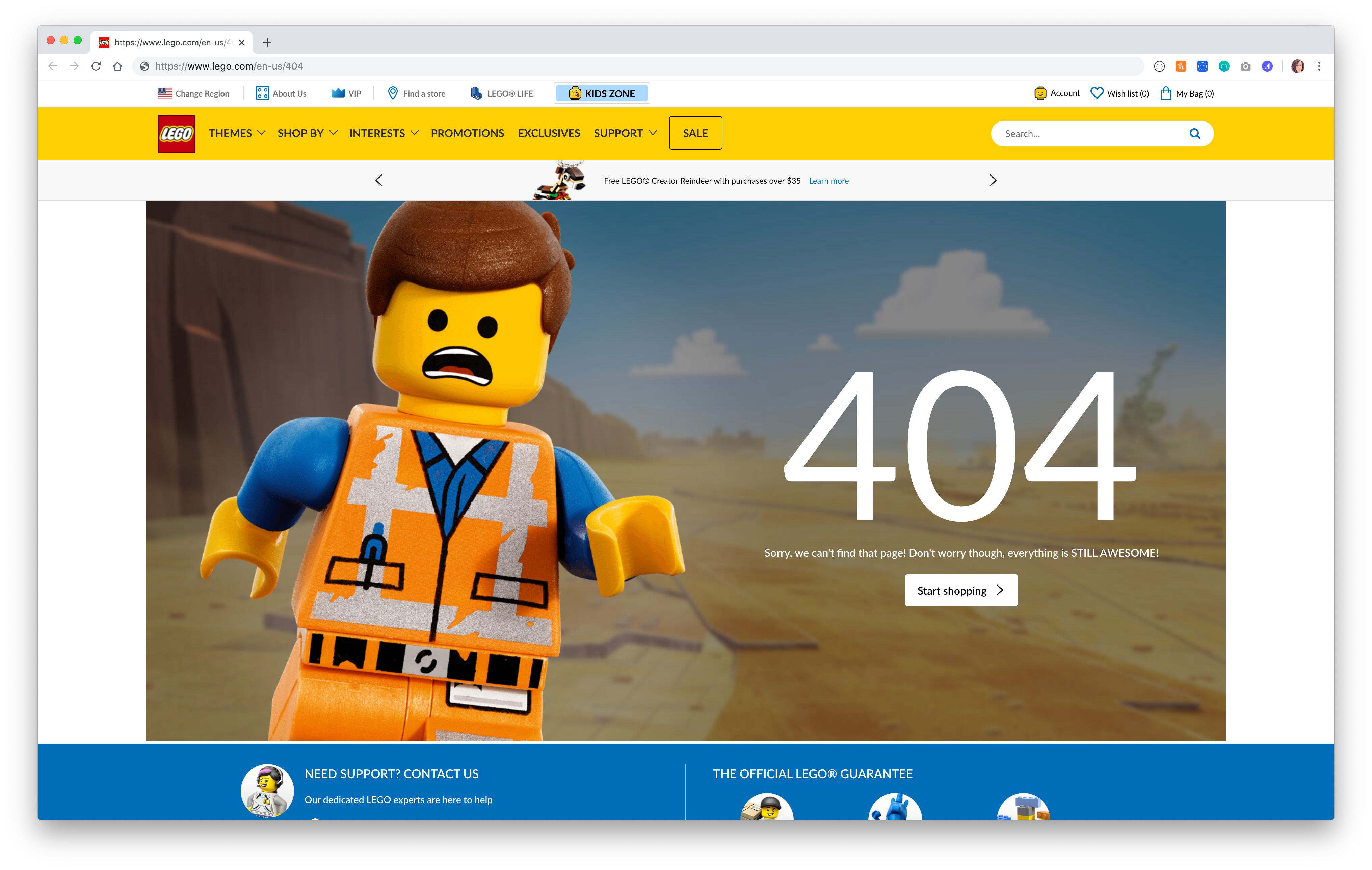
Lego’s adorable 404 page features, of course, a LEGO character from the LEGO movie. It includes a cute graphic and a quick blurb (and line from the movie), assuring the user that everything is still awesome!
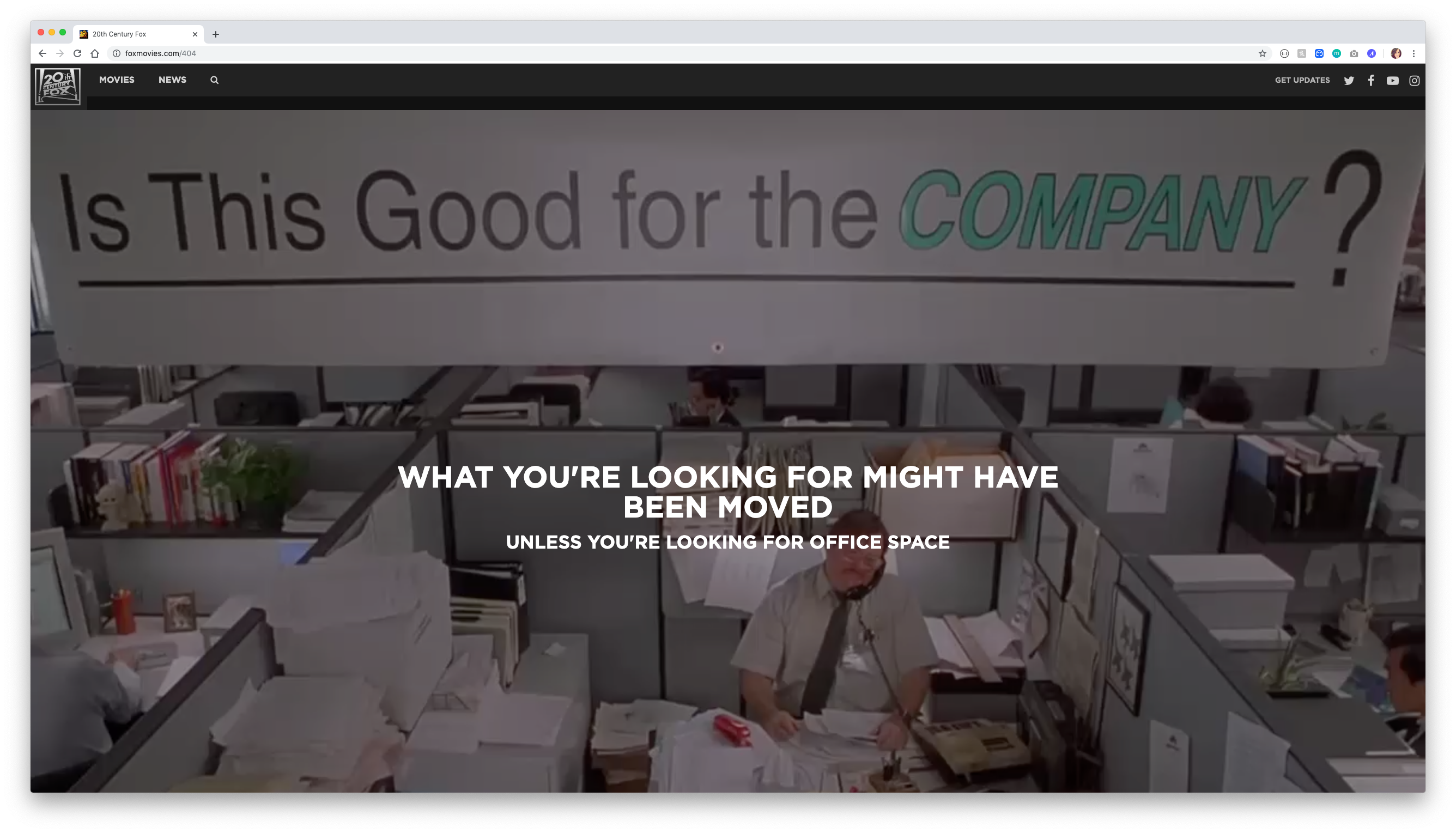
We thought it was appropriate to put 20th Century Fox as 20th on this list. This 404 page changes with each refresh and includes a funny message that directs you to one of their most famous pictures, such as Office Space, Edward Scissorhands, Young Frankenstein, and more!
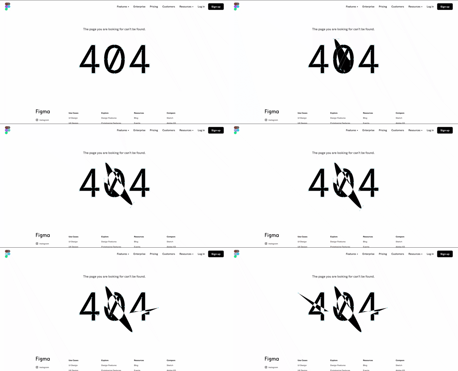
Figma is a super cool design tool, and their 404 page is functional, too. Play around with anchor points and Bézier curves on the oversized 404 text. You can reshape these vectors as much as you want. Compared with other design platforms’ 404 pages, this one is definitely one of the more innovative ones we found.
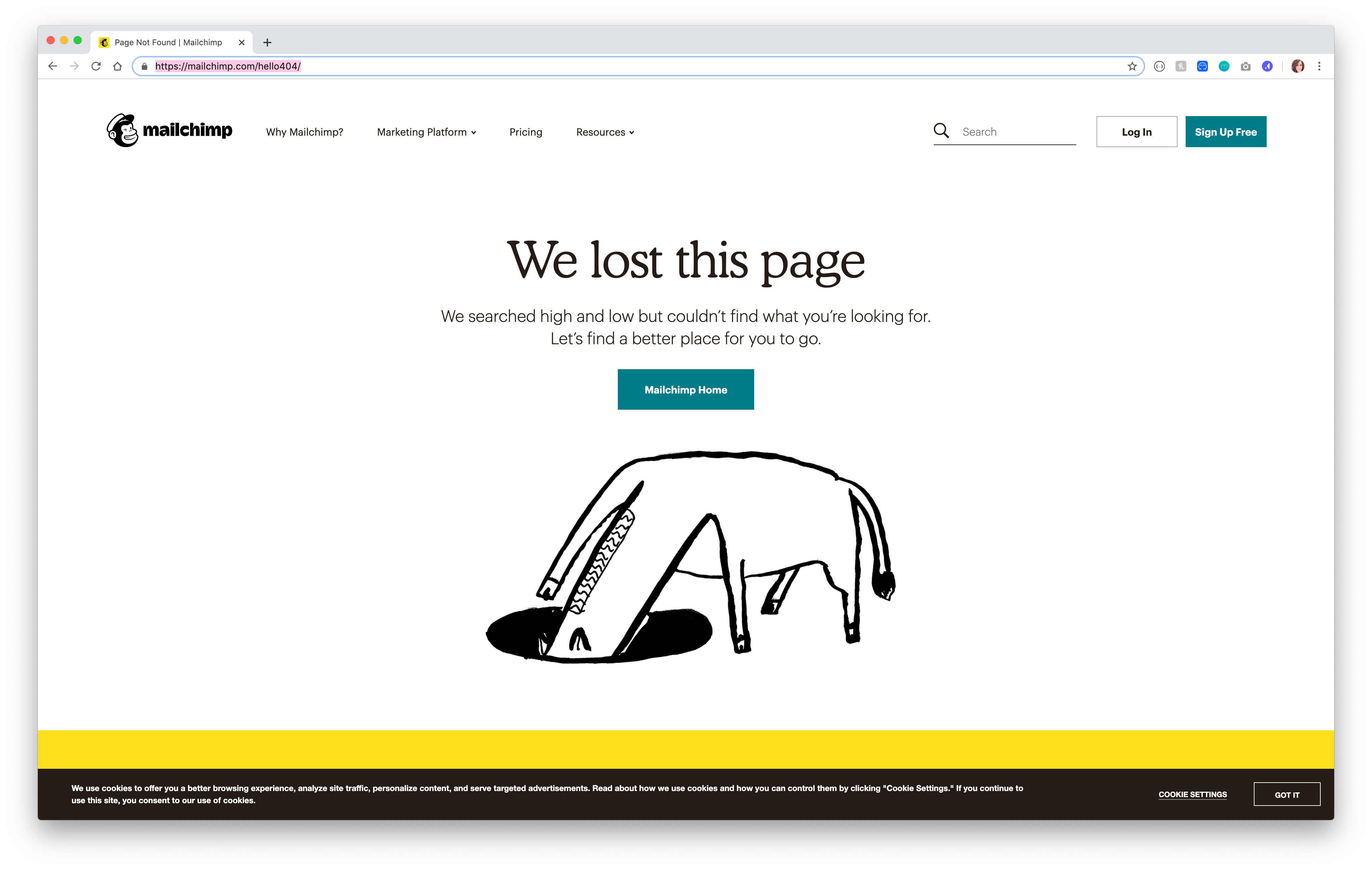
This cute, simple 404 page features Mailchimp’s branding. With a cute message and a button that sends you right back home, this 404 page is a good example for anyone looking for a simple design, text, and image for their error page.
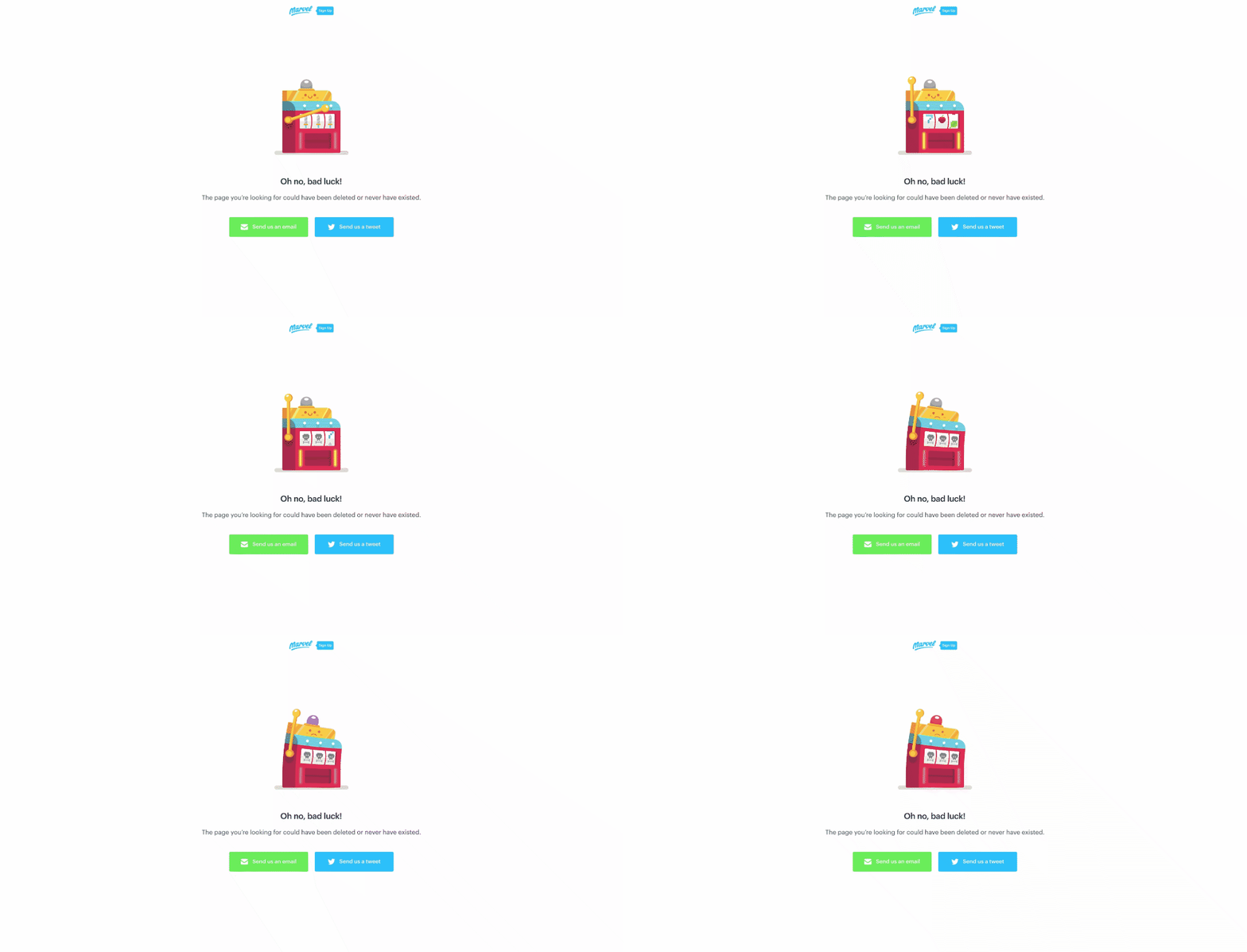
This time, not the Marvel you may be thinking of - Marvel App is an app for prototyping. This cute animation is a play on bad luck, which quickly tells the user they’ve landed on a page that doesn’t exist. It also gives the user options to let them know via email or twitter what they were looking for that’s now missing, which is a great idea.
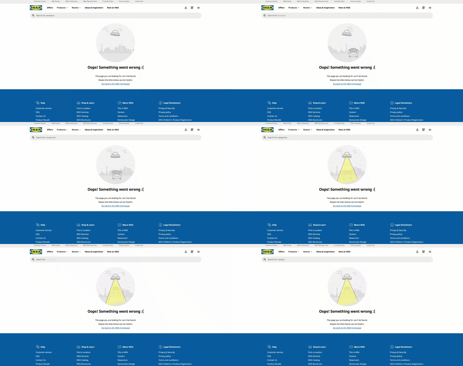
Oops! Something went wrong. Even though the furniture you were looking for might have been abducted, Ikea provides a search bar on their 404 page as well as 3 menus to help you get back to what you were looking for. We vote this 404 page both adorable and extremely user friendly.
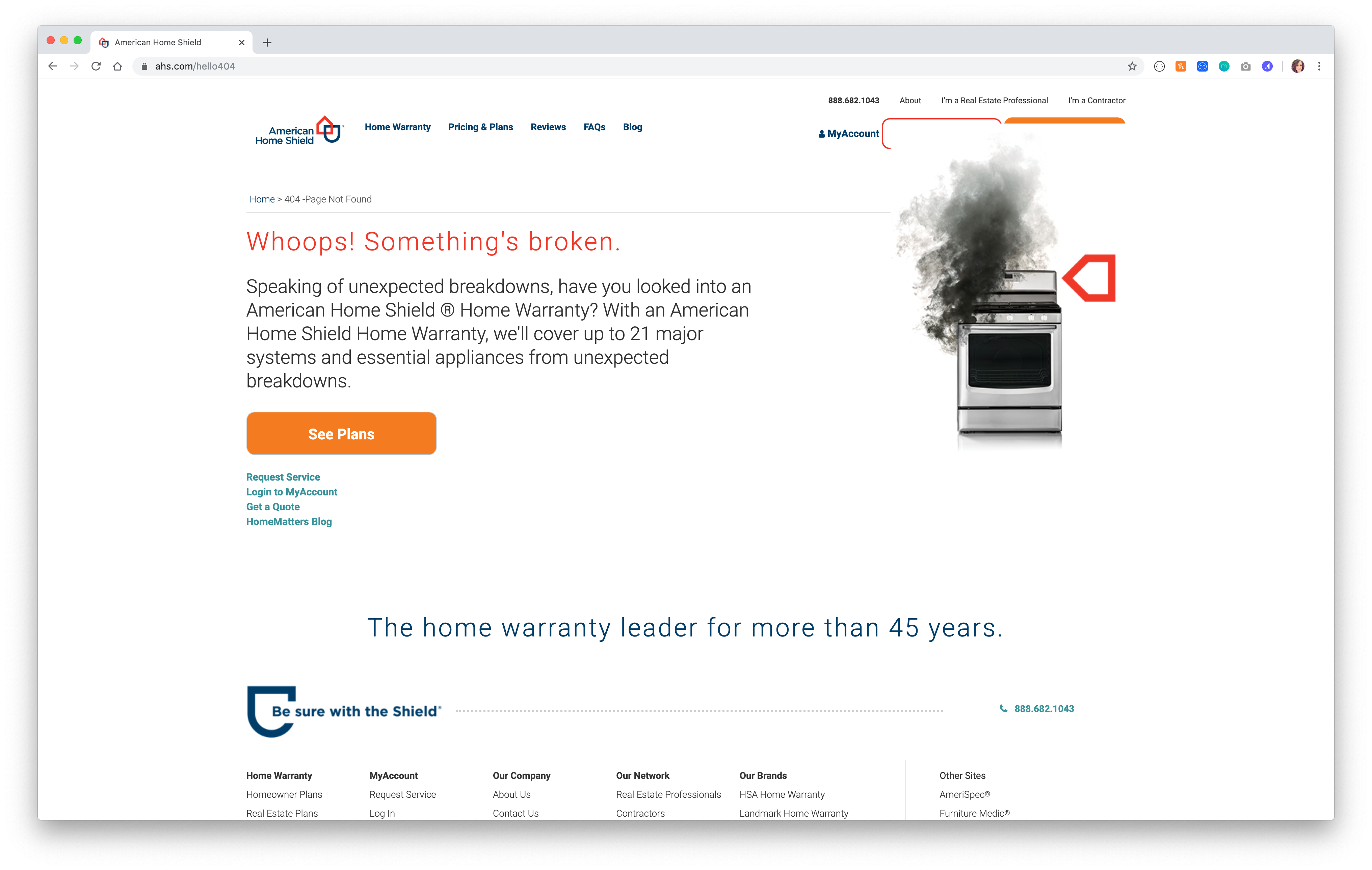
American Home Shield is known for their warranties on home appliances, so it’s perfect for them to feature something that’s broken on a broken link. We also love that AHS takes this opportunity to turn lost traffic into a converted user by suggesting the user take a look at the plans available. Maybe this page isn’t so “broken” after all!
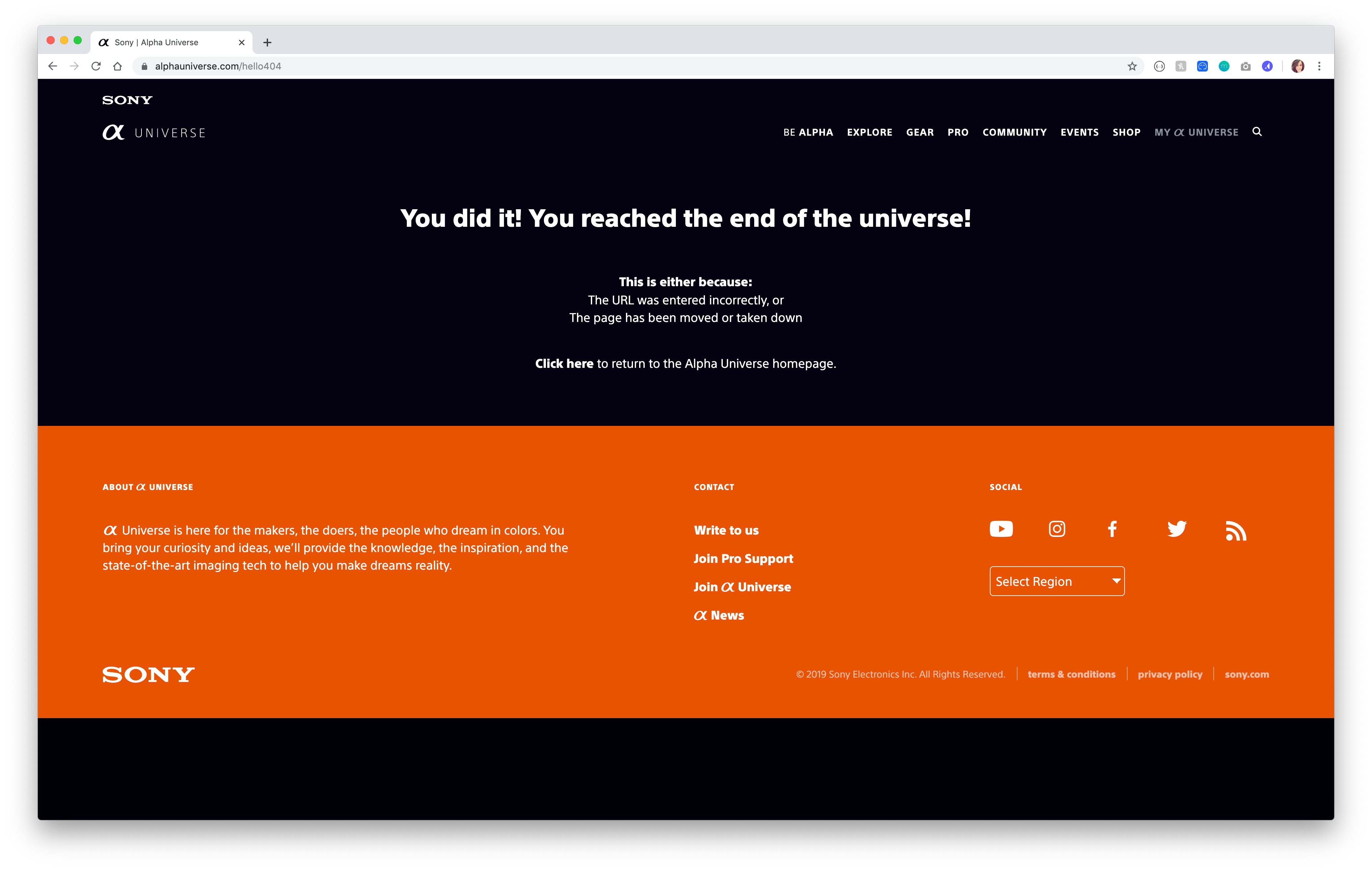
This 404 page is extremely simple and straightforward. Sony Alpha Universe website highlights artisans who use Alpha cameras and the art they create. We love that this 404 page literally speaks for itself in reaching “the end of the universe!” with a quick link back to the homepage, while still keeping site navigation on page.
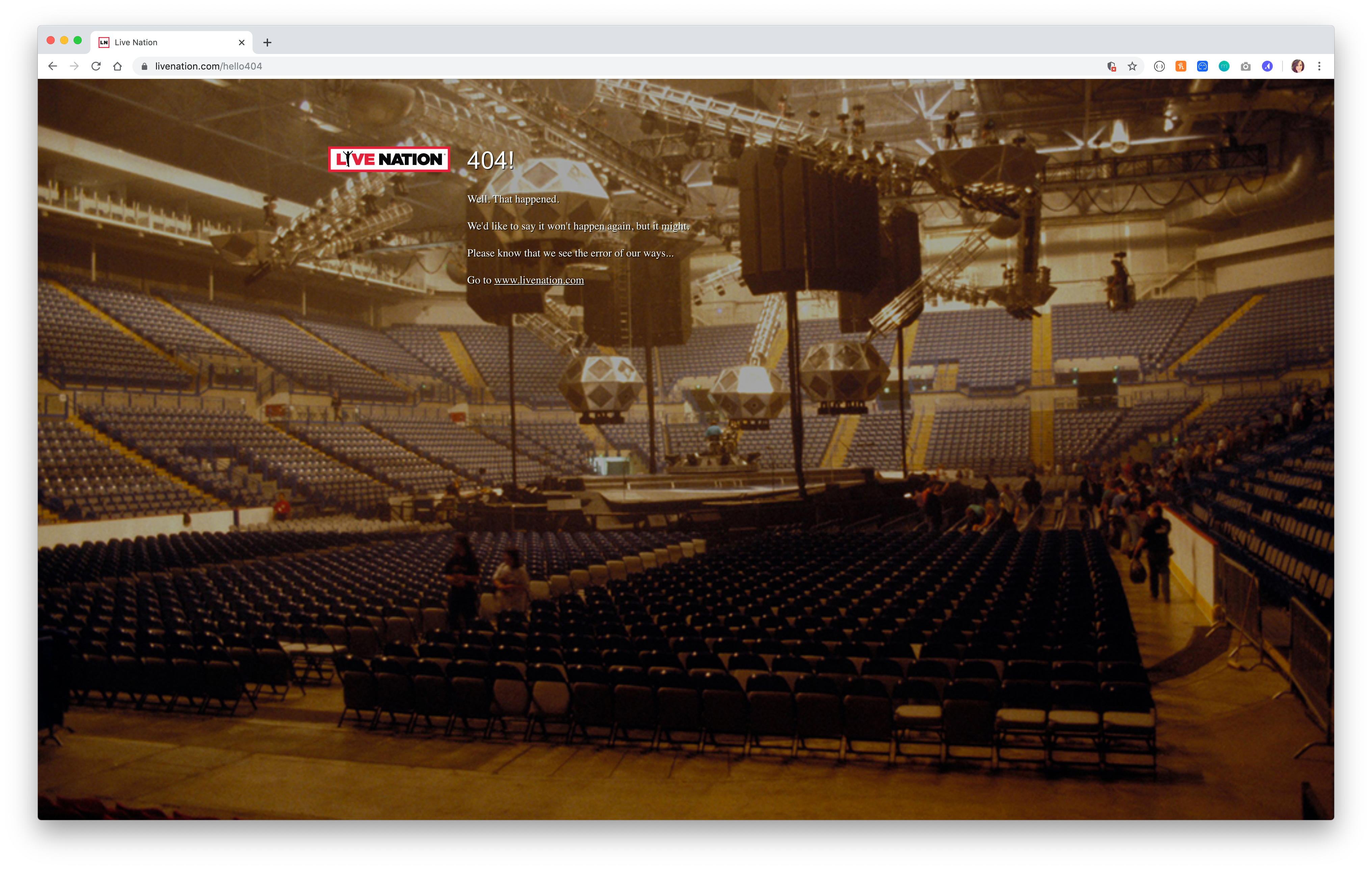
Live Nation entertainment’s 404 page is an empty show venue, which is very on brand. We love the simple design of this page. It’s concise and to the point to let you know you’ve stumbled across a page that doesn’t exist, with a link back to the homepage. The only thing this 404 page could use is maybe more navigation options than just going back home, or a search bar to allow the user to search for what they were looking for in the first place.
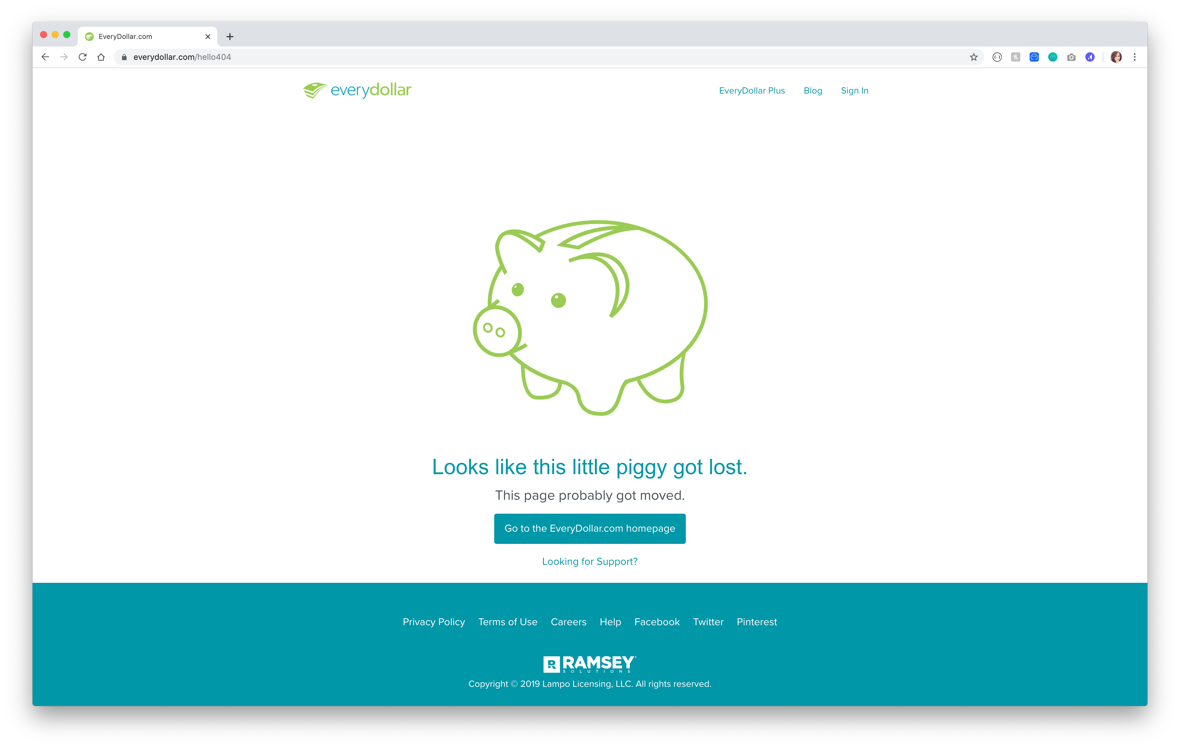
EveryDollar is a budgeting app that helps users take control of their money by assigning a category to every dollar that comes in or gets spent. This 404 page is minimalist in design and features a cute “this little piggy got lost” message, on brand with piggy banks and money. We also love that this 404 includes the top and footer navigations to help users easily find the content they need.
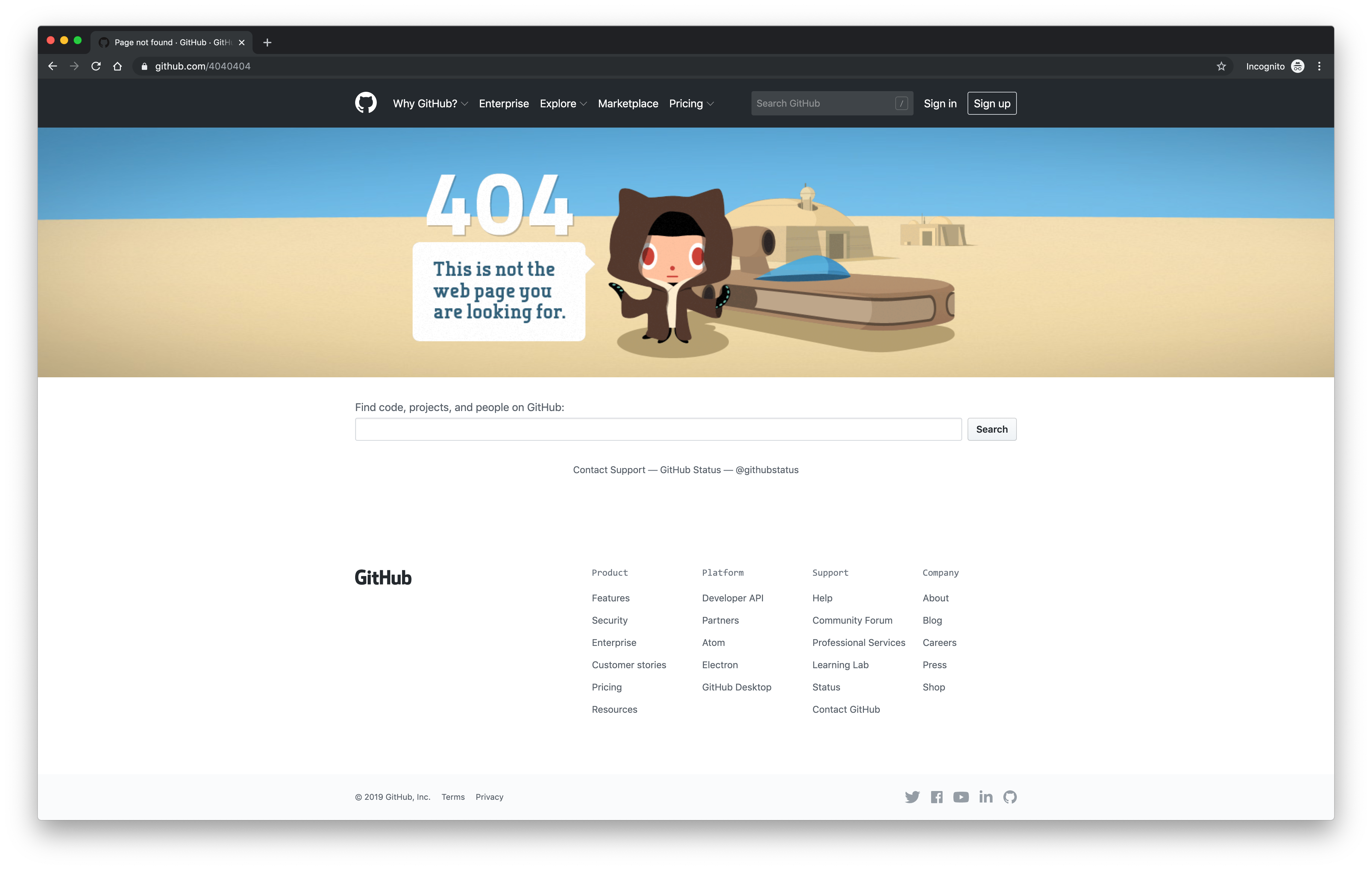
Github’s page is absolutely on brand. We love the nod to Star Wars and a wise Github character announcing to the user the webpage they were seeking does not exist. The hero illustration is just enough to communicate the 404 error without compromising the navigability of the menu and search below.
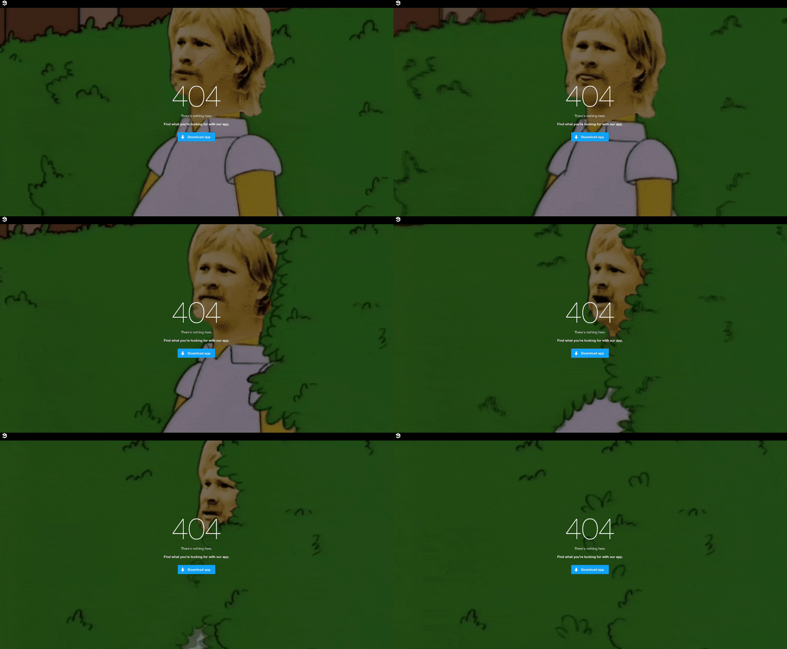
9gag is an app where you can find all kinds of content, gifs, and more. 9gag’s 404 page has one purpose: to get you to download their app, which we love. It features a quirky gif playing in the background, but the only CTA is to download the app, which drives traffic to convert. Brilliant.
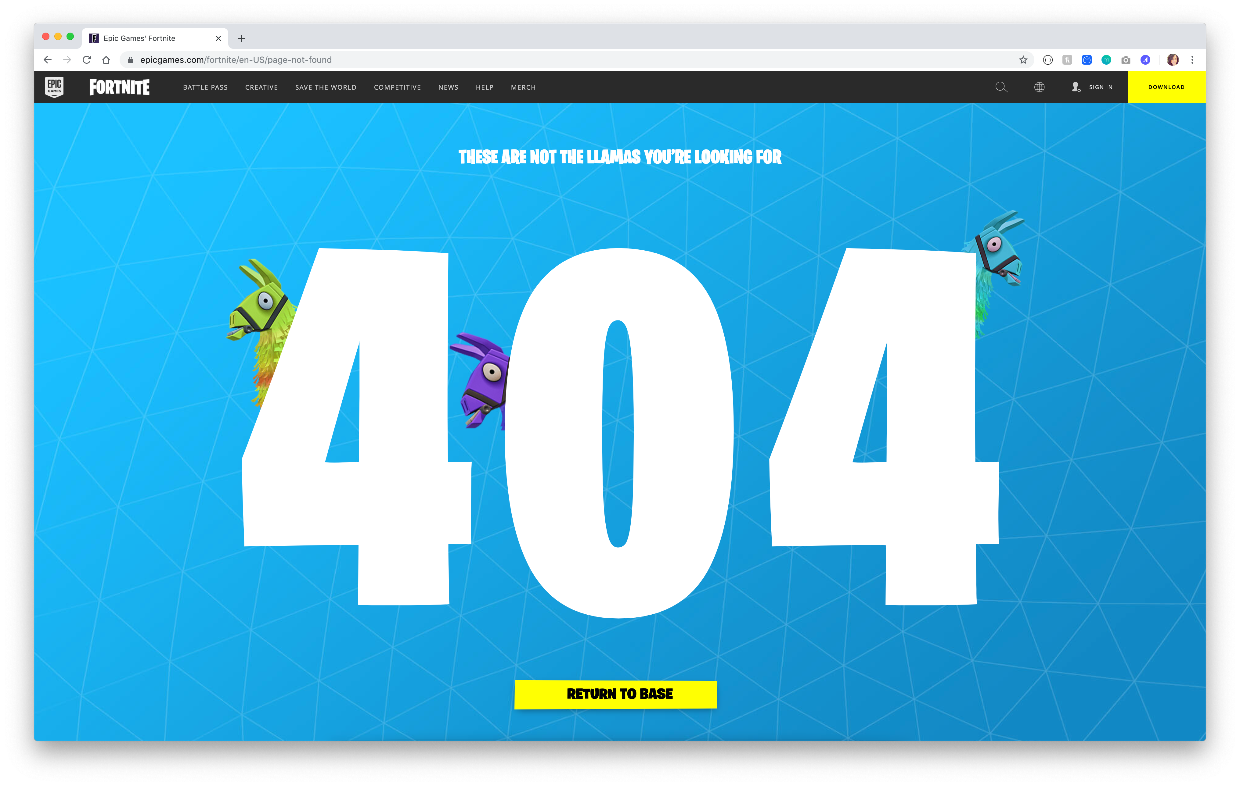
Epic Games’ Fortnite 404 page is perfectly on brand, as we’d expect. The bold imagery and llamas on the page both speak to the game and the audience. With a clear CTA directing you back to base, this 404 is a winner in our eyes.
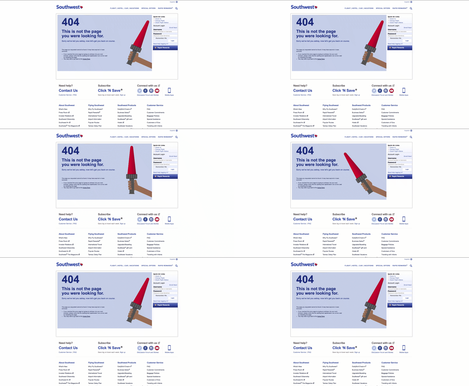
Lost on a website? Maybe you need some air traffic control to send you in the right direction. We love the homage aviation on this 404 page, while still providing users the same menus and login options they would have on a found page of the site.
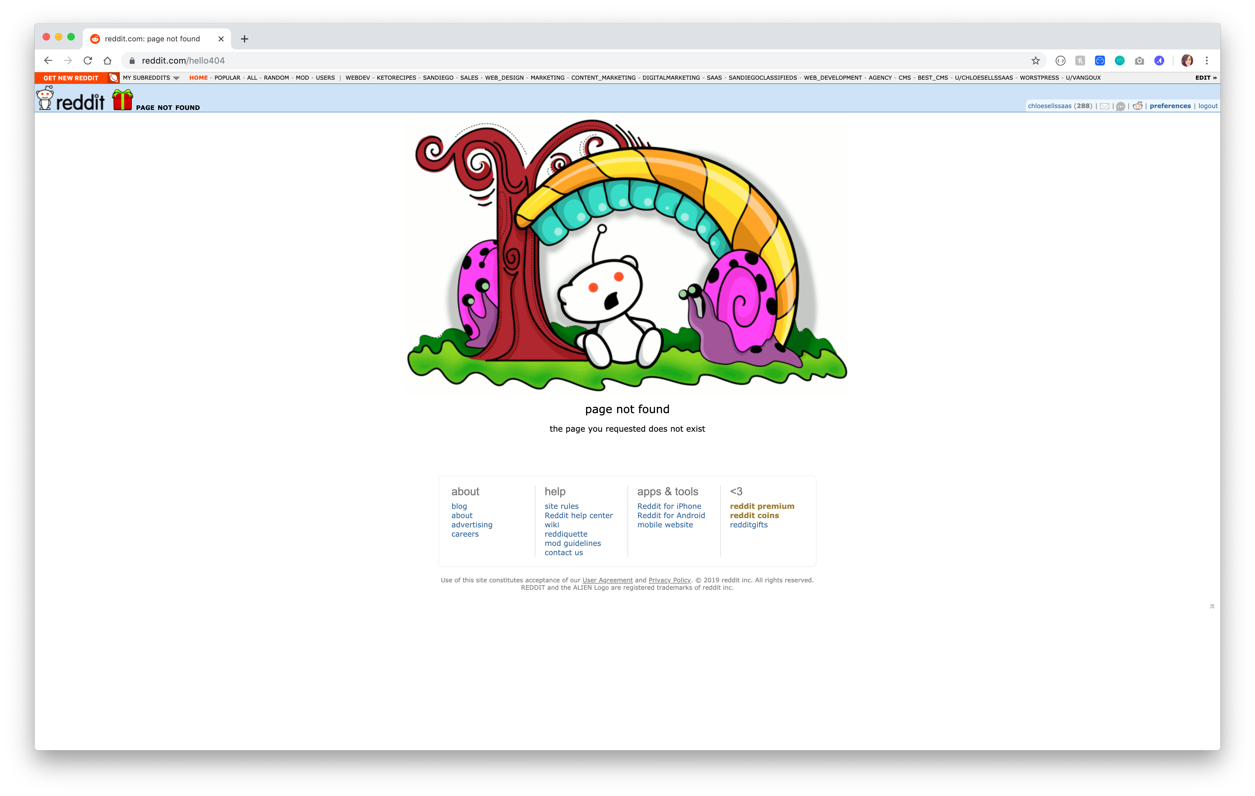
Reddit’s 404 page just lets you know that what you were looking for doesn’t exist. The fun thing about this 404 is the illustration of the Reddit logo changes with each refresh. Some feature a narwhal, being lost in the desert, rainbows, and more. Which one will you land on?
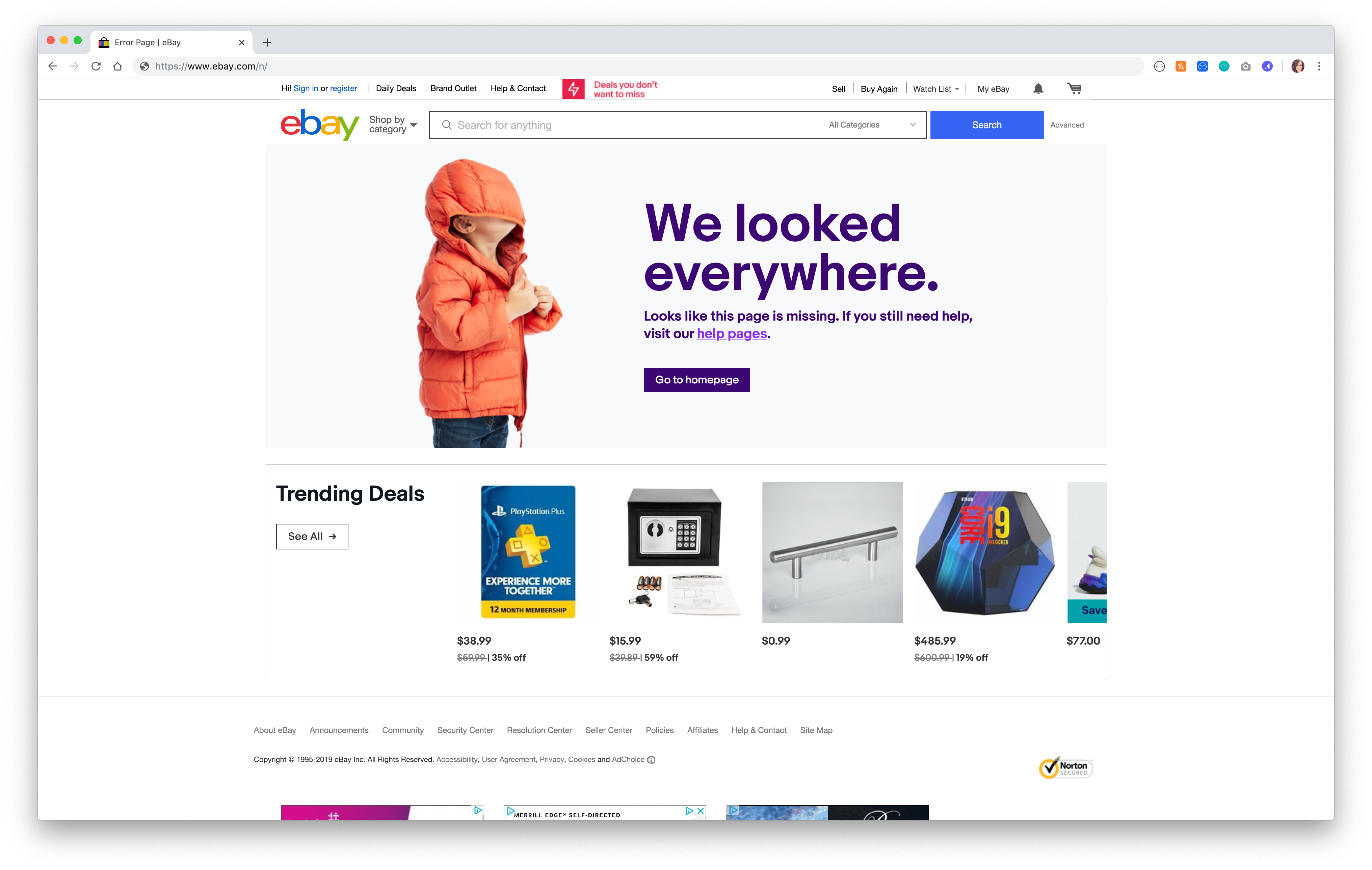
Ebay’s 404 page tells you you’ve hit a 404 without saying the error. It features adorable imagery and includes trending deals to try and steer you in the right direction of finding the products you were looking to buy. It also includes a link to help pages specifically, just in case you were looking for something that wasn’t an awesome deal.
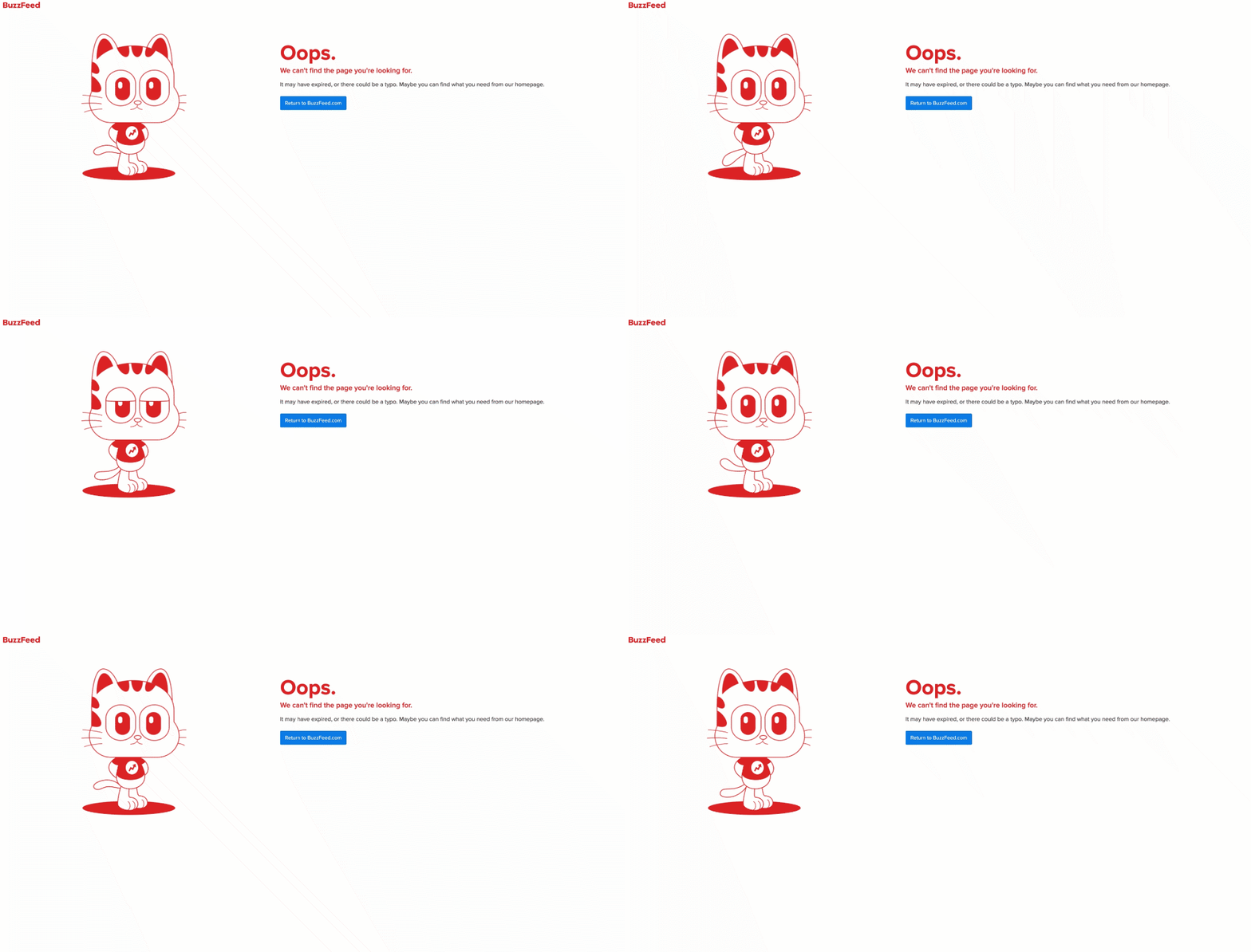
Could you imagine finding something that didn’t exist on Buzzfeed? On the content site that seems to cover everything, they’ve still designed a minimalist 404 page just in case what you’re looking for doesn’t exist or was removed. This animated gif and straightforward messaging has us swooning over this 404 page.
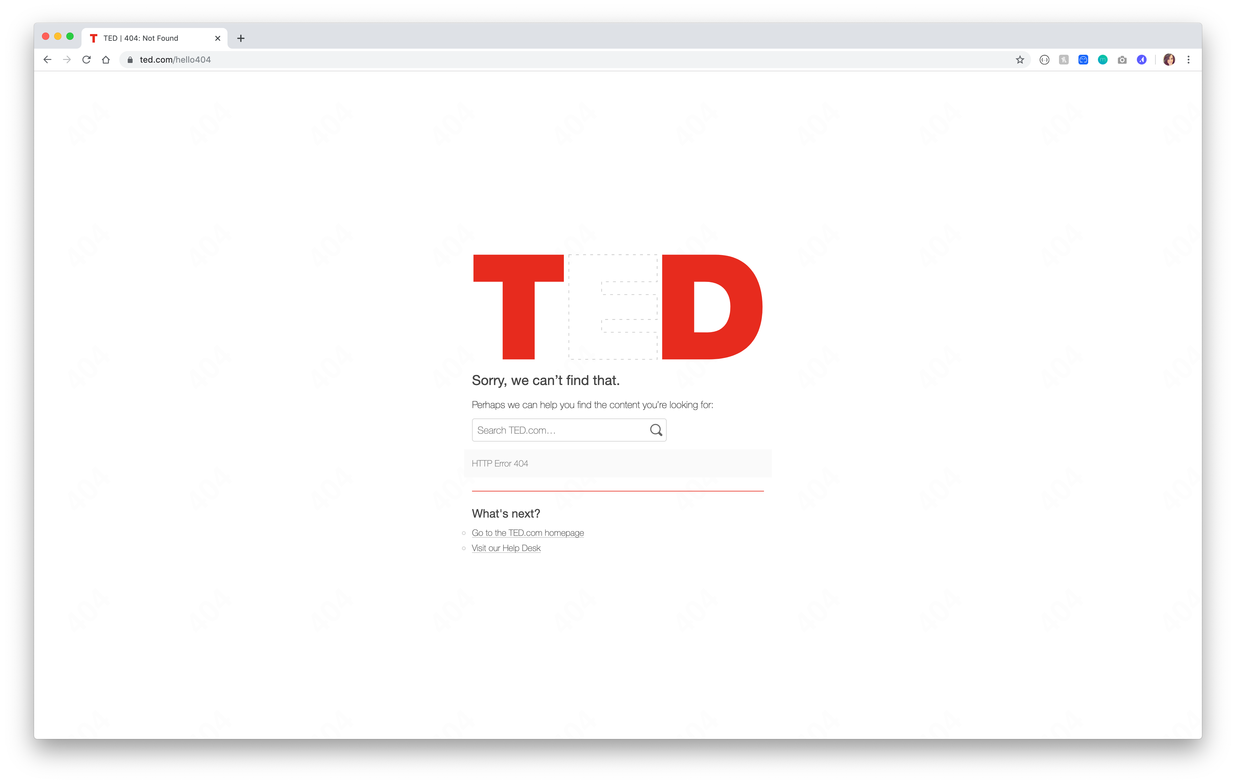 TED.com has a library of innovative thinkers who share theses, stories, and more on their site. We love the brilliance of including your logo on the 404 page with part of it missing, like Ted has done on their 404 page. This page also has a prominent search bar to make it easy for users to find their next favorite innovative lecture on the site!
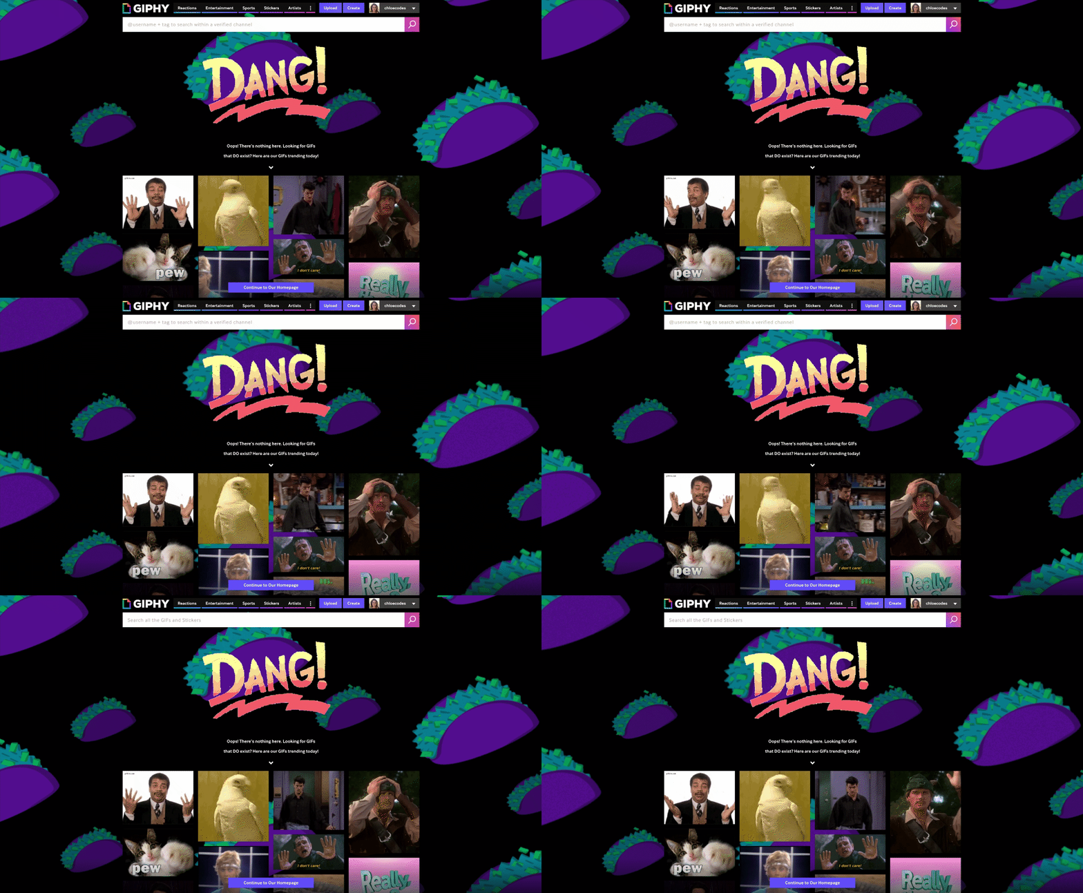
Of course Giphy’s 404 page includes loads of gifs! This 404 is awesome because the imagery lets you know you’ve reached a 404 without an intrusive message. Plus, the page includes the top trending gifs of the day, which change all the time. Also, the taco background is awesome.
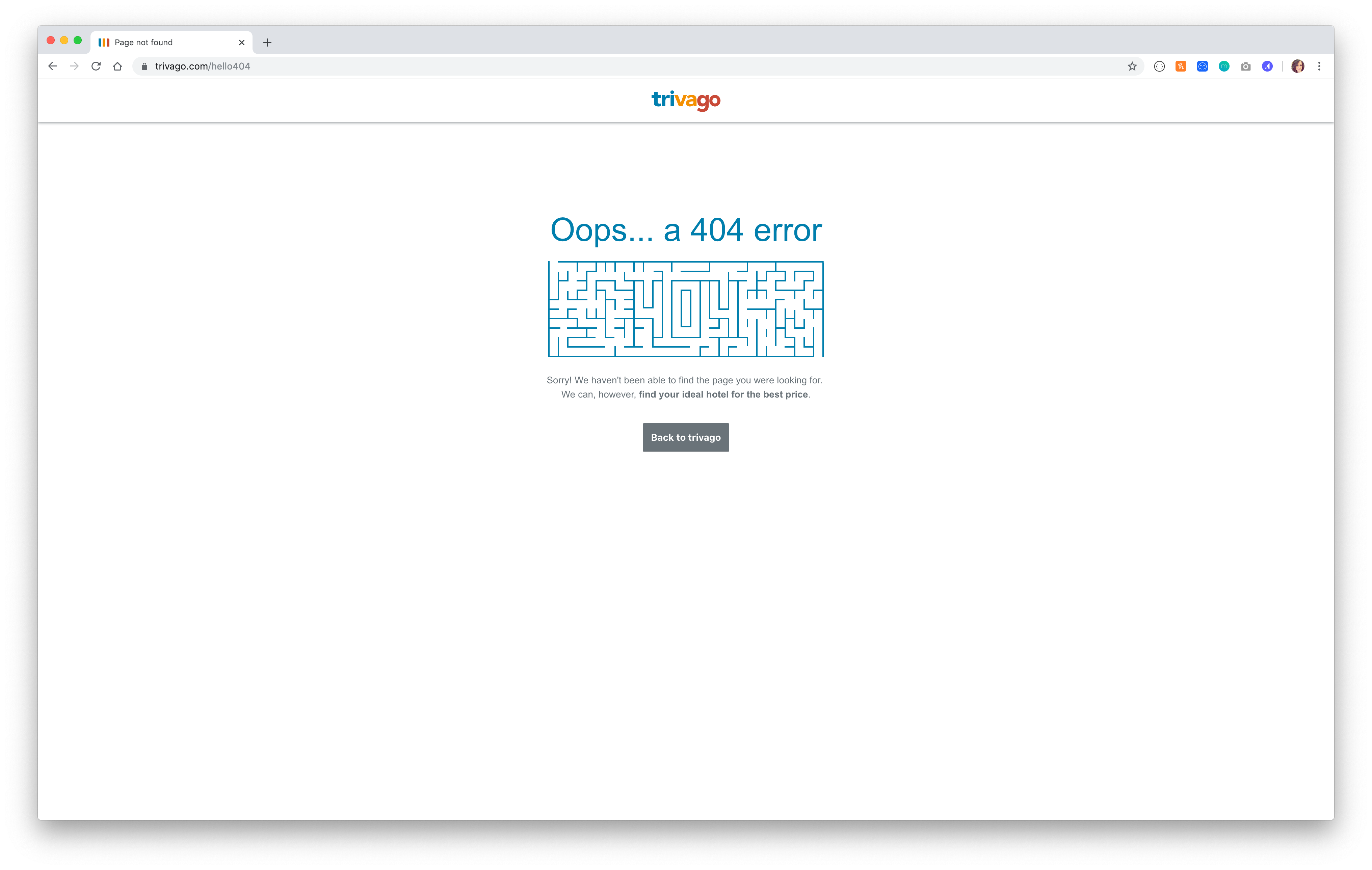
You’ve gotten lost! But, you can be found. We love this clear 404 page with minimalist design, featuring a maze. We also love the messaging on this page… you may not be able to find the page you wanted, but Trivago will help find your ideal hotel for the best price. Perfect, on-brand messaging.
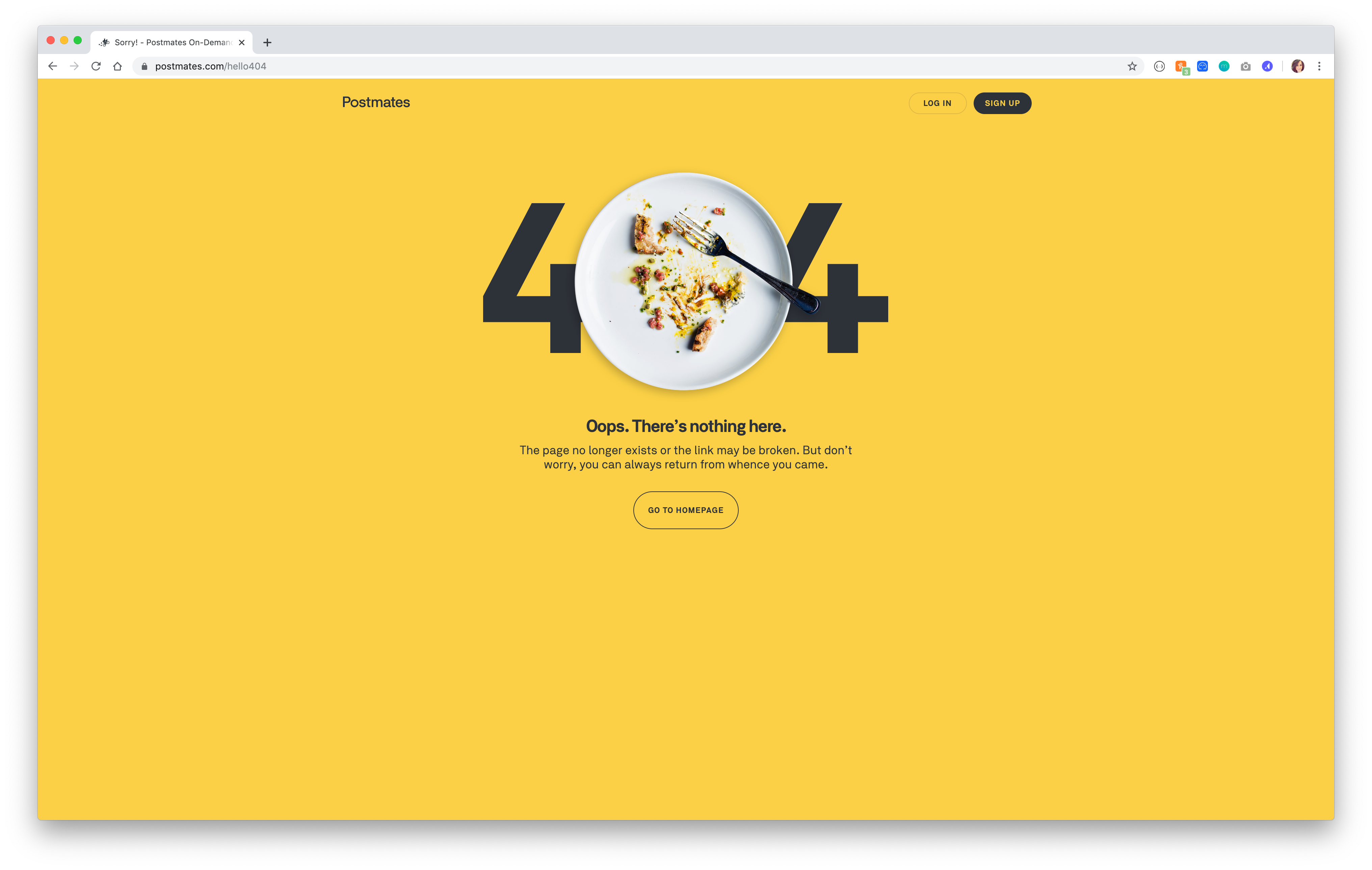
Postmates has a great, on-brand 404 page. We love the clever imagery of an empty plate in the 404, and how Postmates encourages you to go back to the homepage. Even if your plate is empty, this page reminds you it can be full when you order delivery.
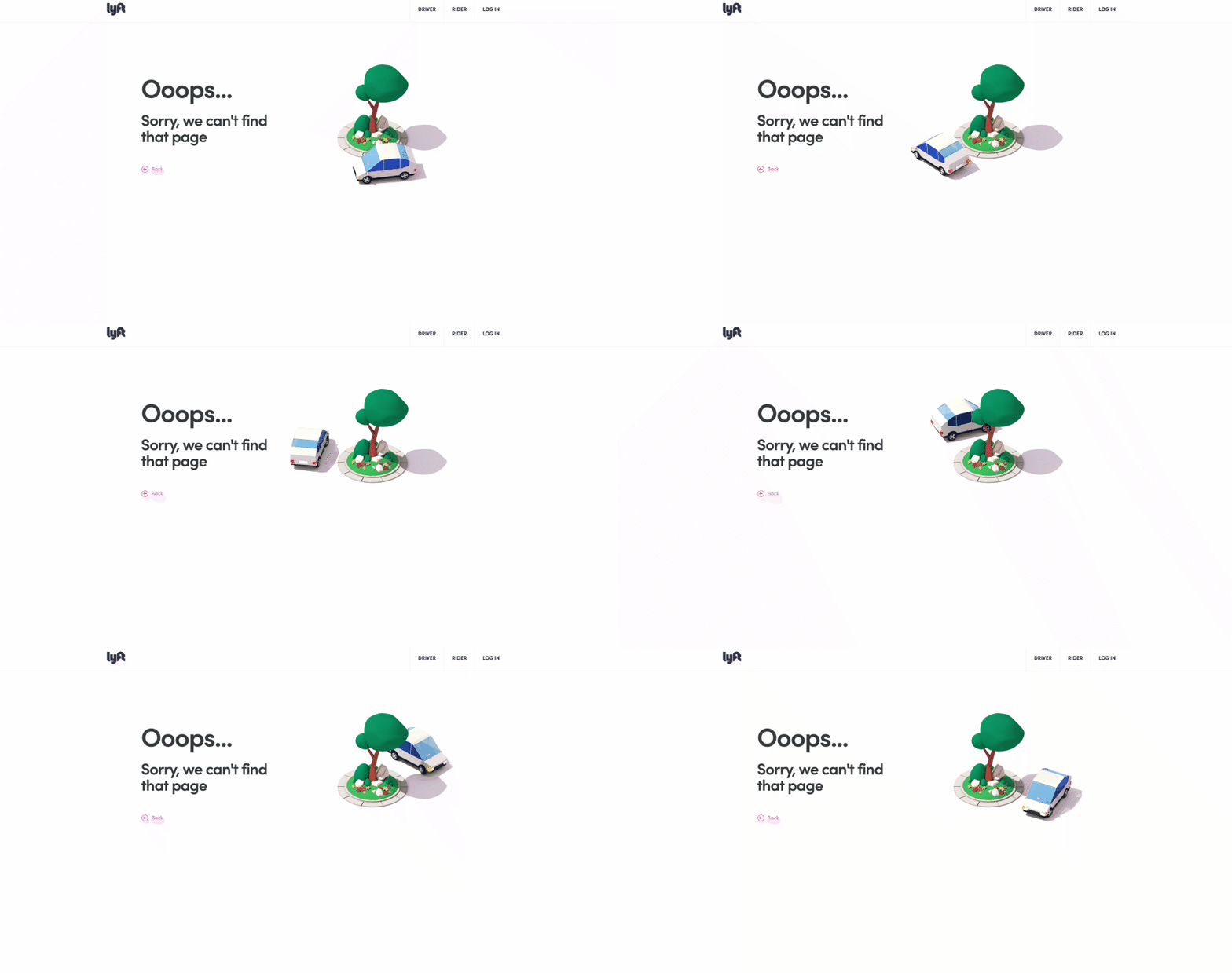
Last but not least, we love Lyft’s 404 page! If your lost like this driver is around the tree, don’t fret. Lyft features a clear menu at the top for drivers and riders, and also includes a quick easy link to go back to where you were before you got lost.
BONUS 404 PAGE DESIGNS
But wait, there's more! We'll continue adding to this article as we find more cool examples.
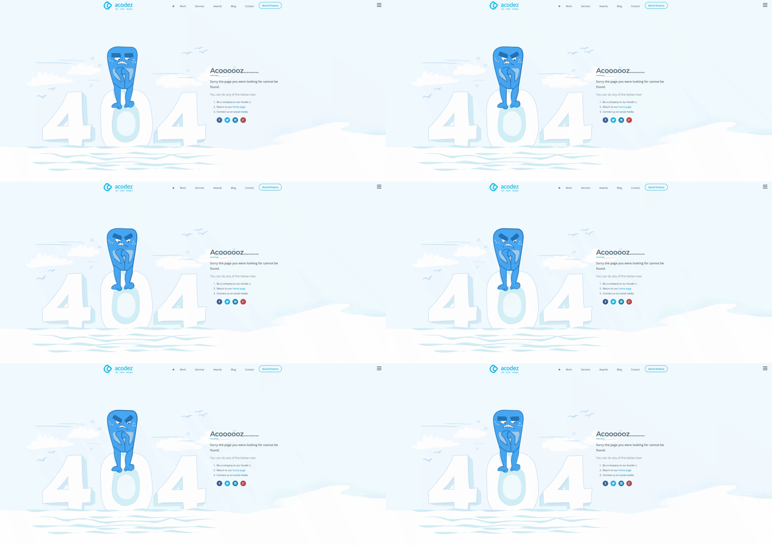
Acodez a web agency located in India. This agency showcases its personality in their 404 page which features their company mascot, Acodie!
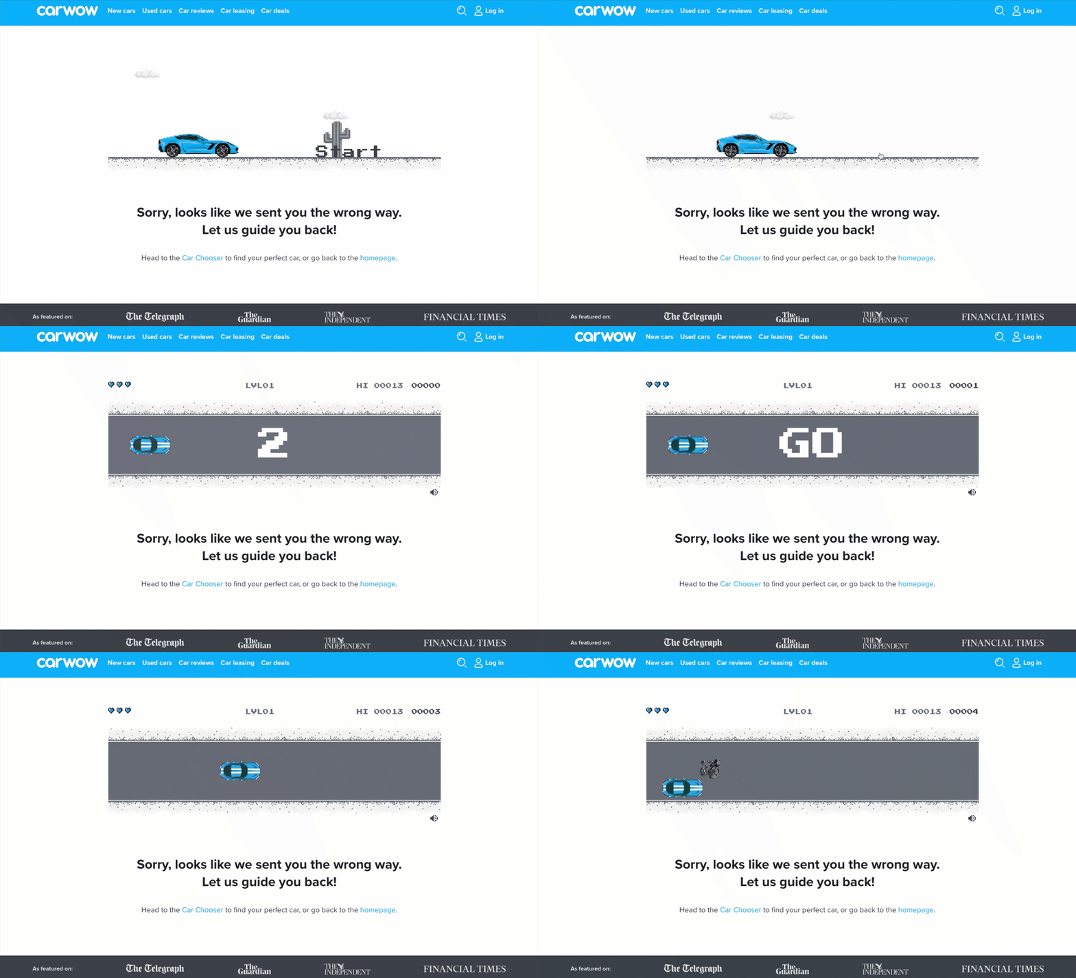
CarWow can help you find your next favorite car. This website is one of the most widely used car buying comparison sites on the internet. But have you tried to find a car that maybe was sold, or is no longer listed? Don't be sad for too long... you can play this super fun interactive racing game they've included on their 404 page! It definitely makes for a great user experience. Click the link above and check it out for yourself.