You’ve probably seen the WYSIWYG (wiz-ee-wig) acronym on the internet before but never paid too much attention. We need to go back to a time before Windows and its fancy folders and icons to tell you more about it. Before that, computers were nothing more than a black screen with white text, referred to as a command-line interface (CLI).
It was boring, complicated, and once the only option that we had to execute commands on our PC.
The same goes for web design. In the early years of the internet, web design involved a wall of complicated code that only the skilled programmer could understand - until the What You See Is What You Get (WYSIWYG) editor was invented, that is. Let’s dive in and learn about WYSIWYG and its advantages for modern website building.
What Is WYSIWYG Exactly?
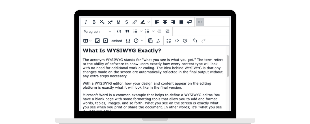
The acronym WYSIWYG stands for "what you see is what you get." The term refers to the ability of software to show users exactly how every content type will look with no need for additional work or coding. The idea behind WYSIWYG is that any changes made on the screen are automatically reflected in the final output without any extra steps necessary.
With a WYSIWYG editor, how your design and content appear on the editing platform is exactly what it will look like in the final version.
Microsoft Word is a common example that helps to define a WYSIWYG editor. You have a blank page with some formatting tools that allow you to add and format words, tables, images, and so forth. What you see on the screen is exactly what you see when you print or share the document. In other words; it's "what you see is what you get."
You've probably used one several times without knowing it. Here's a sample of the one we're using to write this article:

Simple, huh?
WYSIWYG and Web Design
A WYSIWYG rich text editor is different from traditional plain text editors in that those editors require developers to enter descriptive code or markup to build websites. Plain text editors won’t give you an immediate way of seeing the results of what you’re doing.
The first WYSIWYG editor, Bravo –a word processing tool– was created in the 1970s and became the base of two of the most known WYSIWYG editors, Microsoft Word and Excel.
In the past, designing a website was impossible for people who didn’t know how to code. The WYSIWYG approach to web design is distinct from conventional web design methods that use HTML code or other markup languages and where the development screen is just a wall of code. In these older methods, you're not able to see the end result or the visual interface in real time as you add new page elements or lines of source code.
WYSIWYG HTML editors reached the masses when user-friendly website builders like Wix emerged, giving non-technical people an approachable way to build web pages. Slowly but surely, enterprise content management systems began to give WYSIWYG editing more precedence, giving marketers and web designers another way to build web pages, landing pages, and email newsletters without calling on the IT department.
All in all, a WYSIWYG editor gives marketers a more enjoyable user interface to work independently from developers. After all, web visitors don't want to stare at a wall of not-so-visually appealing text. They want to see nicely formatted paragraphs, images, videos, and other graphics - all of which enhance user experience.
Here are some of the reasons why WYSIWYG makes a marketer or a web designer’s life easier:
No Code Editing tools: The WYSIWYG editor enables designers to click, drag, and drop elements on a website without any coding skills.
Simplified Publishing: Using a WYSIWYG editor is faster than attempting to format a website from scratch.
More visibility: With a WYSIWYG application, users can preview the website they’re creating and make adjustments in real time.
What Are the Advantages of WYSIWYG Editing?
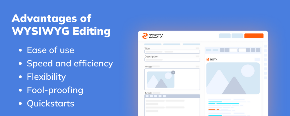
There are many advantages to WYSIWYG editors, especially from a design point of view:
Ease of use: Many WYSIWYG editors have a drag-and-drop interface where users can add or remove different components (i.e., text, images, and videos) on a webpage without having any knowledge of web programming. Being able to piece together parts of a website in such a way is intuitive and fits in with the brain’s natural way of organizing elements.
Speed and efficiency: WYSIWYG editors work much faster than coding a page out from scratch. There’s no need to switch screens and wait for the preview to generate. In addition to the instant gratification offered, users can focus more closely on design rather than be bogged down by technicalities.
Flexibility: WYSIWYG design tools enable you to make small changes on the fly. If an image is slightly out of position, you can fix this in a matter of a few simple clicks. Plus, you can easily keep your site more up-to-date this way.
Fool-proofing: Mistakes are far easier to catch in a WYSIWYG editor than in a block of code. Plus, with a WYSIWYG editor, these mistakes can easily be resolved.
Quickstarts: Many WYSIWYG editors let you choose from a selection of templates to start with. By accelerating the early stages of the developmental cycle, you get more time to focus on the content for your intended audience.
What Are the Biggest Drawbacks to WYSIWYG Editing?
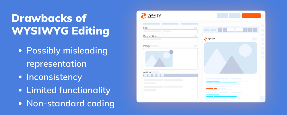
Like anything, WYSIWYG editors also have several disadvantages. The most notable ones that we feel you should be aware of are listed below:
Possibly misleading representation: Occasionally, what you see isn’t always what you get. Now that websites can be viewed on a variety of devices, screen sizes and resolutions, some WYSIWYG editors don’t cater to responsive design or give you the option to see how your website will look on a mobile device.
Inconsistency: With countless WYSIWYG solutions out there, many services will different user interfaces and conventions. If you get used to using one editor, switching to another one isn’t always easy.
Limited functionality: Not everything can be simplified to a drag-and-drop interface. Some page elements will still need some HTML/CSS trickery to produce your desired end result. Other times, you may need to customize a particular pre-made element on a page (i.e. sign-up box) to meet your requirements and this will require you to make some “under the hood” changes.
Non-standard coding: Many editors either generate excessive code or generate code that’s non-compliant with current standards and protocols. While it won’t make a difference to your website’s appearance, too much code can clog up the loading times of a website. This can have a great impact on SEO, which many headless CMS offerings don't consider.
That being said, WYSIWYG editors are constantly improving, with enterprise-grade WYSIWYG editors like the Zesty.io editor boasting cleaner code, better aesthetics, and built-in SEO features.
WYSIWYG Editor Examples
If you’re keen to build your web page with a WYSIWYG-rich text editor but don’t know where to start, here are some well-known editors that you may wish to investigate:
Zesty.io: Remember when we mentioned most editors don’t focus on SEO? Here’s the exception! Zesty.io is a unique headless CMS tuned to engage customers and accelerate page visits through its search engine optimization features.
Adobe Dreamweaver: This massively popular option boasts a large library of code snippets and file transfer features. However, it comes at a hefty price and is only recommended if you want a detailed and complex design experience.
Create: Exclusive to Mac operating systems, this service combines the major features of many of the big-name editors into a single cheap package.
Quill: This free and open-source option is highly customizable. Consider this one if UI customization matters a lot to you.
Seamonkey Composer: A simple all-in-one alternative to its complex brethren. It’s also one of the few editors that’s Linux-compatible.
Summernote: Another open source project that’s easy to customize to your liking. Plus, it’s backed by an active forum community ready to help you if you ever need it.
Choosing the Right WYSIWYG Editor for Your Business
So, how do you choose the right WYSIWYG editor?
In our view, it all comes down to personal preference and the task at hand. Certain editors are better suited to certain tasks. Quill is great if you are looking to build an efficient and user-friendly UI, while something like Zesty.io works well for larger businesses and enterprises who wish to build websites, apps, and single-page applications with greater flexibility and functionality.
There is no wrong answer when it comes to a WYSIWYG editor, but you will find that you gravitate to certain ones that feel familiar to you, that suit your design style, that may fit your business model best, and that appeal to whatever tasks you are trying to complete.
By Katie Moser
Katie is the Senior Marketing Manager for Zesty.io. Her expertise lies in crafting marketing strategy, with an emphasis on content and digital marketing. Having spent too much time in clunky CMS's, Katie understands the need for a CMS that works with you - not against you. In her free time, you can find Katie in San Diego enjoying the sunshine at the beach or on hikes.


