Getting Started: What You’ll Need
An account and instance created in Zesty.io
Some HTML/CSS/Javascript knowledge
We recommend using resources such as BootstrapCDN for this project, but you could also load your own Bootstrap files.
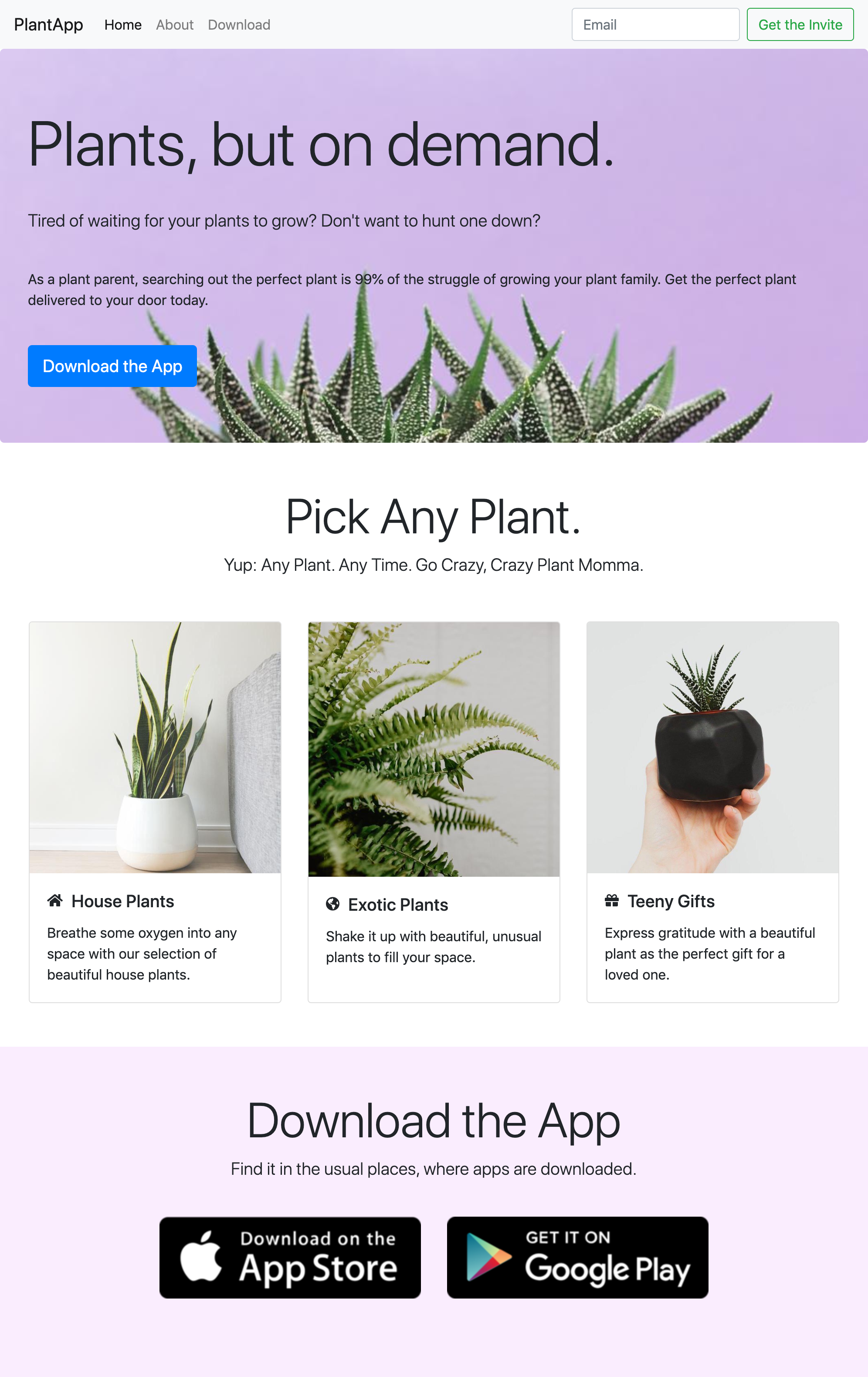
This tutorial will focus on building this landing page to promote our imaginary PlantApp, but feel free to get your creative juices flowing and build your own page with your own styling, designs, and Bootstrap components!
If you haven’t worked with Bootstrap before, don’t worry. It’s a very intuitive, easy-to-use framework built by the folks at Twitter designed to make responsive pages easy to build. It’s built on a 12 column grid, and it’s one of the world’s most popular front-end component libraries. It’s open source and has extensive prebuilt components (some of which we’ll be using in this tutorial), but it also has lots of jQuery plugins you can fin
Of course you can build your own design, but for the purposes of this tutorial, the design we’ll be building for this website looks like this:
Step 1: Create Your Instance
An instance in Zesty.io is the space you’ll use to build your landing page. You don’t have to worry about hosting, backend configuration, CDN, or anything like that - we take care of it all for you. All you have to do is build your content models, enter content, and create
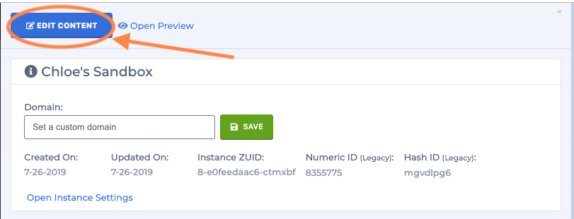
Creating an account and instance with Zesty.io is easy. Click any button that says “Create an Account,” sign up, and when prompted, follow the instructions on creating your instance. When you’ve created your instance, click the button at the top of the slide-out that says “Edit Content,” and bam- you’re in!
Step 2: Build Content Models
Next, we’ll want to build the content model for our landing page. Content models are how we’re going to abstract the content of the page into the CMS. Content modeling allows us to build a user experience in Zesty.io so anyone can edit a page, with or without technical experience. If you’re building a custom landing page, check out these videos:
If you’re following along with the template, our content schema structure is going to be fairly simple. I’ve marked up the screenshot of the landing page we’ll end up building. The items in blue are part of what will be the set on the Home Page (a Single Page model), the Features set (a headless data set parented to the Homepage), and the Download Icons set (a headless data set that will not be parented).
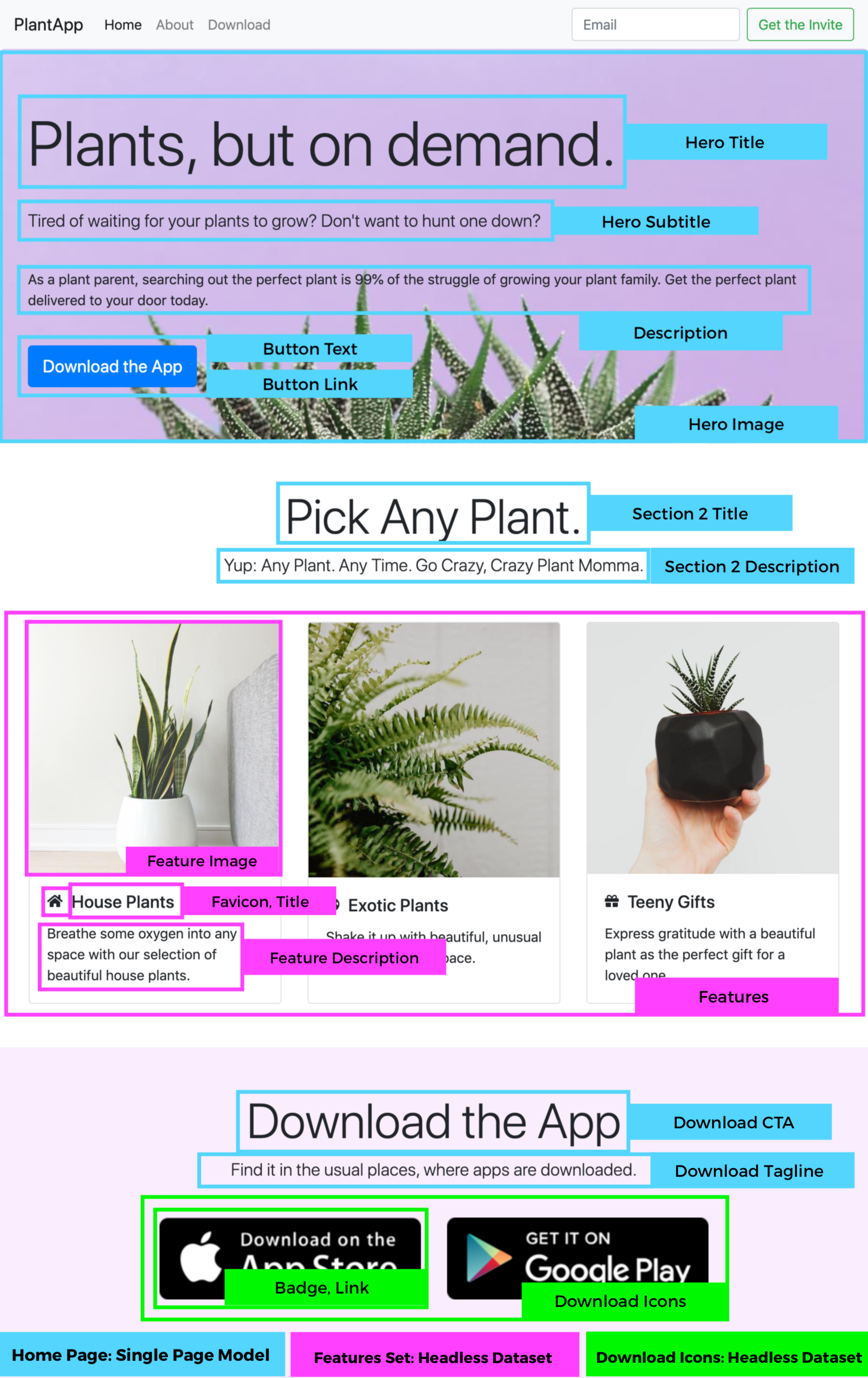
This is how I’d recommend building this for the sake of 1) getting our page up quickly and 2) the fact that this is a simple one-page landing page. However, content modeling in Zesty.io is completely customizable, so feel free to configure this to best suit you
Step 3: Enter Content
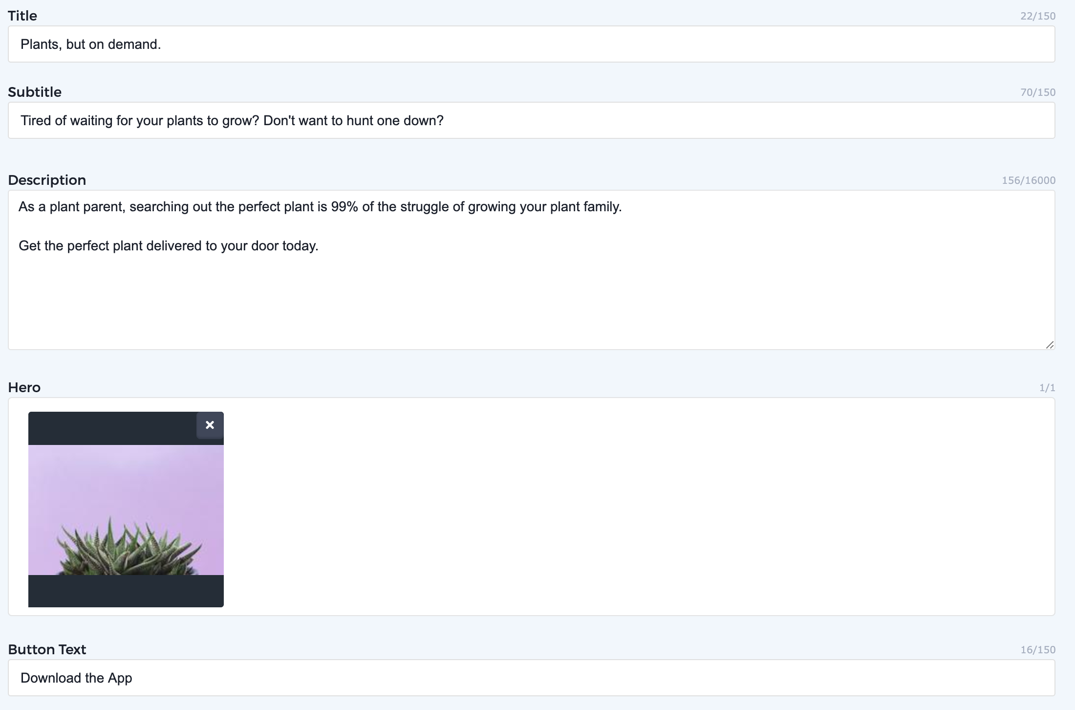
This is the really fun, easy part! In Zesty.io under the Content tab, enter all of the content you’ll need to display on your site. Include any text, images, downloadable PDFs, or whatever else you’re offering on your site. When you’re filling in the content, it will look something like this:
Step 4: Install Bootstrap in the Loader
Now, we get to the coding. First, we’re going to tell Zesty.io that we’ll be using Bootstrap 4 for this page. In the Code tab, you’ll see on the left-hand side an option for Loader.
Loader is a very powerful tool: you can think of it as an app shell. Your loader will be pre-populated with {{current-view}}. This is Parsley, Zesty.io’s templating language, and we’re telling the loader to load the current view (whatever page the user is on). Be sure to keep that there.
To install Bootstrap 4, we’ll include the appropriate links for Bootstrap CDN. Above {{current-view}}, let’s add a link to the stylesheet for Bootstrap, and below it, we’ll include the Javascript we’ll need. You’ll see I also have Fontawesome icons on the page, so feel free to install Fontawesome in the same way. Once everything’s included, you’ll end up with something like this in the Loader:
Once you have that completed, you’re ready to start coding the views.
Step 5: Build the Views
Since this is a single page landing page, building the homepage is most of what we’ve got to do. This website includes three main Bootstrap components:
Navigation bar
Jumbotron
Card Deck
Here we’ll walk through the code of building each part.
Building the Navigation
Since this page is one page, we’re not going to need Parsley for the navigation. This is pretty vanilla as Bootstrap goes. If you need help with Bootstrap’s navigation, I recommend you visit their documentation, as it’s pretty thorough. The code that outputs this particular navigation:
One thing that’s important to note is that I chose to include my nav in the Loader. That’s because in the future, if I add more pages to the website, I want the Navigation bar to load on every page. Some people prefer to have Loader be mostly empty save for {{current-view}} and include the Navigation on the page they’re building, which is perfectly acceptable. It’s up to you where you choose to include the header, but that’s it! It’s pretty straightforward.
Building the Jumbotron
Bootstrap’s Jumbotron component is a div that expands to the edges of the screen (or its parent container) and includes a large title, subtitle, and button. But! The fun here is that we want to call content from the Content Manager in Zesty.io. So, we’ll be using Parsley. Parsley is Zesty.io’s templating language that calls content from the manager and creates the output. You’ll see it because it’s marked by hugs {{ }} on either side of the call.
So, for the landing page template we’re building, this is what my Jumbotron code looks like:
Be sure to remember that Parsley autofills based on the fields you created. So if you called Title something like Hero Title when you created it in the Schema tab, you’ll see that Parsley suggests {{this.herotitle}}, since that’s the reference for the field you created.Be Cautious: Reference names are customizable, but be wary of changing them, as you’ll have to go back to your code to fix the references so the content doesn’t disappear.
Building the Card Deck
So, we created a headless data set for the Cards component that we’ll be using to showcase the features of our app. This is really fun because we’ll need to use what’s called each loops to loop through our content.
Since we’ll be building a Card Deck, everything will be wrapped inside a div with a class of “card-deck.”
Now, we want to display each card we’ve created. So, in Parsley, we use an each loop to create every Card. Each loops are contained within:
{{each}}{{end-each}}Now, let’s tell Zesty.io what we want to display. We want each planttype (the reference I gave my feature) as type (the individual item, you can call this variable whatever you like)
So, the first part our each loop will look like {{each planttype as type}}
Then, we fill in the guts with the usual stuff: a div with the class “card,” and now that we’re accessing content for each type, our Parsley calls will look more like {{type.title}} for the Title of the card, as an example.
My each loop ended up looking like this:
You’ll note that since I have a Sort Order associated with the cards, which you can do, too. In your each-loop, add sort by type.sort_order, and add asc or desc for ascending or descending order to reflect the order you’ve set in the CMS.
Building the Footer
Just like the Navbar, it’s entirely up to you whether you want to build this in the loader file or in your landing page view. Either way will be fine.
This will be more standard: we’ll want the footer to stretch across the page, so we won’t put it in a container. I called my footer’s ID “downloadBar,” since the CTA is to download PlantApp. Since I have two download icons, I’ll be using an each-loop again to call each one, and use some fancy Image Modifiers in Parsley to crop the image to the size I want. That way, I won’t need to re-upload different sizes to resize the image for different viewports.
Step 5.5: Styling
Of course, like any other site, we’ll need to add styles to make sure everything is customized to match our design! In Zesty.io, CSS files are automatically compiled. You can throw your styling in the CSS page that came when you created the instance, add LESS or SASS, and more. Check out our documentation on CSS here to learn more.
Step 6: Test and Publish!
Every instance of Zesty.io has a stage environment and a published state, so you can preview your work and make tweaks before sending things live. You can always access the live preview by clicking the Preview button in the top right hand corner, which updates as you build, or you can view and share a preview URL which can be accessed at the top of the content editor.
Once your preview is pixel-perfect, it’s time to send the landing page live! To publish your page, make sure that all content is Published by pressing the blue “Publish” button in the content editor for that page or headless dataset item. You’ll also want to make sure the code is published by clicking into the Code tab and pressing Publish All.
Remember what you named your instance? Zesty.io generates a zesty.dev URL for you based on your instance name. To publish to a custom domain, you must have a paid instance. Once you’ve signed up for a paid instance, you can add in your domain and follow this documentation to send your landing page live.
Need help? Join our Public Developer Slack Channel and ask the community!