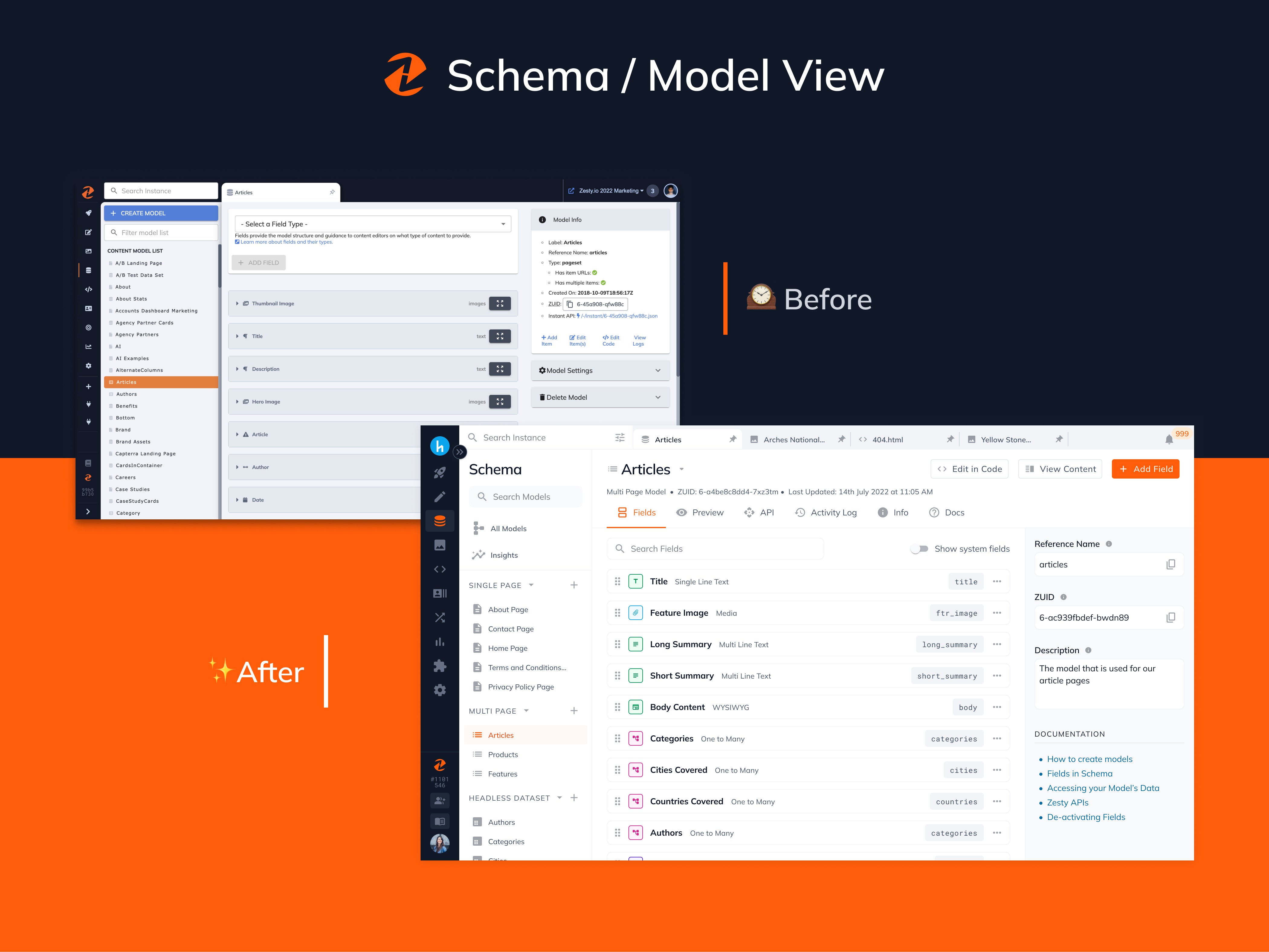
We are excited to announce the launch of the fully redesigned schema in Zesty. This consists of several user experience (UX) & front-end platform improvements, allowing you to build and manage your schema even more efficiently and securely.
Since launching in 2010, it's been an incredible journey empowering our customers with our fast secure infrastructure allowing them to deliver millions of pages of content to their websites and applications. To each of them who have been with us since so long, thank you for working with us, and sharing all of your valuable feedback.
We're extremely committed towards making Zesty an even better experience for you and today's latest release of Schema is our thanks to you.
TL;DR
Schema Interface has been fully redesigned
You will have access to it starting March 7th
Features and Updates include:
Dedicated All Models Page that is an all in one view of all models
New Model Creation Flow with reduced visual clutter
New Model View experience with tabs including Fields, APIs, Activity Log, Docs, and Preview
New Field Creation Flow with added functionality
Models can now be viewed by model type in the sidebar
Sort models in the sidebar by name and date modified
Add Fields between two fields
Re-ordering Fields is a lot faster
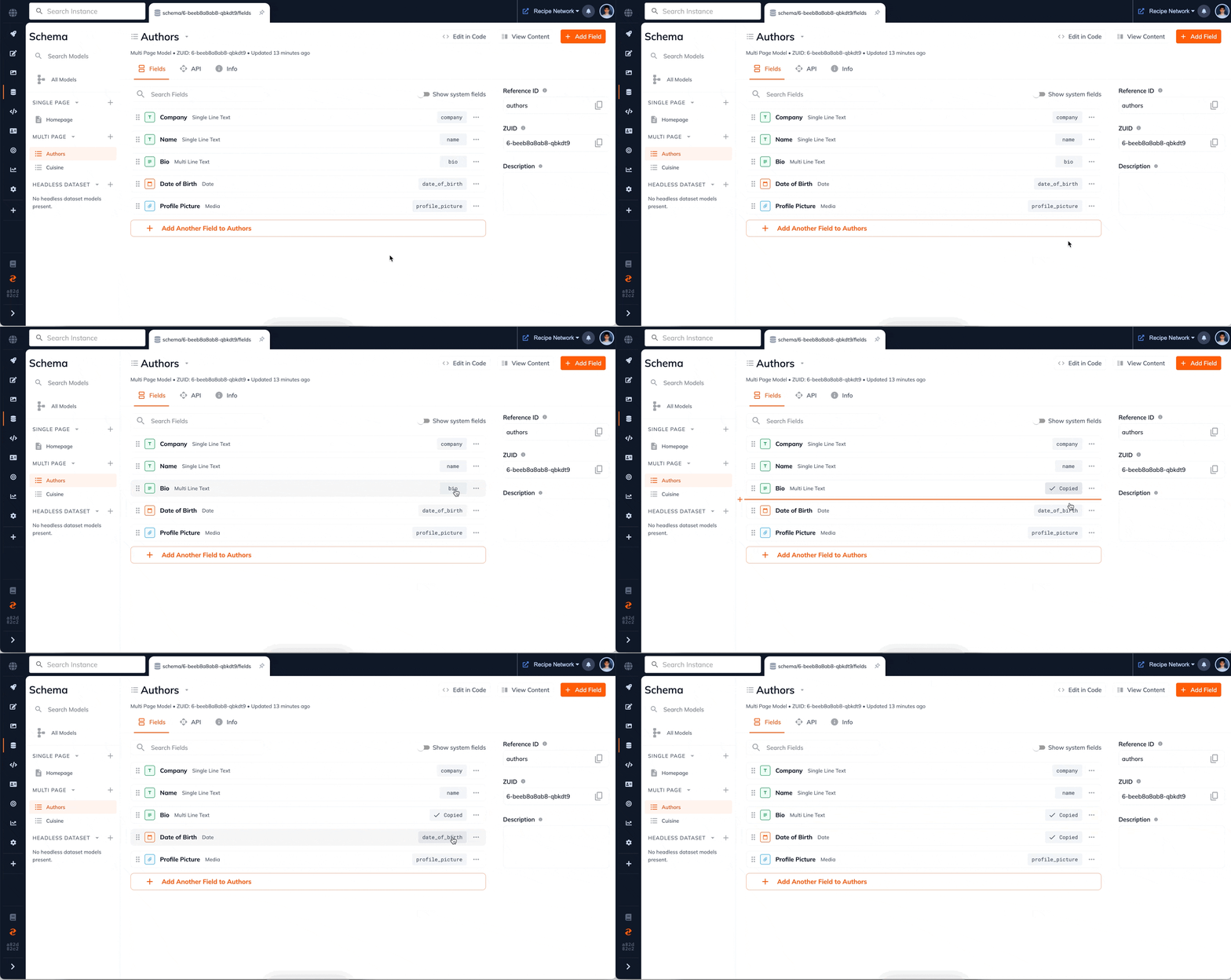
Quickly Copy Reference IDs
Validation Rules and Default Values - upcoming release
Model Templates - upcoming release
View Model Insights - upcoming release
Updated visual language that matches recently updated apps such as Media, Activity Log, AI Content Assistant, and Launchpad
Below is a sneak peek into our process and a walkthrough of all of the new features to come.
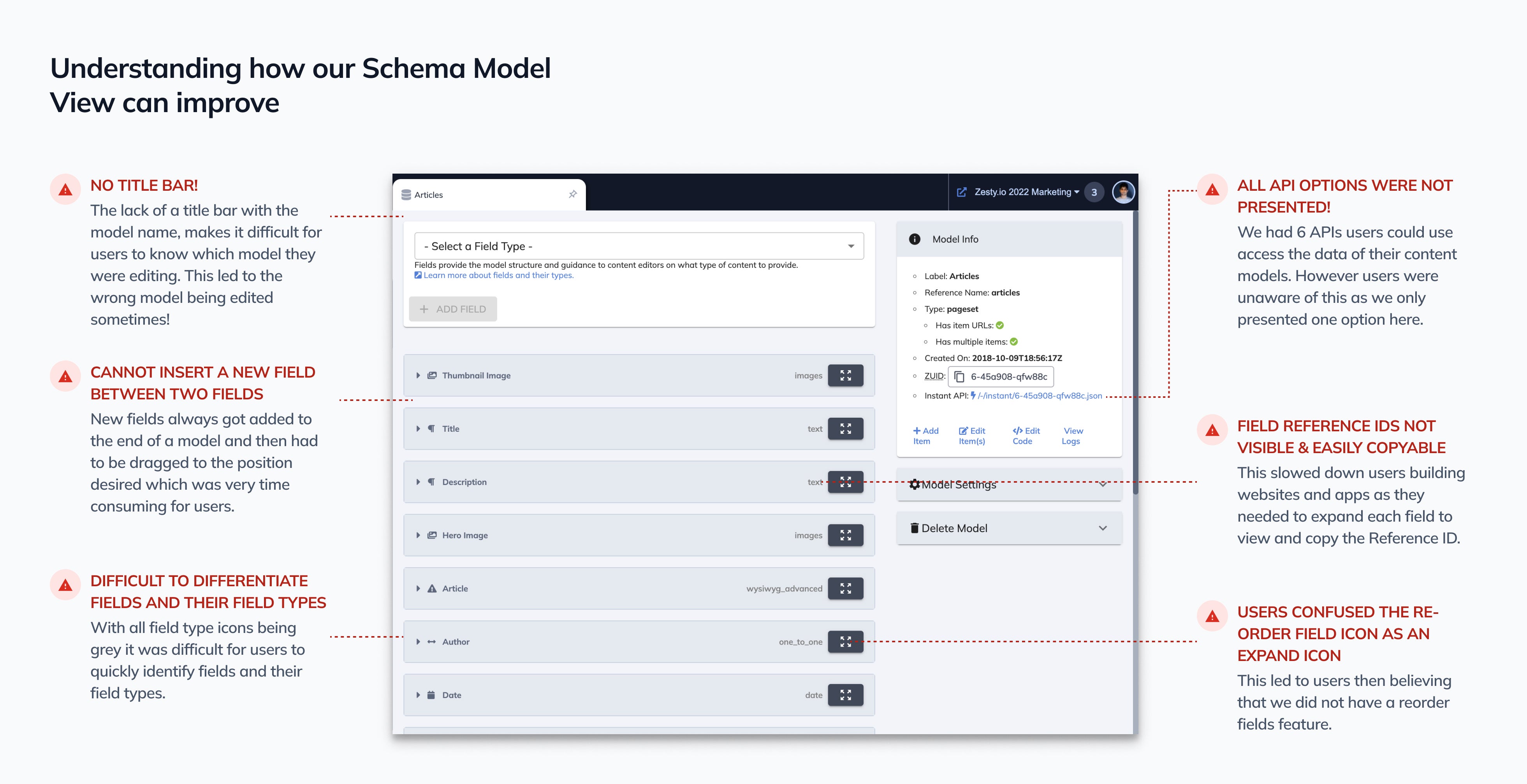
Understanding where and how we can improve
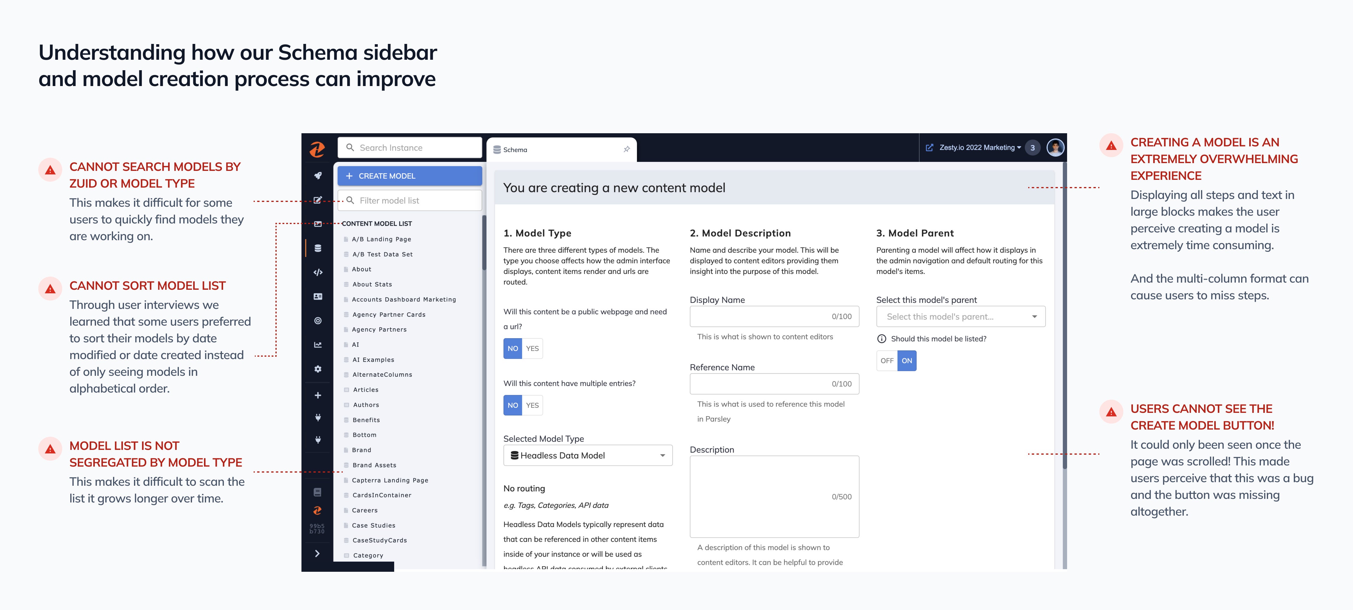
Before rebuilding Schema, it was important to us to understand what marketers & developers needed. We had multiple discussions with customers which helped us discover insights and feature requests, such as:
Creating a model for the first time is an extremely overwhelming experience
No ability to sort models in the sidebar
Models are not segregated in the sidebar
Difficult to scan and differentiate fields
Re-ordering fields is unintuitive and extremely laggy when used
All available APIs and end points are not listed
The average number of total fields a model has, has increased significantly over the years, and it had become difficult to view
Reference IDs can not be found and copied easily
No singular view of all models
Field validation and rules are desired to ensure data integrity and quality
The two images below give a small snapshot into what we learned.
An Inside Look at the New Experience
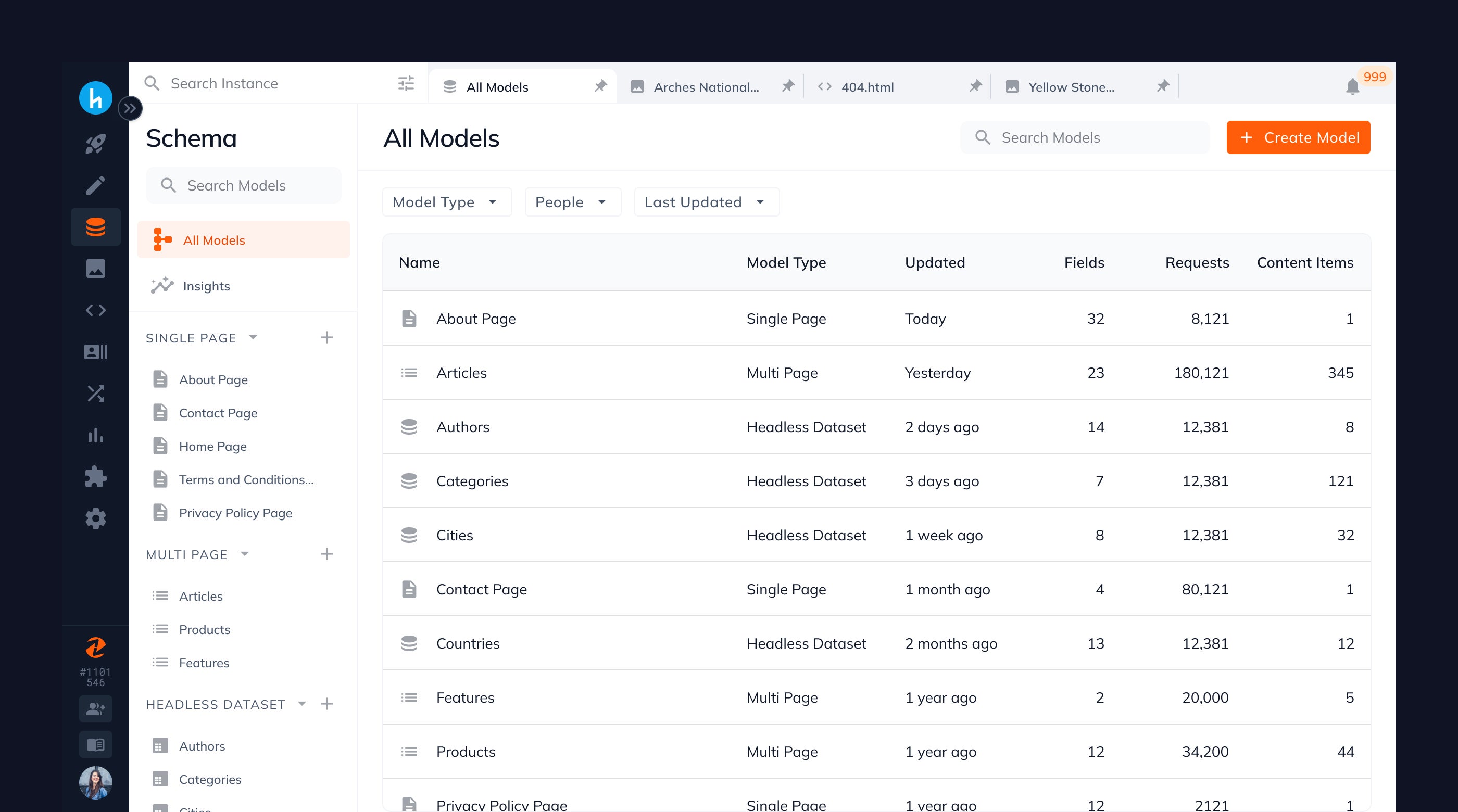
See All your Models in One Place
A common concern we heard from users, was that they did not expect to be greeted by the create model screen each time they entered Schema. And in particular they found this rather frustrating, as what they really wanted to see was all the models in their instance.
Hence we have created a dedicated All Models page that shows you all of your models, which you can then filter by model type, user, and date updated. Thus allowing you to find the model you want to work upon faster.
Brand New Model View Experience with Significant Improvements
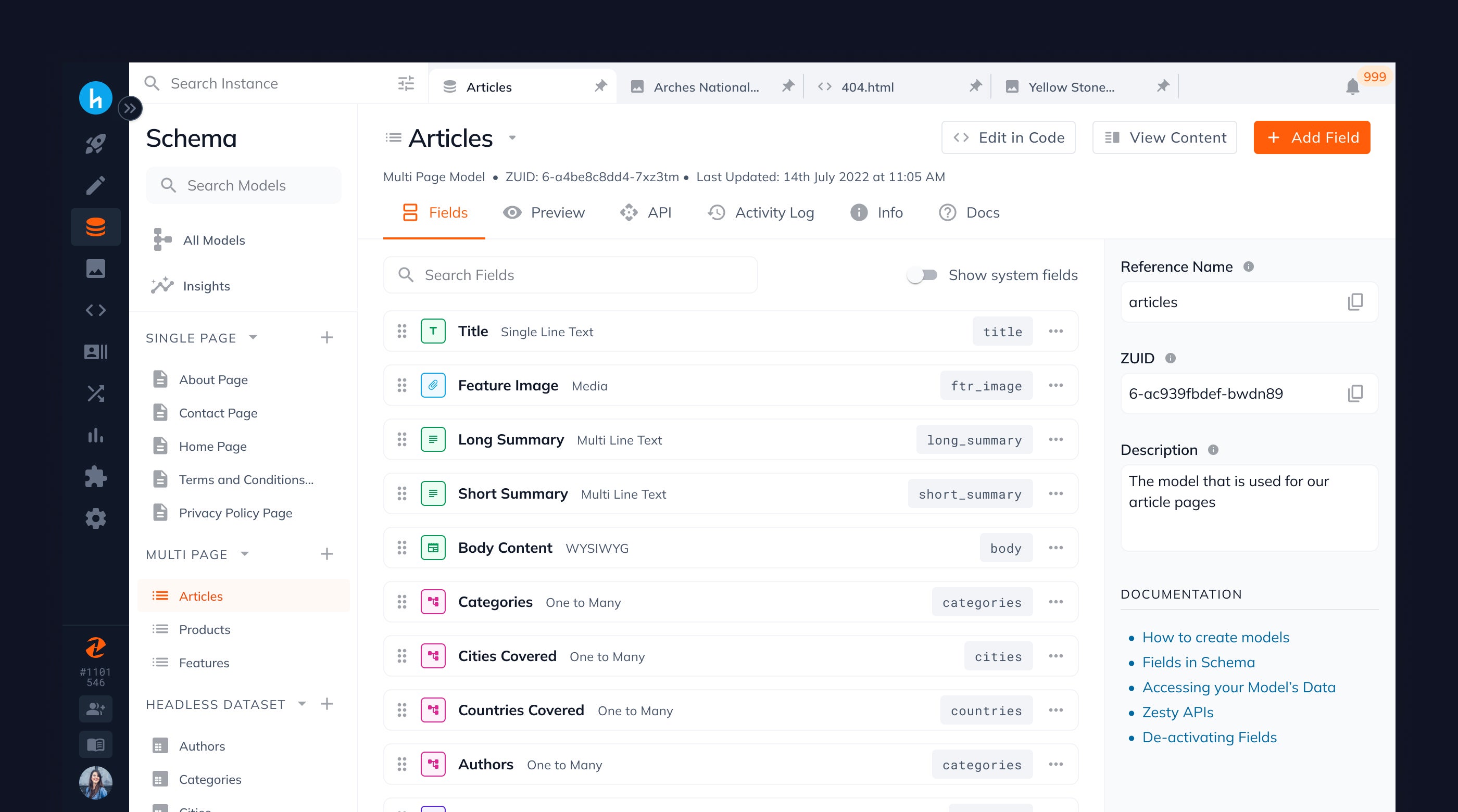
The new model view experience has been completely refreshed with multiple significant improvements.
Each model has dedicated tabs that allow you to view your model fields, a preview of the content form, API endpoints, activity log, model info, and documentation on how you can use your model.
Field type iconography is now color coded so that you can easily identify and differentiate fields from each other.
View Content Items and Edit Code are now buttons in the top right corner instead of links that were previously blending with the rest of the content.
Search the fields of a model which is extremely useful when a model has more than 10 fields
View system fields of a model that represent the state of the content such as the Item ZUID, when it was created, updated, and the version.
Quickly copy the Reference ID & ZUID of a model from the right sidebar
Creating Models is now faster and cleaner
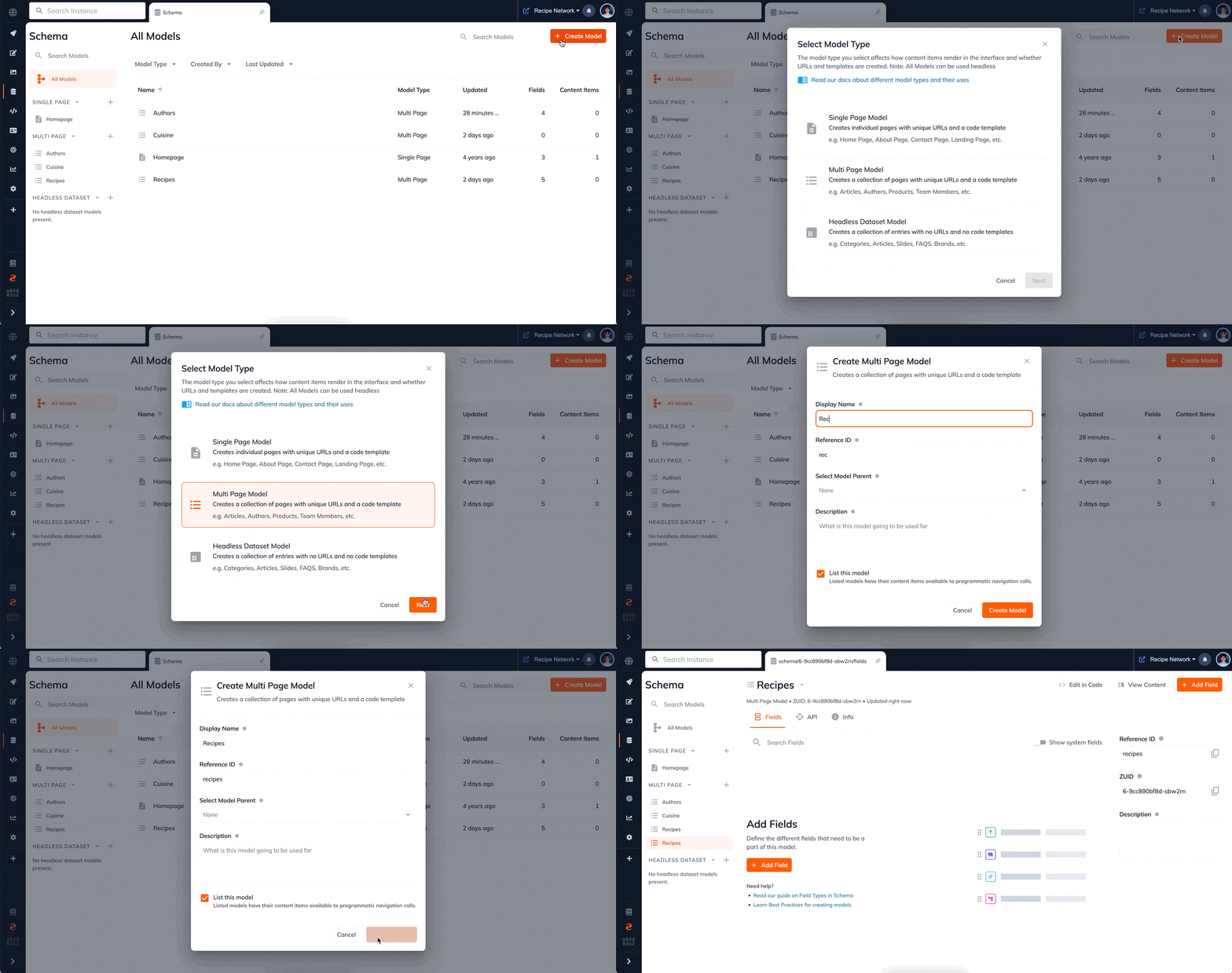
The previous model creation experience was reported to be extremely overwhelming. The large blocks of text made the user perceive that the task of making a model was more time-consuming than it actually was.
We've now redesigned this experience to be a simple two step sequence that will significantly reduce the time to create a model. Additionally you can create models not only from the "All Models" page but also via plus buttons conveniently located on the left sidebar. This improvement provides you with more flexibility and ease in creating models, ultimately improving your overall experience.
Creating Fields is revamped
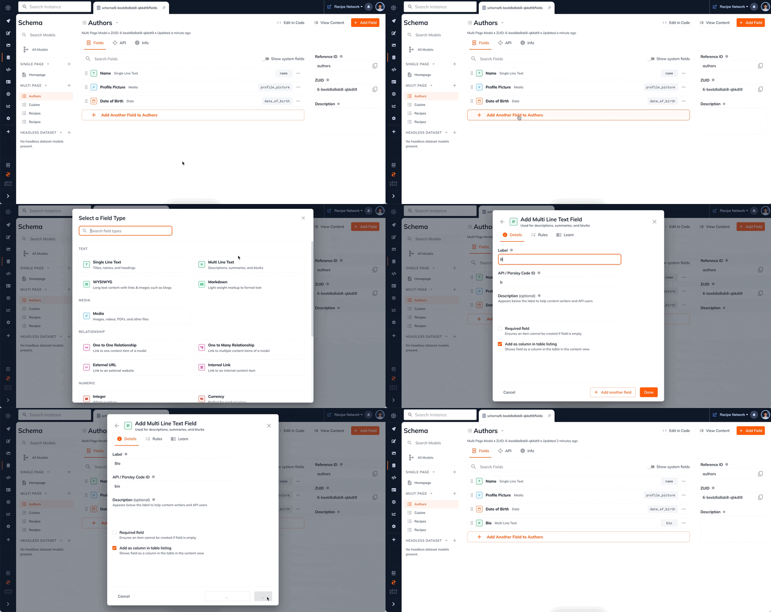
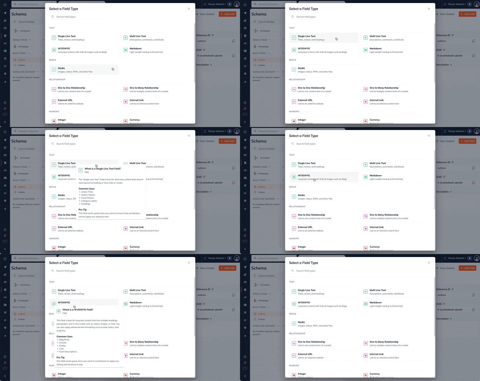
Earlier when users were creating fields, they found it difficult to quickly search field types and sometimes were unable to understand which field type to use when. Hence we have created an experience, that now allows you to quickly search field types, along with small snippets with best practices for each field type.
Access the API endpoints of a model from Schema itself
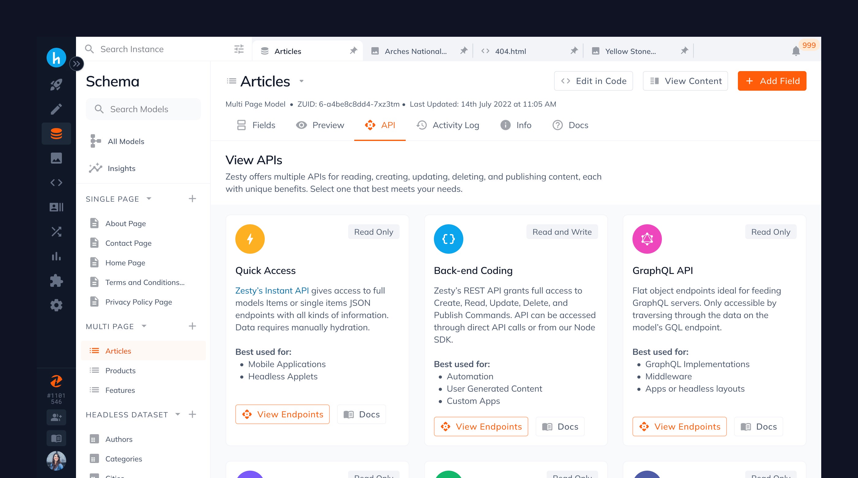
Through our user interviews, we learned that a critical step a user takes after creating a model, is connecting their website or app to it. However they found it really difficult to find information on how to do the same as there was no documentation or end points listed on the model view.
Hence we have introduced a dedicated API tab that allows users to view each of our 6 API options and their end points - Quick Access, Back-end coding, Graph QL, Site Generators, Custom Endpoints, and Visual Layout.
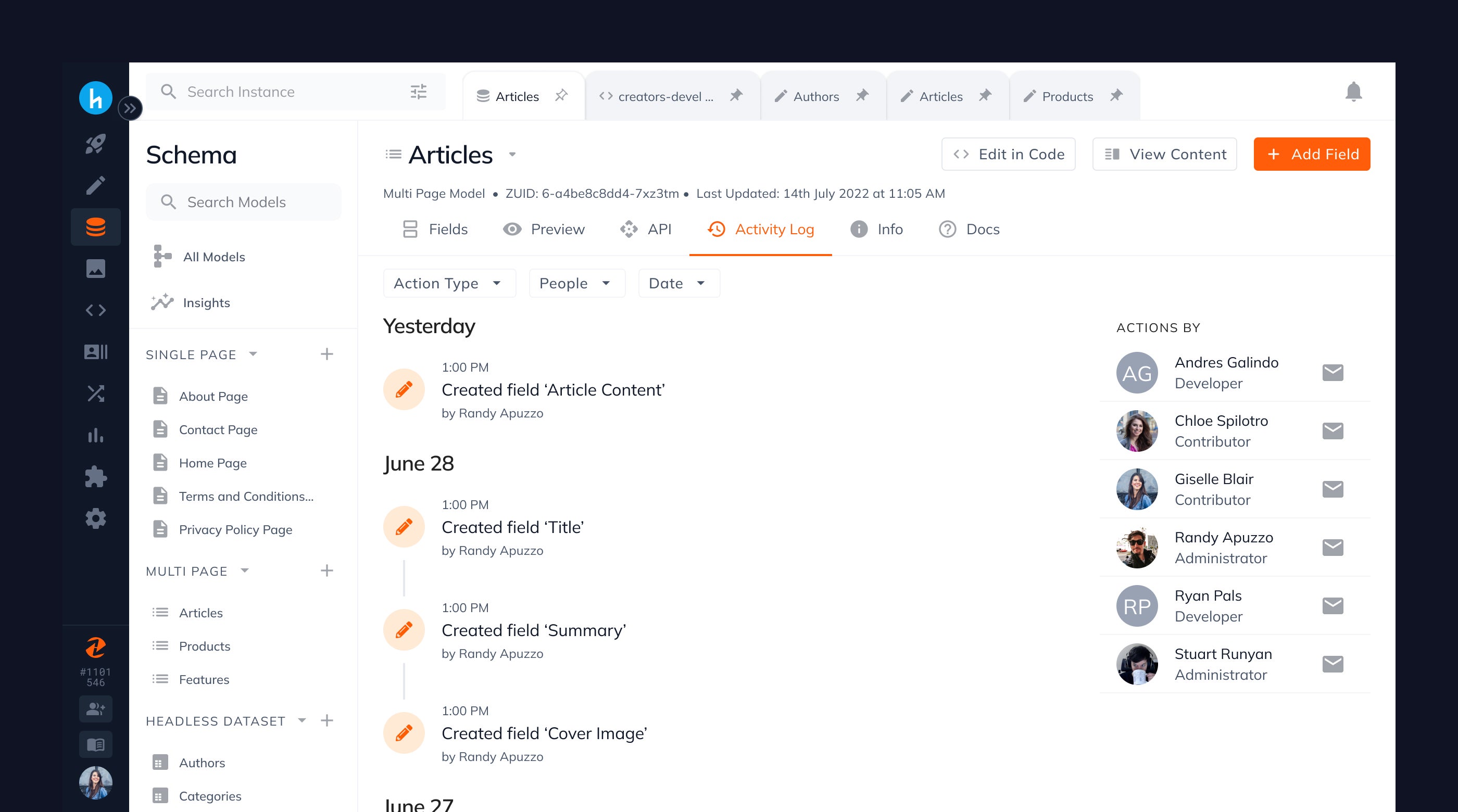
Monitor your model user activity with ease
Rather than having to visit the Activity Log app each time to know who took what action on your model at what time, you can now see the same from Schema itself. We have added a dedicated Activity Log tab in the model view itself that allows you to conduct investigation when something unexpected happens with a model.
Minimize Content Errors with Field Validation Rules and Default Values
When working with teams, we learned that users want to be able to set rules on how content should be created to ensure content consistency. For example, they wanted to set a minimum or maximum character count for a text field or constrain a media field to a certain file type or set the default value for a field.
Hence we're introducing field validation rules that can be applied to any field (except UUID) within Zesty. This will ensure that content inputted always meets the rules set thus ensuring consistency and quality in content created. Some of the field validation rules you will start to see soon include:
Unique Field: ensures that multiple items can’t have the same value for this field
Default Value: ensures that a default value is auto-added into the field when an item is created
Limit Character Count: specifies a minimum and/or maximum number of characters allowed
Match a Specific Regex Pattern: Only accepts specific regex pattern provided by user
Limit File Type/s: allow a user to limit the file type to a set of file types or file extension
Set File Upload Limits: allows a user to input a maximum number of files that can be uploaded to a field
Set Start and End Date/Time Range: allows users to input a date between a set start date and/or end date
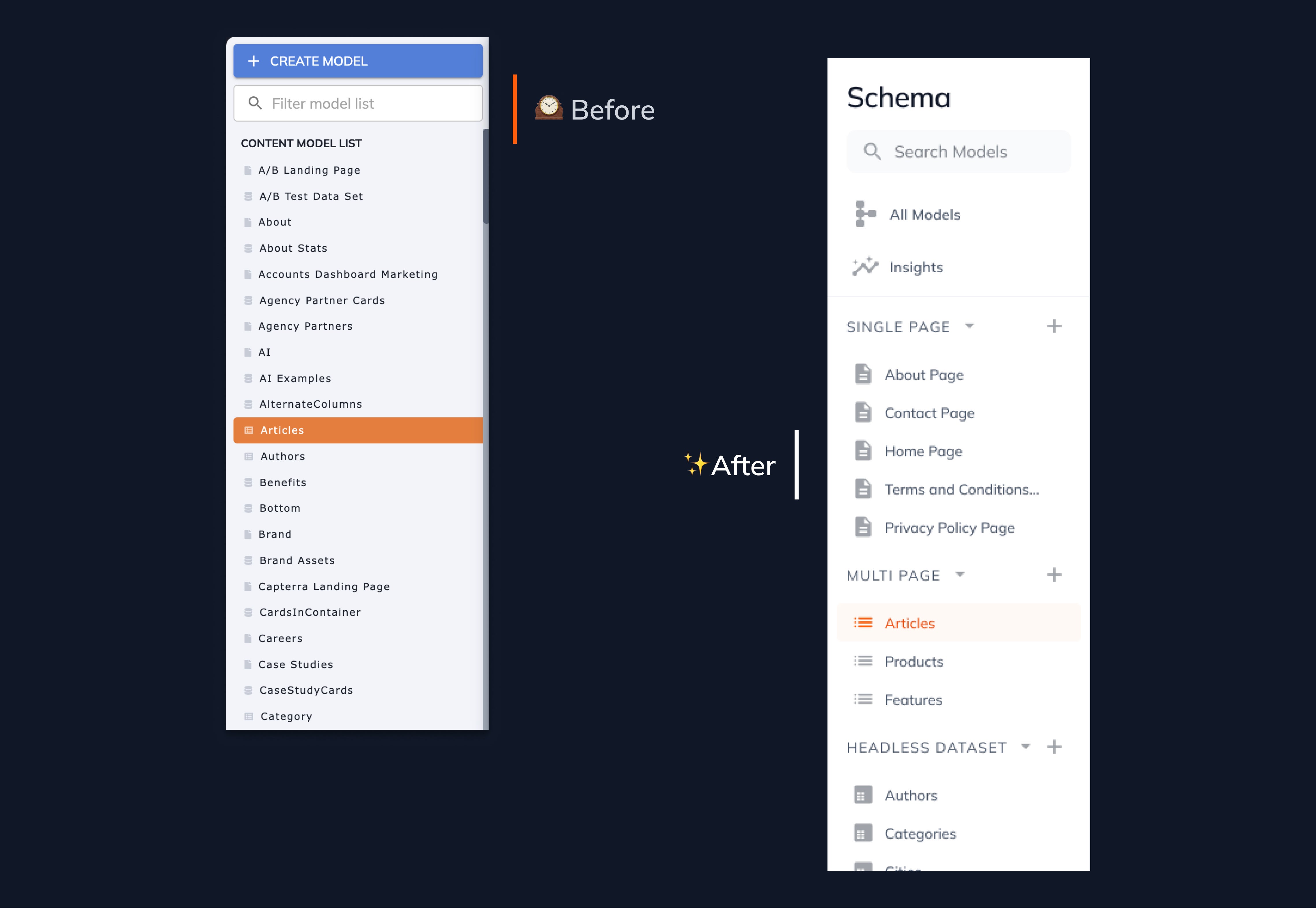
Models are now segregated by model type in the sidebar and can be sorted too
As instances grow, so do the total number of models that live inside of them which made the side navigation bar extremely cumbersome to scan for our users. Hence we have now segregated models by their model type in the sidebar so that you can scan it faster.
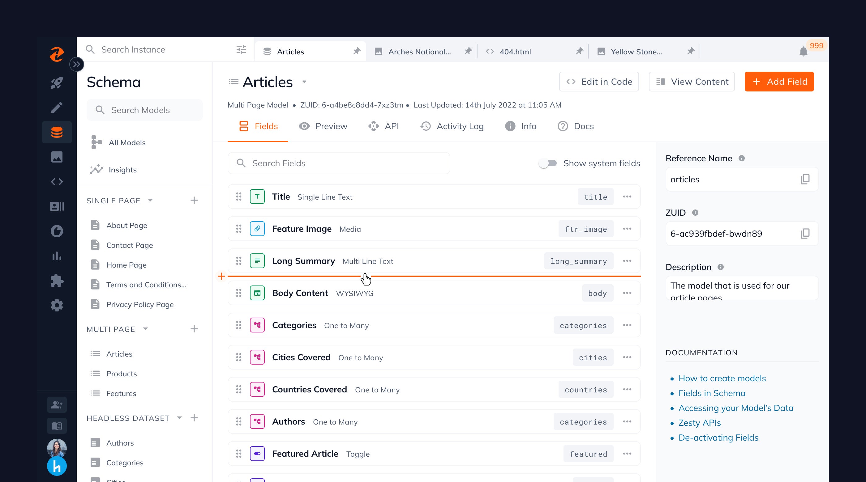
Add Field Between Two Fields
In our user interviews, we learned that customers many a time return to a model and wish to insert a field between two fields. The only way they could do this was if they added a new field to the end of the model and then dragged it to the new position desired. Except this was very cumbersome.
But this has now changed. You can simply hover your cursor between two fields and click on the orange plus line to add a new field.
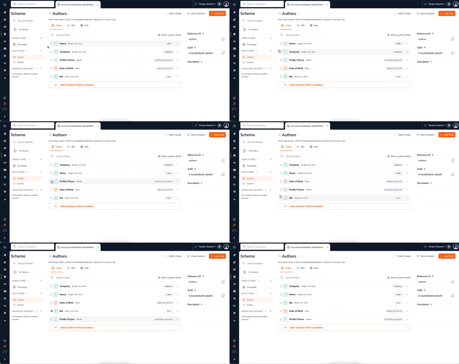
Re-ordering Fields is now faster & more intuitive
Putting your fields in a desired order should be a simple drag and drop process. However we learned that many customer didn't know of this feature due to them being unable to recognize the move icon. And what we definitely heard from those who knew how to use it, was that it was extremely laggy.
This is now a thing of the past. We've followed the industry standards and moved the re-order icon to the left and our engineering team has invested time into making re-ordering as snappy and smooth as possible so that it can actually be a simple drag and drop process.
Quickly Copy Reference IDs
Our research revealed that a crucial aspect of linking one's model to their website or app involves copying the reference IDs of each field. However, this process was laborious for users, requiring them to expand the field, select the reference ID, and then right-click to copy. As a result, this created frustration and developer fatigue.
We are thrilled to announce that we have streamlined this process to a single click. Reference IDs are now directly visible on the field item, and they are automatically copied to the user's clipboard upon clicking. This enhancement saves users valuable time and minimizes developer fatigue.
Documentation integrated into Schema
We listened to the feedback from our new users and discovered that they were frustrated by the lack of guidance and best practices when using Schema for the first time.
To address this, we have proactively integrated documentation throughout the various steps users take. This includes adding documentation to empty states and the right sidebar, creating a dedicated "learn" tab for fields, and incorporating documentation into our API tab.
Duplicate Models to speed up your process
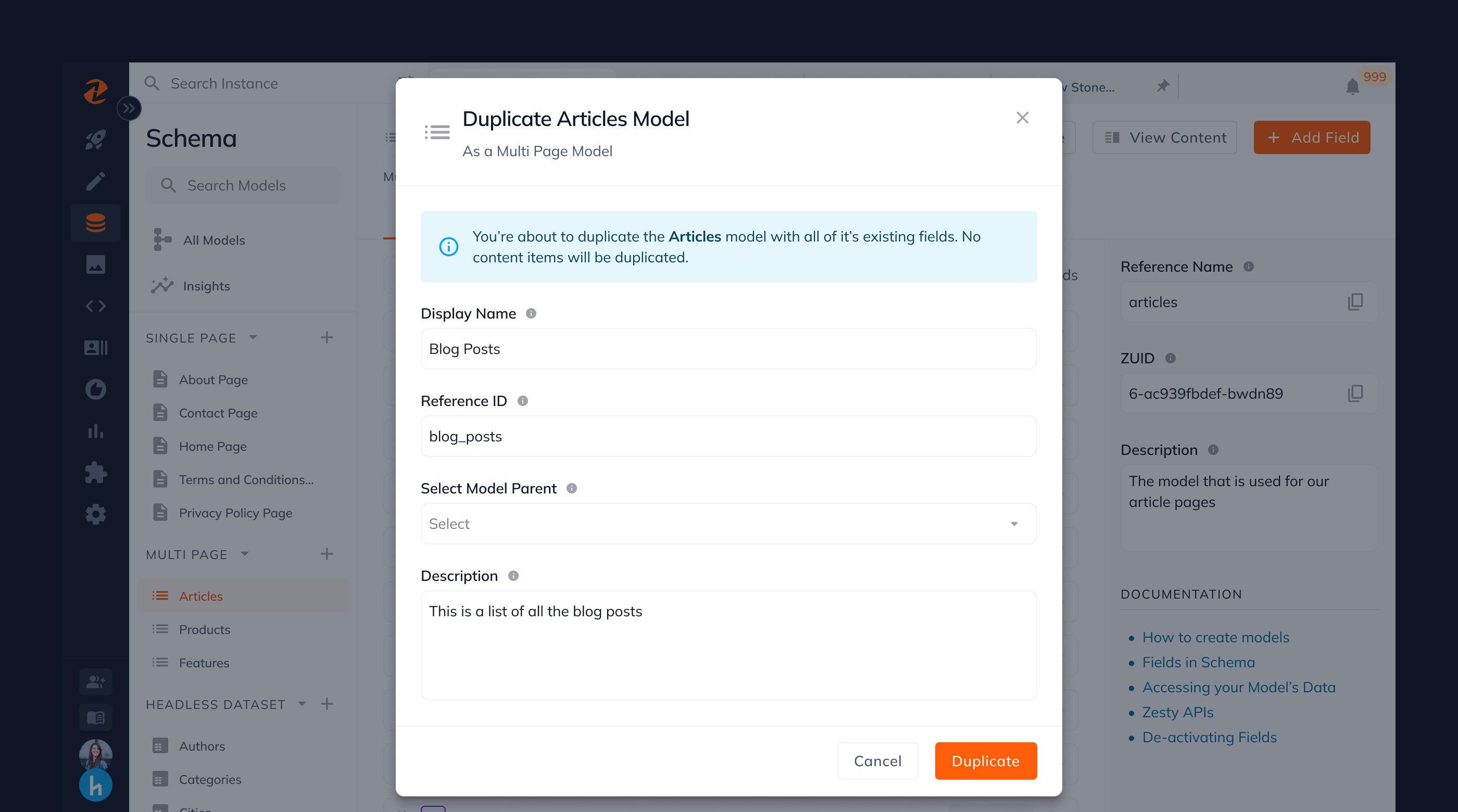
When making new models, you may sometimes realize that there are already models similar to the one you're trying to create. This holds true especially when creating new landing pages. With our new duplicate model feature, you can you can simply duplicate an existing model and then modify it as required, thus saving you a significant amount of time.
Performance Improvements
From a performance standpoint, schema has implemented advanced virtualization techniques to incrementally load larger and interconnected data sets. This approach enables us to show users more pertinent information about their models, including the number of content items and fields.
What's Next?
We can't wait for you to try the new Zesty schema experience. Over the next week, we will be rolling out the new Schema experience to all instances and will be sharing more details about upcoming features along the way. Moving forward, our team is building new ways to enhance the way you build models and leverage schema to power your websites and apps with content.
We'd love to hear your feedback
We would love to incorporate your ideas and feedback in building the future of Zesty. We are actively listening and learning from each of you, so please share your thoughts with us over a video call or this feedback form.
By Zoshua Colah
Zoshua is a Senior Product Designer at Zesty.io, elevating the experiences people have in making content-rich experiences. Having spent over 5 years making intuitive product experiences, he understands the need for a CMS that works with you - not against you. In his free time, you can find Zosh either teaching, mentoring, or sharing UX resources.