Landing pages can be integral to the success of a comprehensive digital marketing strategy. In order to be both enticing and informative, a landing page takes a great deal of creativity to produce. When done right, a landing page can significantly increase your conversion rate, attract new customers, and engage your audience from the first impression onward.
Whether you’re a seasoned landing page creator, or about to embark on your first creation, there’s something to be learned from some of the best landing page examples we’ve found for 2018.
PetDesk is a landing page example that tailors itself to business owners and consumers. They offer services for Veterinarians and a free app for pet owners. Their headline does a good job of targeting both pet owners and Veterinarians with the statement: “You want to give animals the best care possible.” Their sub-headline, with the statement about being “as passionate about pets as you are,” is appealing to any caring practitioner who wants to grow their business.
Right below the landing page’s main featured content area, there are six icons/links to additional information. By having multiple options on the landing page design, it is easier for prospective clients to pick and choose what they want to learn about the brand, versus having to read through a huge data sheet or FAQ.
Another landing page design feature utilized by Pet Desk is the inclusion of reviews. This is helpful because consumers are influenced by the positive experiences of others, so sharing insight from customers can go a long way.
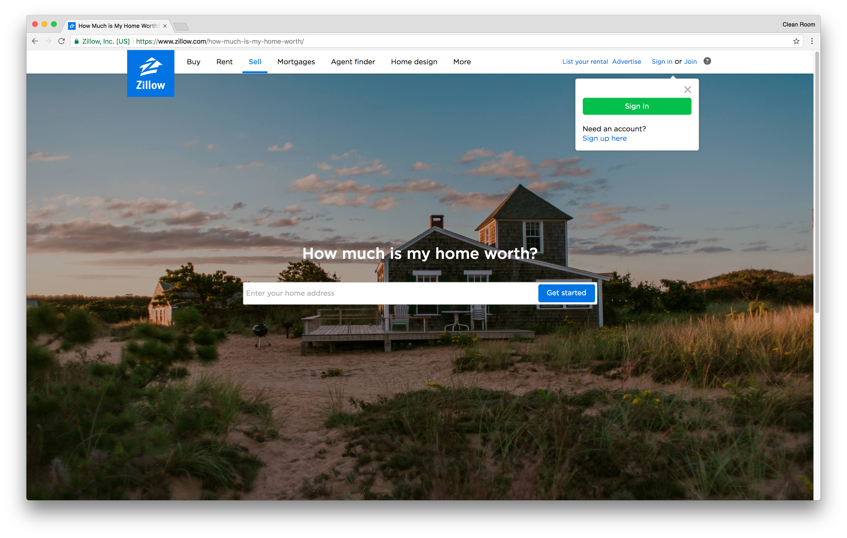
For homeowners playing with the idea of selling their home, Zillow’s landing page is a great place to start. Initially, you’ll be prompted to enter your home address to get started with an assessment of how much your property is worth. Scroll down a little bit further and Zillow gives a few details on how they calculate your home’s worth with their “Zestimate” system. Further down the page, they list other ways to pinpoint the value of your home with more accuracy.

SPI Entertainment’s landing page grabs you with their scrolling headline, “Be Wild, Be Crazy, Be Fun, Be Uninhibited, Be Free, Be Vegas.” Their headline leaves you wanting to know more about what SPI Entertainment has to offer. At initial glance, they’ve kept their landing page simple, minimizing their clickable options to a video, shows, sales, and contact information. They’ve also listed an expandable box that will lead you to more information about the brand.
When you scroll down, you have access to SPI’s social profiles, along with a sub-headline that further expands on the Vegas entertainment experience you’ll receive with SPI. Further down the page, SPI has placed some great black and white photos which convert to video once you’ve dragged the mouse over them. Each video is a snippet of information on some of SPI’s past entertainment ventures. SPI Entertainment is a great landing page example of how simplicity can still intrigue consumers to pursue a product or service further.
Carfax is offering a free app to help make staying on top of taking care of your car a lot easier. They’ve listed a simple form to get signed up that only requires an email and password. They’ve also made sure to list a link to their terms and conditions of the site on their CTA, as well as a tag letting the user know that the app is complimentary.
Scrolling down will give you more of a feel of how the app can make your life easier when it comes to car maintenance, and they’ve listed a number of 5 star reviews they’ve received from real life app users around the country.
Digital Telepathy is a landing page example where bold colors are put to use. Red is a power color that can be associated with many different things such as energy, passion, and determination. As you scroll down, the red fades away into your basic, easy to read white background with black fonts. They do a great job of highlighting key points on how the brand will benefit the consumer.
Digital Telepathy understands the importance of keeping your call to action visible at all times, so they’ve fixed their CTA, along with their brand name and a few other informational links, at the top of the page. That way, the visitor can take action at any point throughout the landing page, versus having to scroll back to the top or all the way to the bottom.
PicMonkey isn’t shy about encouraging you to sign up for a free trial, and as soon as you land on their page you’ll be greeted with a request to sign up. Their headline is straight to the point, and their landing page image reinforces what the brand is offering: a photo editing and design tool.
Next to their brand name and logo, they’ve listed some of their core key offerings: editing, touch-ups, design tools, and a collage builder. PicMonkey is a great landing page example of letting site visitors know exactly what you’re offering as soon as they reach the page. There’s no need to scroll down for the most important information, making for an efficient landing page design.
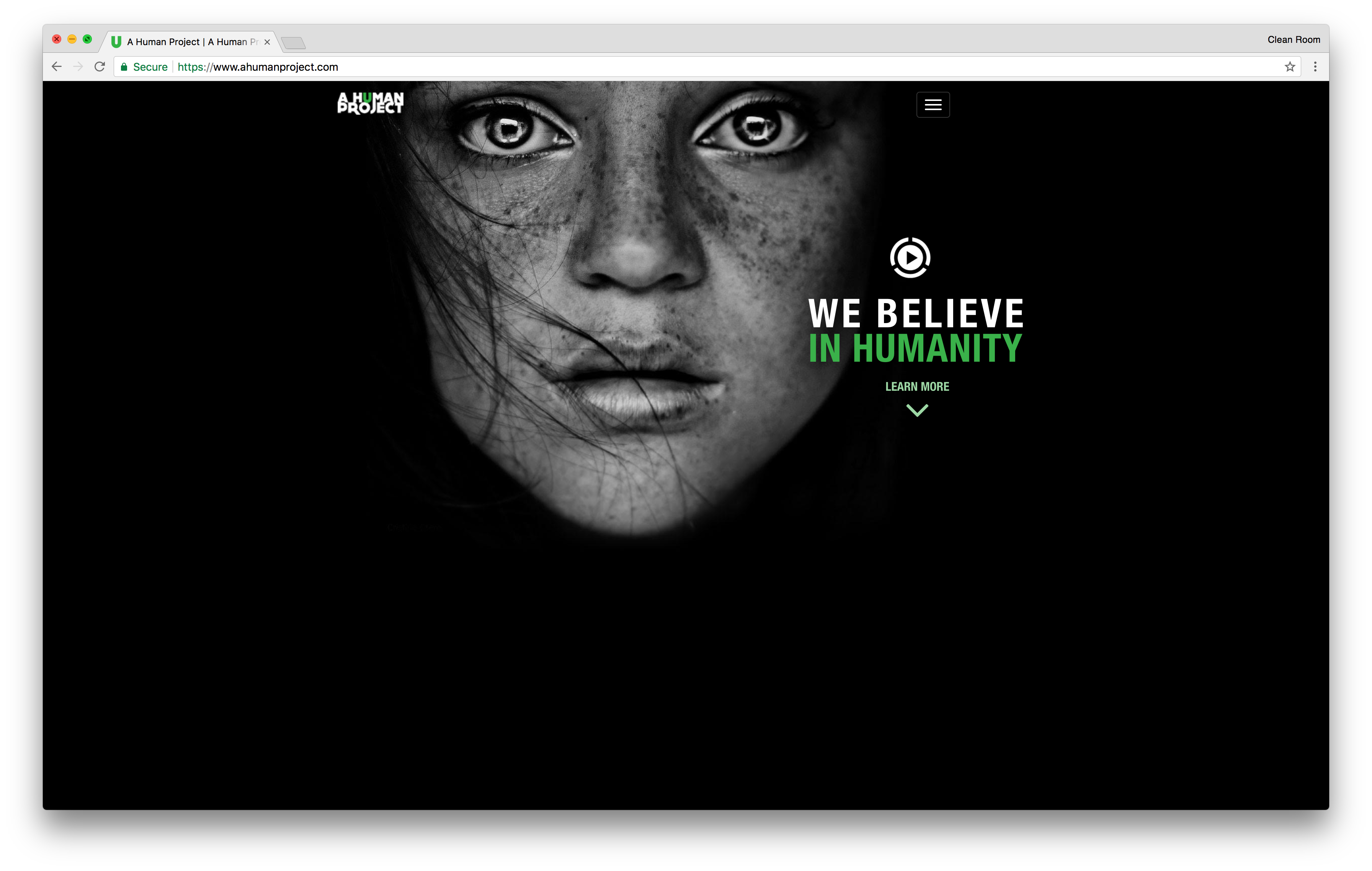
A Human Project opens up with a stunning photograph of a young girl with the headline, “We believe in humanity.” Because the initial impression is is centered around this provocative image, the viewer is drawn into learn more. By clicking on the “learn more” icon below the headline, you’ll be scrolled down to the bottom of the page to learn about the mission statement. At this point, you can continue on to learn more information, and you’ll be presented with the option to donate to the cause. A Human Project does a great job of getting their goals, and requesting donations in a respectful and meaningful way.

This landing page focuses on everything skin, and for the average beauty shopper this is a hot topic. They’ve laid out a list of interactive photos with each potential skin ailment. Once you’ve clicked on the issue you’d like to resolve, you are redirected to a product list, which helps you on your quest for better skin. Sephora uses product pictures and a caption about what exactly that product is designed to do, and how it can help your skin. They’ve also listed prices and a direct link to purchase. Sephora’s landing page design is a great example of how making a page interactive can lead to a conversion.
Sony’s Alpha Universe is a great landing page example that focuses on everything photography. At first glance you’ll see beautiful, high-quality photographs, all taken with Sony’s Alpha series cameras. Each photo contains a link to excellent, photography-based content such as “How to Make Killer Wide-Angle Landscapes.” These resources are great for professional and amateur photographers and they’ve created a community for photographers to submit and display their photographs.
To foster a community, Sony added a call to action at the top of the page, where site visitors have the option to create an account. They’ve also taken it a step further and added a simple lead capture form at the bottom of the page. Visitors can opt in to receive their newsletter and latest product releases and updates. Another landing page tip that can be taken from Alpha Universe is the inclusion of a privacy policy and the sites terms and conditions. This is especially important when consumers are creating login accounts, and when personal information is being collected.
Wordstream’s landing page example prompts you to make a choice about 5 seconds into the page, “Are you making the most of your AdWords budget?” This is a big question for many marketers and pop ups can be useful tools to get people to sign up right away. Still not convinced? Another cool landing page design feature WordStream utilizes is a quick and easy Google AdWords performance grade; all you have to do is enter your email address.
Another win for WordStream on their landing page design is the fact that they’ve listed a safety and security guarantee right on the initial page of their landing page. For this industry consumers want to know that they’re protected, and they’ll feel better knowing that WordStream takes security seriously.
When you think of the word slack you typically don’t think of work and productivity. Slack made sure to clear up any confusion on what their offering with a bold headline, “Where work happens.” Their subheading goes into a little more detail on what you can expect with Alack, and they’ve listed a CTA front and center to learn more.
Scroll down a little and Slack has made sure to list some of their prominent customers. Because new visitors to the site see these name brand companies, it helps to reinforce Slack’s trustworthiness.
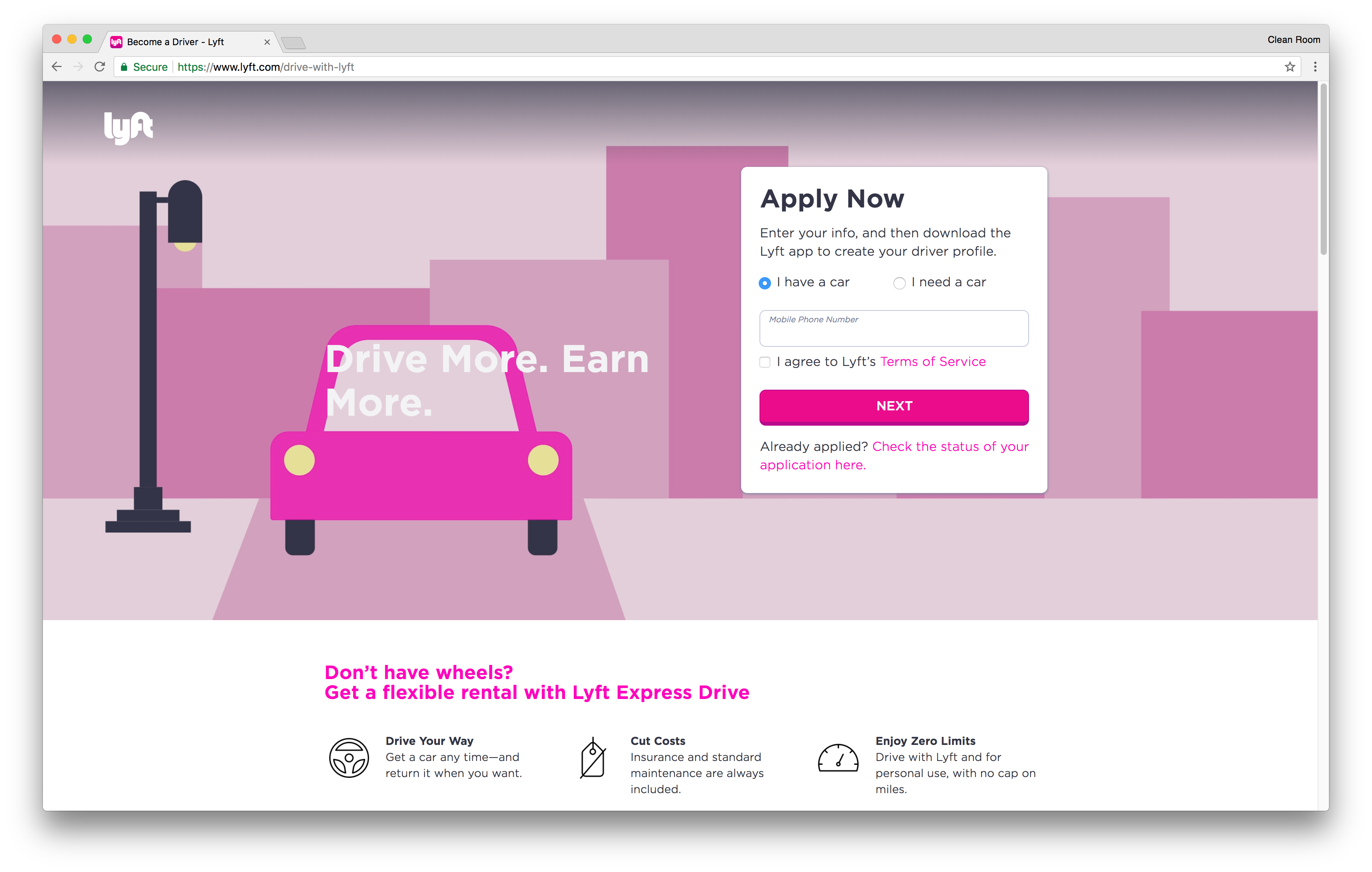
Lyft’s landing page design places their call to action front and center, and it’s tailored to helping the website visitors access the Lyft app. For those considering a job with Lyft, they make it easy to get quick facts by placing key points about the business in a prominent spot landing page. They’ve even made an option for patrons looking to drive with Lyft but don’t have their own vehicle.
Another important landing page feature Lyft chose was listing a few frequently asked questions. For those inquiring about becoming a Lyft driver, these questions could weed out the need to contact Lyft for simple answers, and cut down on time spent during the initial sign up process.

With the 4-Hour Workweek, the name alone is enough to get website visitors wanting to find out more. This landing page lets you scan the site for about 30 seconds before prompting you to take action to unlock a list of “5 Morning Rituals to Help You Win the Day.” Sounds great, right? Who wouldn’t want a few new habits to help make the day better? Once back on the landing page you’ll see reviews from various popular news sources backing the author, Tim Ferriss, and his methods to a better you.
Salesforce is another example of a straight to the point landing page design. Their headline is tailored towards business growth, which is typically what prospective Salesforce clientele are looking for when considering the platform. They’ve also made sure to list their phone number multiple times on their short landing page, so site visitors can readily chat with one of their sales people, and gain more insight into how Salesforce might be right for their company.
Salesforce chose to keep their content simple by adding a few stats on what website visitors could expect with Salesforce, such as an increase in sales revenues and lead conversions. For their lead capture, Salesforce added a form with a little more detail than most. For this type of business, a longer lead capture makes more sense, as it makes it easier to direct each lead to the appropriate package for their job title and business size.
Fiverr opens up their landing page with an engaging headline that many website visitors are bound to relate to (“Ever Got Lost Customizing a WordPress Theme?”). They’ve strategically listed a bottom-line price point in the sub-headline of $5 to make Fiverr even more appealing to potential customers, and they’ve made sure to include the word “free” many times throughout the landing page. The word free is always a big selling point for consumers and it helps the company pull in more leads based on the potential of free products and services.
Videos have become increasingly popular in regard to digital marketing, and Fiverr has taken this a step further by adding a video testimonial to their landing page. Another smart landing page feature utilized by Fiverr is a Facebook “like” button. Social media is an amazing marketing tool, and a great way to create buzz is to have users “like” your brand’s social pages.
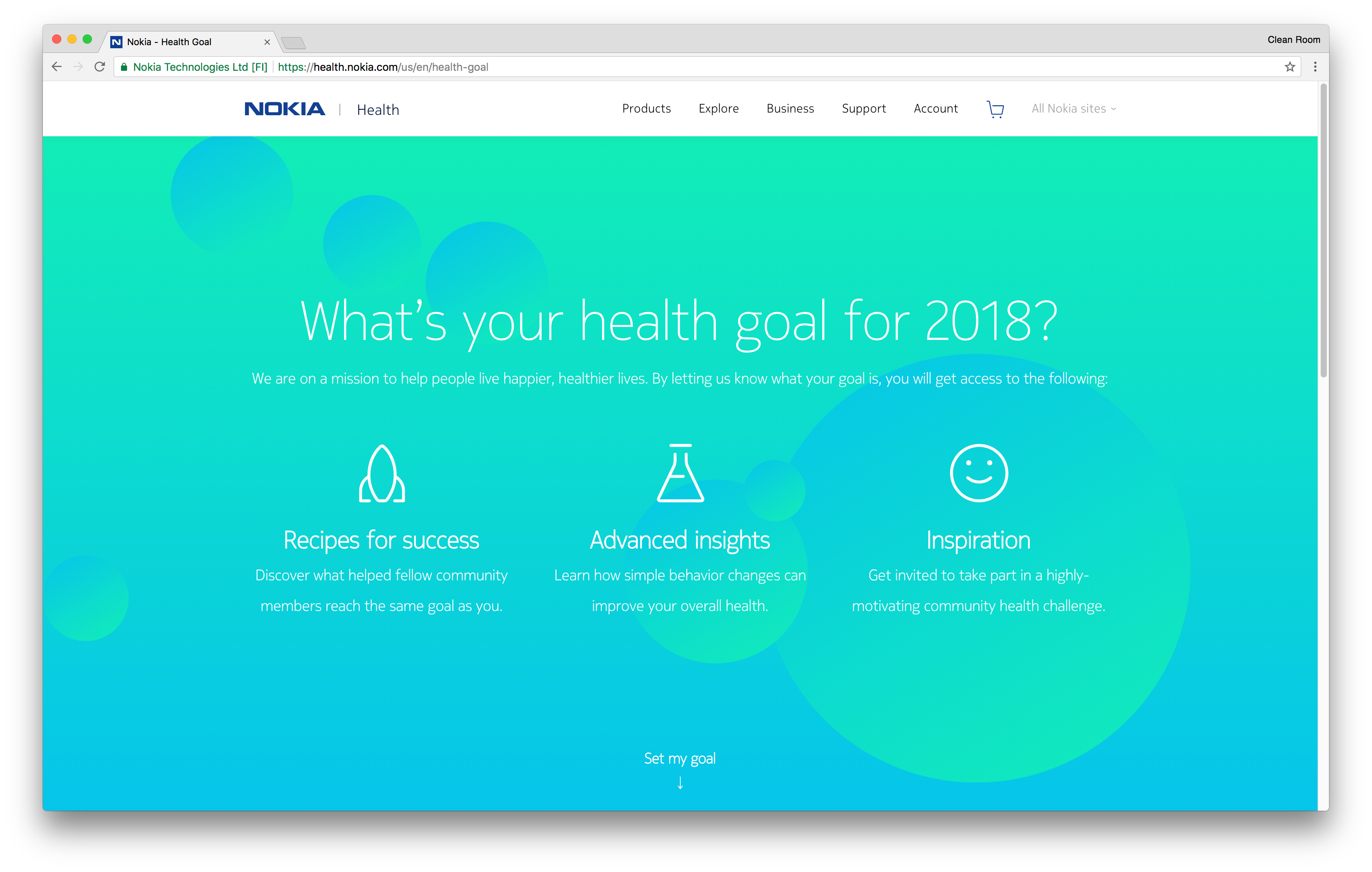
Nokia’s landing page design is friendly and easy on the eyes, with a moving background image. Their sub-heading lets visitors know what they’re mission is, to help people live happier, healthier lives. Their landing page is interactive, and based on what your health goals for the year, you can choose what path you’ll take. Afterwards, you’ll be prompted to leave your email address and subscribe to the specific “goals” email list that you’ve chosen. In this aspect, Nokia made the smart move to create multiple email lists. This is a great way to keep people on your list because they’re only receiving content that applies to them.

Ashford University is a great landing page example for visitors who are looking for a specific service. Their content is focused on what potential students will want to know the most, and they’ve listed common concerns that anyone looking to go to school would be considering.
They’ve also made sure to list all of their degree offerings on their landing page, which makes it easy for potential students to decide if they should move forward and request more information. They’ve created a lead form tailored to direct each website visitor to the appropriate contact by asking questions such as: interested area of study, and age range. Based on these answers, the school representative will be able to provide them with the most relevant information up front, and alleviate the most pressing concerns. Limiting the need to go back and forth is definitely a plus when it comes to conversion rates.
The landing page for CA Technologies employs a very basic, straightforward design. They’ve listed the solutions and services offered at the top of the page, and have a highlighted blue call to action for obtaining a free trial. Another important landing page design feature they’ve used is a stationary call to action on the right-hand side of the page. At any point throughout the page, you are able to click on one of these icons to chat, contact, or get in touch by email.
At first glance, NetSuite makes sure you know where their CTA is with a bright orange “Free Product Tour.” They’ve also made a great landing page example of how you can include a good amount of copy on your page, and have it work well within the page layout. With just the right amount of copy, and an explanation of NetSuite’s key features, the visitor has an understanding of what the brand has to offer before continuing on with a product tour.
Because the lead capture form requests a fair amount of information, NetSuite is more likely to obtain quality leads. They’ve also pre-checked the box to join NetSuite’s mailing list for updates on new product releases and features, which could keep the door open for consumers who might not be ready to make the jump.
Capital Rehab Group chose to place an informative video front and center on their landing page. This is helpful because visitors may prefer to watch a video, as opposed to read through pages of content, in order to gain an understanding of the company.
Another win for this landing page is their use of the word “free.” The enticement is that visitors can claim a free “House Flipping DVD” for a limited time, versus paying the full price of $19.99. By using “for a limited time,” it creates a sense of scarcity, and this encourages website visitors to act now.
One of the standout landing page features for iMeetLive is their image slider, which gives potential customers a glimpse of what their software looks like. Having a quick preview is enticing because it gives a glimpse of what to expect in a full live demo. iMeetLive also utilizes small snippets of content to give website visitors a feel of what the brand has to offer, without overloading with too much information. They’ve chosen to keep two stationary call to actions, one on the bottom and one on the top of the webpage which are viewable at all times. They’ve also added a CTA mid-page, in between the copy, for potential customers who are ready to move forward.