What is a Microsite? | Top 19 Microsite Examples of 2019: Updated!
Your website is your organization's digital hub, so you should use it to present every piece of information you have to offer, right? Not quite.
While it’s tempting to bloat your website with hundreds of pages for every feature, event, and cause your brand is involved in, sometimes, it’s better to launch a microsite to help keep your content tidy and easy to digest.
In this post, we explain what a microsite is and what they are commonly used for. Plus, we’ve compiled a beefed up list of 19 interactive microsite examples to help guide your microsite design.
What is a Microsite?
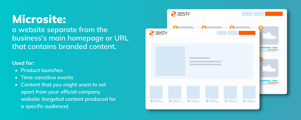
What is a Microsite? In a nutshell, a Microsite is a website separate from the businesses’ main homepage or URL that contains branded content. A Microsite can be a subdomain, however it usually has its own URL that is completely independent of the main website’s URL. It still represents the same brand, but it is more singularly focused than the main site.
If you aren’t already using Microsites in your marketing, you might be wondering what value they bring to the table, as compared to you company website. Unlike your “official” website, which provides a comprehensive overview of your entire business, Microsites are more singularly focused. They are often used for product launches, time-sensitive events, and other content that you might want to set apart from your official company website, with targeted content produced for a specific audience.
When to Use a Microsite
It can sometimes be tough to tell when to build a landing page as opposed to an entirely new microsite. There are two key indicators that you’ll need to build a microsite instead of a landing page: your goals are increased engagement and campaign recognition.
Increase Engagement with Microsites
Landing pages are just that - one page. Microsites can be micro-experiences, and often have multiple pages associated with them. Building a small site with multiple pages means that you can engage your customers for longer, whereas landing pages are great for direct response marketing purposes (i.e. quick purchases).
Campaign Recognition
Microsites are often on a separate domain from the company’s main site. If you’re putting a lot of effort and resources into a campaign, a microsite will absolutely be better for distinguishing it than a landing page. Creating collateral and an experience specific to a campaign means that it likely deserves a microsite over a landing page!
What's the Difference between a Microsite and a Landing Page?
What makes an Effective Microsite?
You’ll know your KPIs for measuring a successful campaign, and the same KPIs should be applied to measuring the efficacy of a microsite. Some ideas for success criteria:
Conversions: obviously the Holy Grail of success metrics, measuring conversions on the site (downloads of a whitepaper, opt-ins, sales, etc.) will be a great way for you to measure the success of your microsite.
Traffic: how much traffic are you sending to the site? The more people who organically land on your site, the more successful your campaign should be.
Time on site: how long are your users spending on your site? If they’re only spending 15 seconds and bouncing, you may have some optimization to do before considering this a successful microsite.
Top Two Use Cases for Microsites
Microsites make excellent choices for promoting a standalone marketing campaign. Depending on the direction of the campaign, many businesses choose to add interactive content to their sites such as quizzes, videos, surveys, and anything else that might attract attention to the brand. By using a microsite to draw traffic and attention to the campaign, your official website can serve its purpose of providing more evergreen content to a wider audience. Even if you push out content to your microsite daily, you can can choose to update your main website as needed, while enjoying the traffic your microsite generates.
Red Bull, known for their series of microsites, has a long history of building microsites built for influencer marketing campaigns. These microsites can be seen as a pinnacle of information around a specific topic, making them much more relevant to search engines.
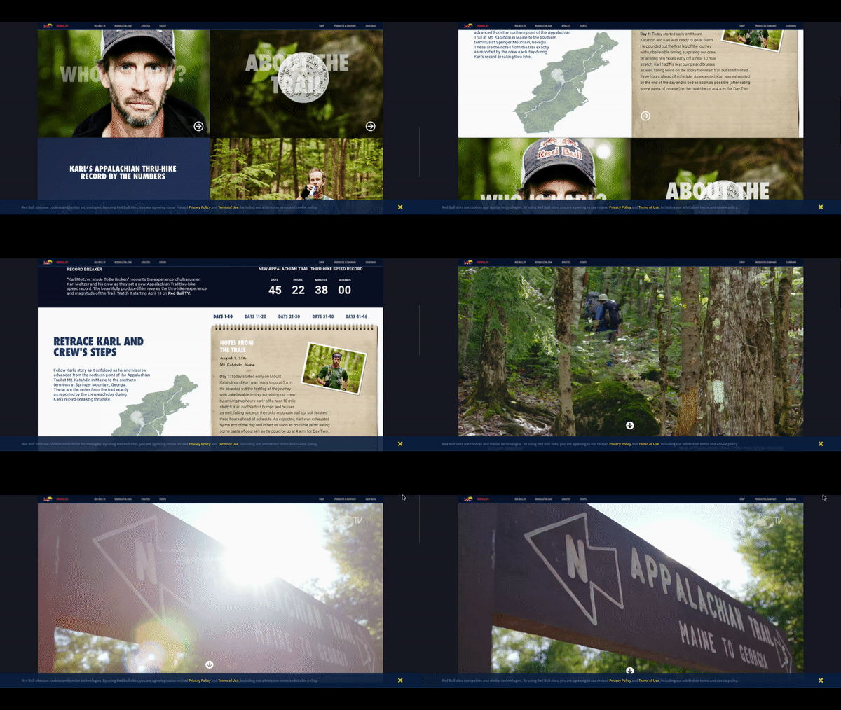
Because microsites can have more relevant content, as compared to a landing page, they lead to greater SEO (search engine optimization) benefits. For example, Red Bull’s digitally interactive microsite for Karl Meltzer fans, has achieved page 1 status in Google for those researching Karl Meltzer, a famous ultrarunner. In addition to SEO, Red Bull has managed to stay brand consistent by creating an engaging interactive digital experience. The site allows you to journey through the actual notes of Karl’s adventures.
Another common use for a microsite is when you need a repository for current content on a regular basis, much like a media site. These types of microsites act almost like a newspaper or magazine website. On these types of microsites, content is published daily and there is a continuous feed of fresh articles, videos, and other media for consumers to digest. To reach the intended audience, this type of content marketing should always be combined with SEO, and Automatic Search Engine Optimization. With highly optimized content, Google will give authority and credibility to your microsite, which can lead to added brand loyalty, audience reach, and revenue.
If you’re still not convinced that a microsite is right for your brand, or would like to learn more about their capabilities, we’ve surveyed the best microsites of 2019. Enjoy!
https://www.zesty.io/mindshare/content-marketing/how-to-build-a-microsite-in-one-day/
19 Best Microsite Examples of 2019
To provide inspiration for a new service, campaign, or content strategy you may have in the works, we have gathered different use cases of Microsites, including those built on our content marketing platform. Take a peek at a few of the best Microsite examples we’ve seen this year.
Microsite #1 - A Human Project
Built on Zesty.io, A Human Project is a Microsite for a nonprofit aimed towards generating donations, which are used to creating gamified education platforms across the world. While the Microsite pushes you to discover more about A Human Project, the site has one core goal: conversion. At the bottom of every page you can see the donation form.
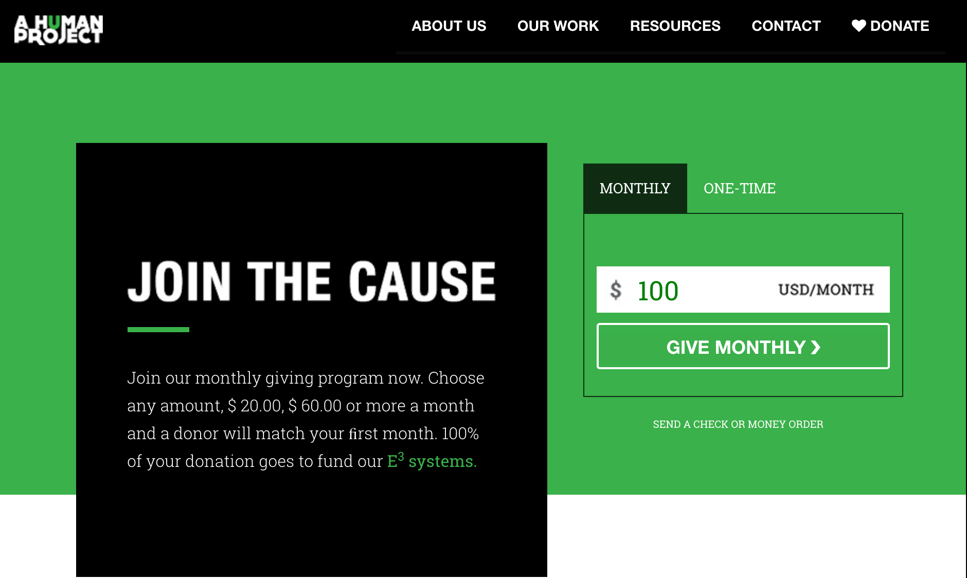
Microsites like these have the capacity to create an engaging user experience, and can be used to evoke activism around a movement or message.
Microsite #2 - Collaborative Fund: The Bright Future of Car Sharing
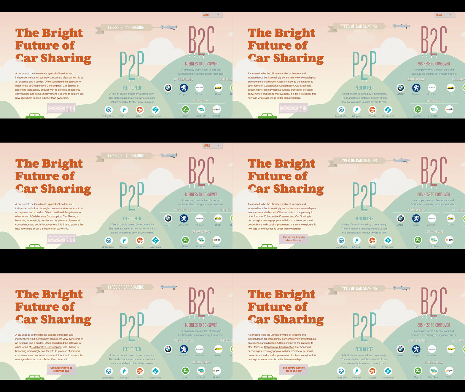
This site brings together all things car sharing. It is big on information, with a lot of media to keep users entertained. The site is designed to transition through pictures and users will discover new information with each new illustration. Using the mouse to hover over different sections of each picture reveals new snippets of information corresponding with the illustration. The Bright Future of Car Sharing is a great example of how a Microsite can focus on creating an entertaining and interactive experience for the user without the need to be overly complex.
Microsite #3 - Lucidworks: The Data That Lies Beneath
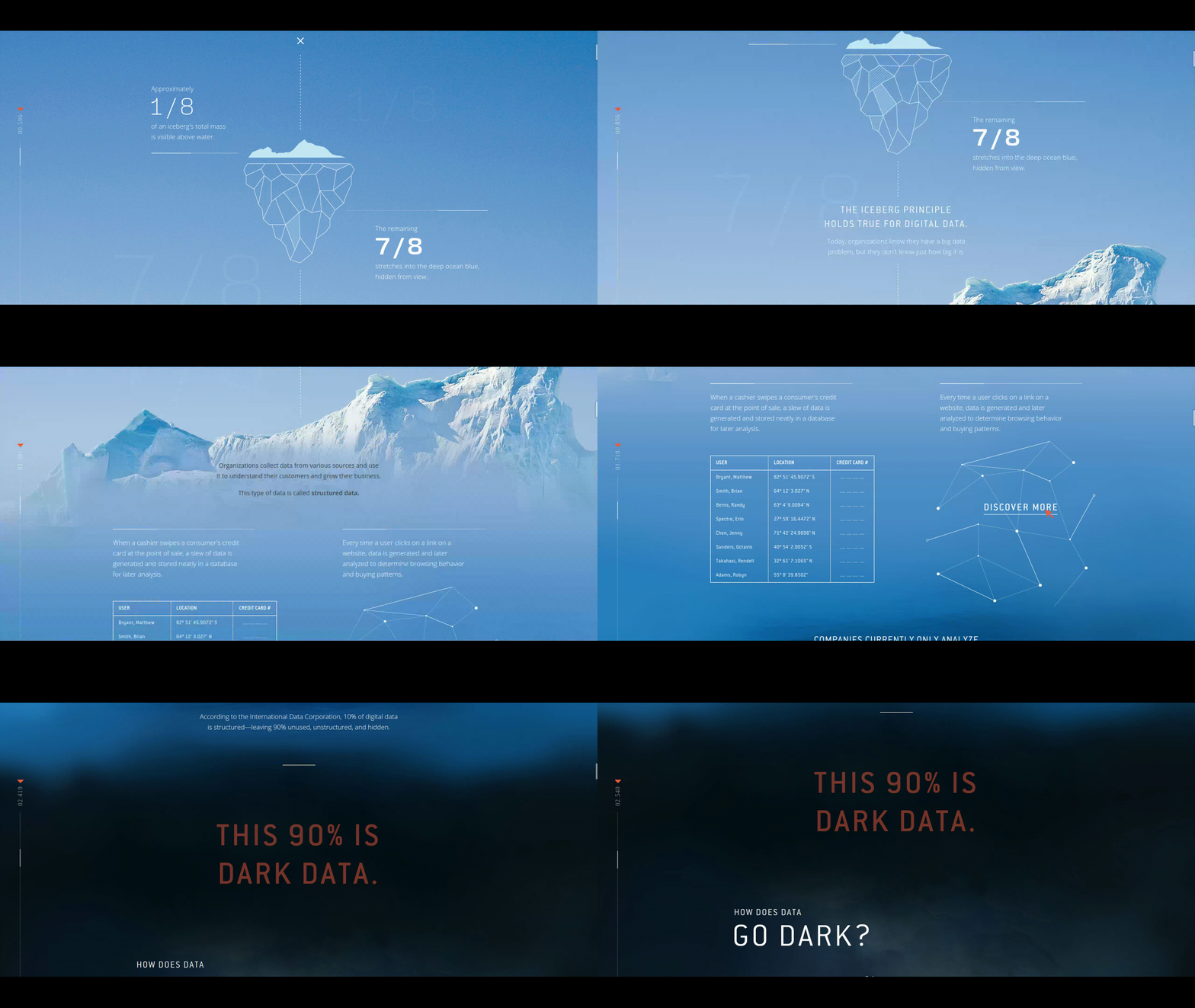
What is dark data? This Microsite focuses on dark data and what you can do to protect yourself. Most people aren’t aware of the impact dark data can have on you and your family. This Microsite is full of easy to read infographics that inform the user of dark data’s hidden potential.
Lucidworks pulls you in with their opening, comparing an iceberg to the amount of knowledge you actually have about your own data. They explain that only 1/8 of the iceberg is actually visible to the eye (what we see above water) and that the remaining 7/8 of the iceberg remains underwater, hidden from view. This analogy contrasts what we know about digital data and how large organizations aren’t even aware of what a huge issue the “data that lies beneath” can cause for the public. They list some staggering statistics about the average data breach, which costs an average of $3.5 million dollars per breach!
As you continue to scroll through the Microsite, Lucidworks does a great job of explaining what makes data go dark, and they also give tips on protecting yourself from the dangers dark data might pose to you and your family. At the end, Lucidworks explains what they are trying to do to stop this epidemic by focusing their efforts on making data more secure and out of reach of those who would mean to do us harm.
Microsite #4 - Mitchell: Program Freedom
Mitchell provides software solutions for claims management, and the collision repair processes. In MItchell’s case, they developed a new product and developed a Microsite as part of launching a campaign around the product. This Microsite, Program Freedom, delivers a cloud-estimating and communication platform to help insurance carriers, repair facilities, suppliers and OEMs. As an example of the content marketing strategy at play, there are topical and relevant news articles, which help drive search engine traffic. Because the Microsite A microsite can be a perfect time to introduce a set of articles related to your campaign or focus product. However you should be combining content marketing with SEO.
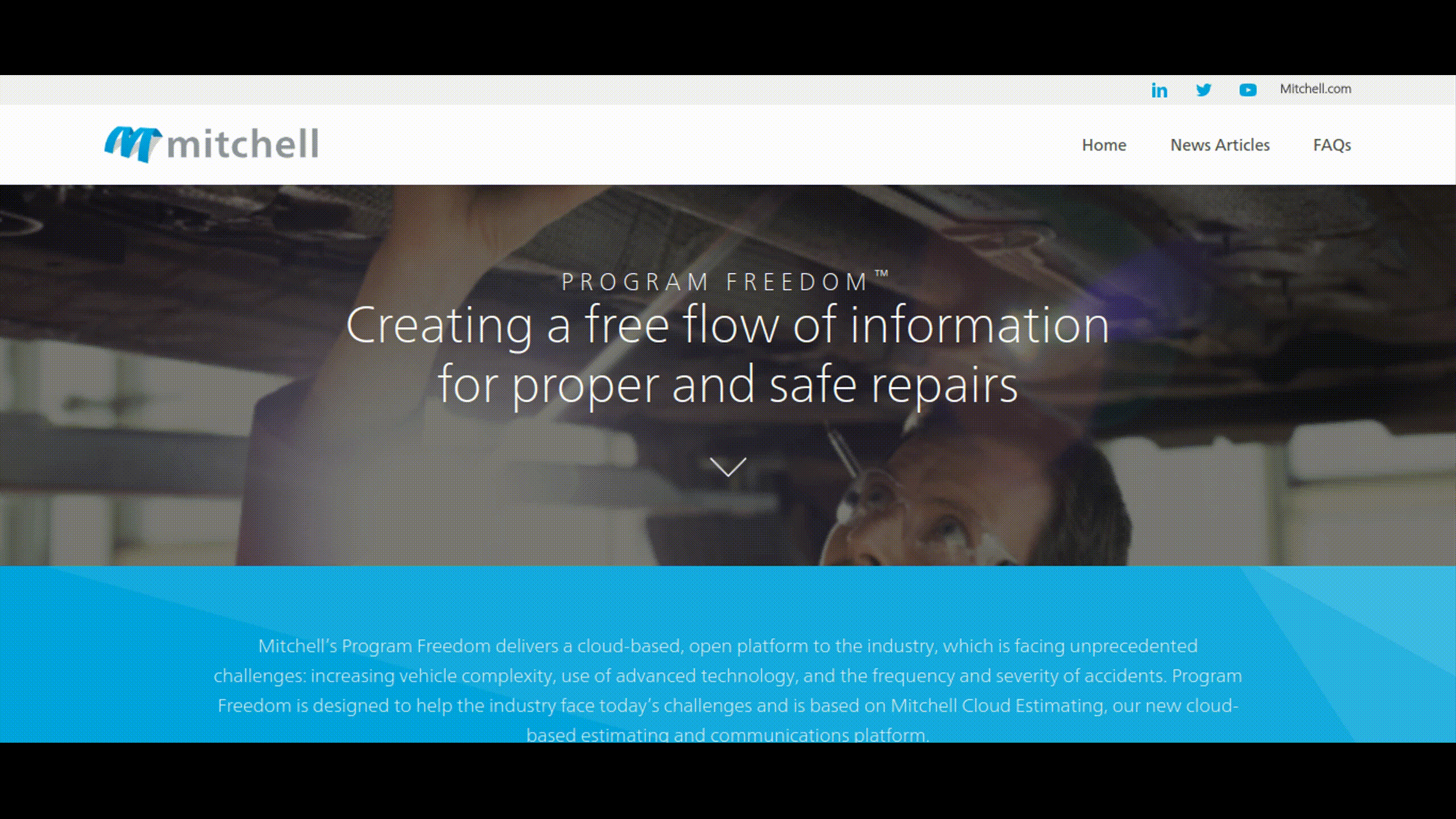
Throughout the Microsite, the user is taken through the different facets of the platform, with articles to provide credibility and added context. There is also a helpful FAQ, and consistent CTAs inviting visitors to connect and request more information, to increase conversions.
Microsite #5 - ProPublica: Workers’ Comp Benefits: How Much Is a Limb Worth?
This Microsite is brought to us by the nonprofit newsroom ProPublica. The title alone is enough to grab your attention, “How much is a limb worth?” Typically, we wouldn’t think of attributing a monetary value to an arm or a leg, but ProPublica brings light to the fact that there is indeed a dollar amount assigned to body parts, and this number differs from state to state. Often, workers become displaced from their field when they’ve sustained such a drastic injury, and the loss of wages for can devastating. The Microsite calculates the lost wages that result when a worker loses a limb, and highlights the severity of these types of “on the job” injuries.
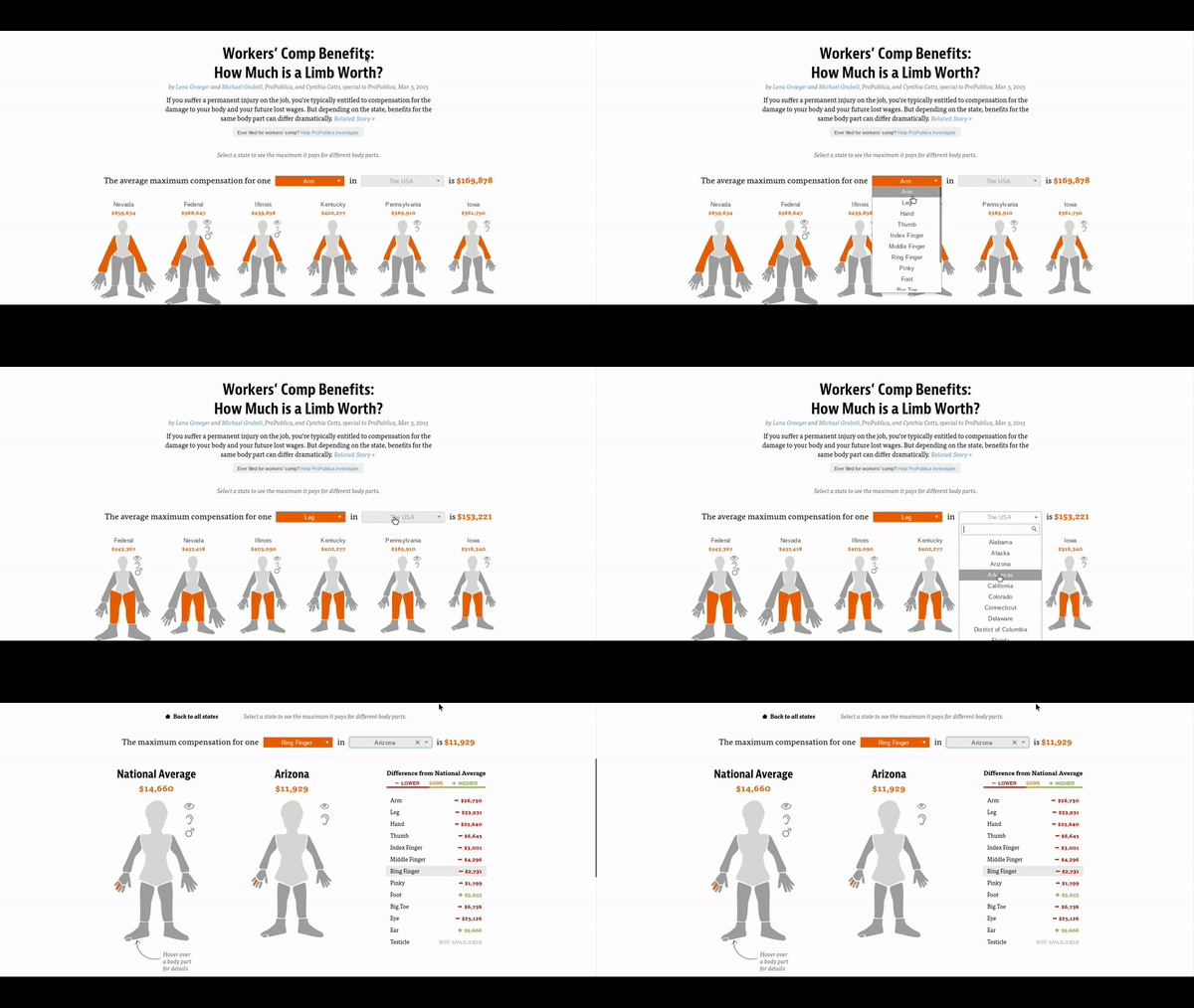
ProPublica’s intention is to show how workers compensation benefits fall short of covering the actual damage sustained by these serious injuries. With compassion and sound reasoning, they show how even the smallest injuries, such as the loss of a finger, could potentially affect a person’s wages for life.
Microsite #6 - Krylon: The World’s Longest Yard Sale
Many companies create cause-driven Microsites that are authentic to their brands. For example, Krylon was the first company to use Pinterest’s “buyable pins” feature. Their The Longest Yard Microsite follows the Krylon team throughout 600 miles of travel, across six different states, in order to put on the very first Pinterest yard sale. The Microsite contains a synopsis of their journey, with real-time updates for an engaging viewer experience.
This creative use of storytelling helped not only create a richer and more interactive Microsite, but also enabled Krylon to raise $1,898.63 from the sale of items for Charity Wings Art and Craft Center. These kinds of interactive environments are great for social media efforts also - as a direct result of this Microsite, Krylon’s Pinterest followers increased by 400%.
Microsite #7 - Write the Elf by IDEA Agency
It’s always Christmas over at Write the Elf, a clever holiday-themed microsite built on our Zesty.io platform. Instead of a simple landing page, IDEA Agency placed lively video content at the forefront of this engaging Microsite, making it an effective centerpiece to their holiday campaign.
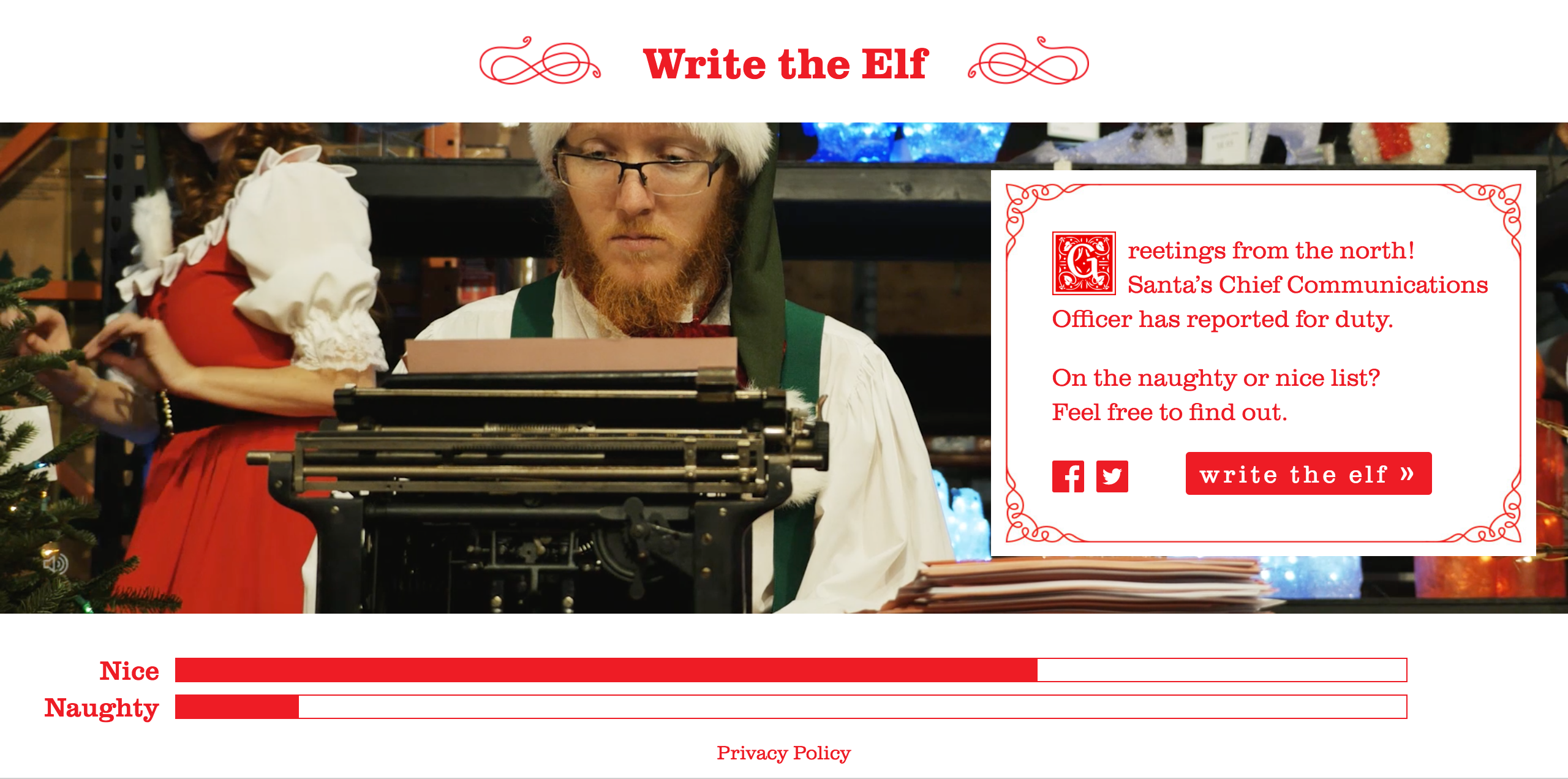
On the Microsite, kids (or kids at heart) can write a letter to the elf, with plenty of space for a comprehensive holiday wish list. Once the ‘letter’ goes through, the sender is sorted into the either the nice or naughty category. Thankfully, the vast majority of participants have been deemed nice, meaning there is hope for the future generation after all.
Microsite #8 - CommUtah
The American Cycling Association created a microsite to share an inspirational story of a group cycling enthusiasts knowns as “The Commute Crew”, who recently took on one of their most grueling cycling challenges yet.
The Commute Crew completed CommUtah, a 421-mile bike ride stretching from Salt Lake City to Moab, Utah in 8 days. It was the first time such a ride has been attempted.
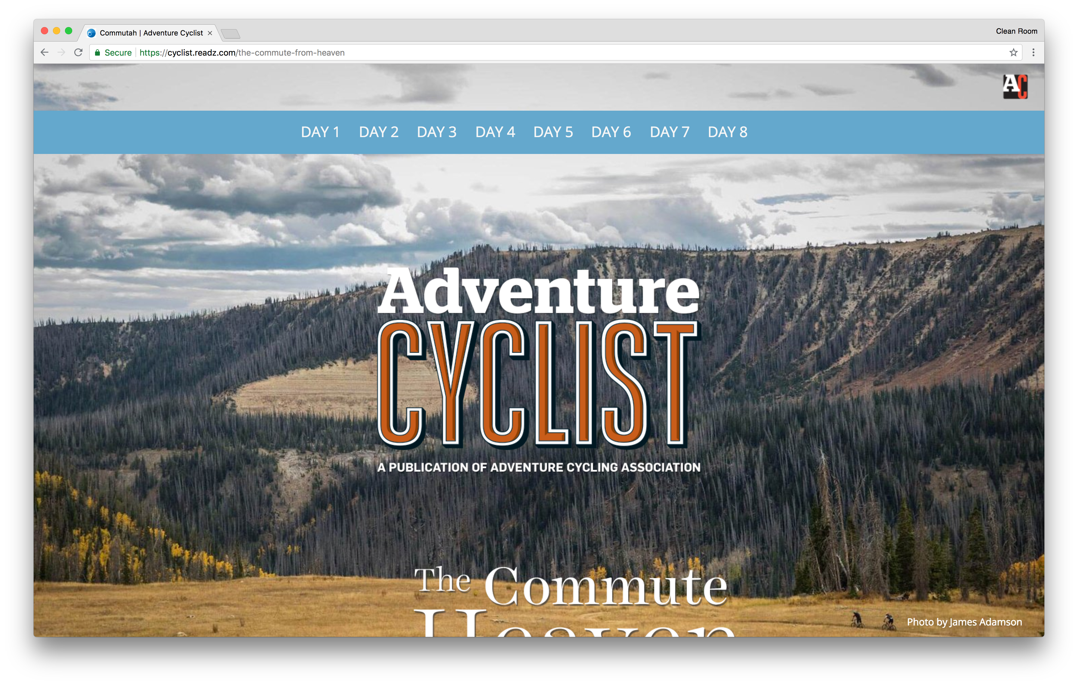
For any cycling enthusiast who dreams of completing such a feat, this microsite will surely appeal to their imagination. The microsite gives a day-by-day breakdown of The Commute Crew’s journey, along with images and caption text to entice the reader. The content was written by Kurt Gensheimer, one of the members of the Commute Crew who also goes by the name of “The Angry SingleSpeeder”.
The navigation menu at the top gives the user the option to jump to a specific day of their journey.
Microsite #9 - EveryLastDrop.co.uk by Waterwise
Waterwise has created a very clever and colorful microsite. EveryLastDrop.co.uk was developed to inform their consumers about the water wastage in the UK and what they can do to reduce it.
EveryLastDrop is a highly interactive single page microsite which plays an animated infographic as the user scrolls down the page.
As the user scrolls down, they’ll see an animated character waking up and getting ready for work. As the character gets prepared for the day, visitors will be given interesting facts and statistics about our current water usage. But EveryLastDrop goes a step further to explain how our water usage goes beyond showering and brushing our teeth. We learn how water is used in food production, clothing manufacturing and more.
At the end of the interactive infographic, the user is given a call to action to watch a video which informs them what they can do to save water and how they can contribute to society.
Microsite #10 - Time to Get in by Porsche
If you ever dreamed of owning your very own customized Porsche, then it is “Time to Get In”. When you first set your eyes on Porsche’s product microsite, you’re presented with a narrative based on the vision of Dr. Porsche: “Dr. Porsche couldn’t find the car of his dreams, so he built his own.”
This narrative intertwines well with the “build your own” Porsche feature and is likely one of the best microsite examples we’ve seen. As the customer scrolls down the microsite, they’re introduced to Porsche’s core values of wanting to build the perfect car and how they can build their own car by turning “fantasy into reality”.
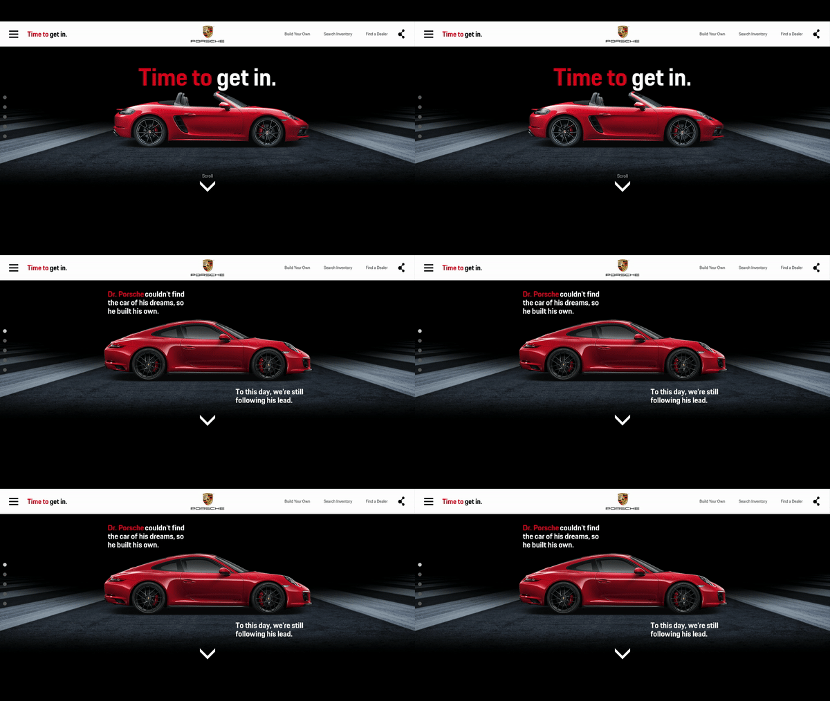
Visitors can also watch videos of famous customers (like guitarist Dave Navarro) who have purchased their own customized Porsche. Those videos truly capture the reaction of when they see their customized Porsche for the very first time.
At the bottom of each page on the microsite, users are presented with a call to action to build their own Porsche. In doing so, users are directed to an interactive interface where they can choose a specific model, and then go on to add their own custom features and accessories.
Microsite #11 - NASA Spacecrafts By NASA
NASA created a microsite that would make any aspiring astronaut glee with excitement. For anyone who is curious about space exploration, NASA Spacecrafts provides their visitors with a very interactive dashboard that gives a historical insight into every spacecraft and satellite that has been launched into space by NASA.
The spacecrafts can be organized by date or by image. When you select a spacecraft, you’re provided with some background information and a 3D visual of the spacecraft, which you can rotate and see at different angles.
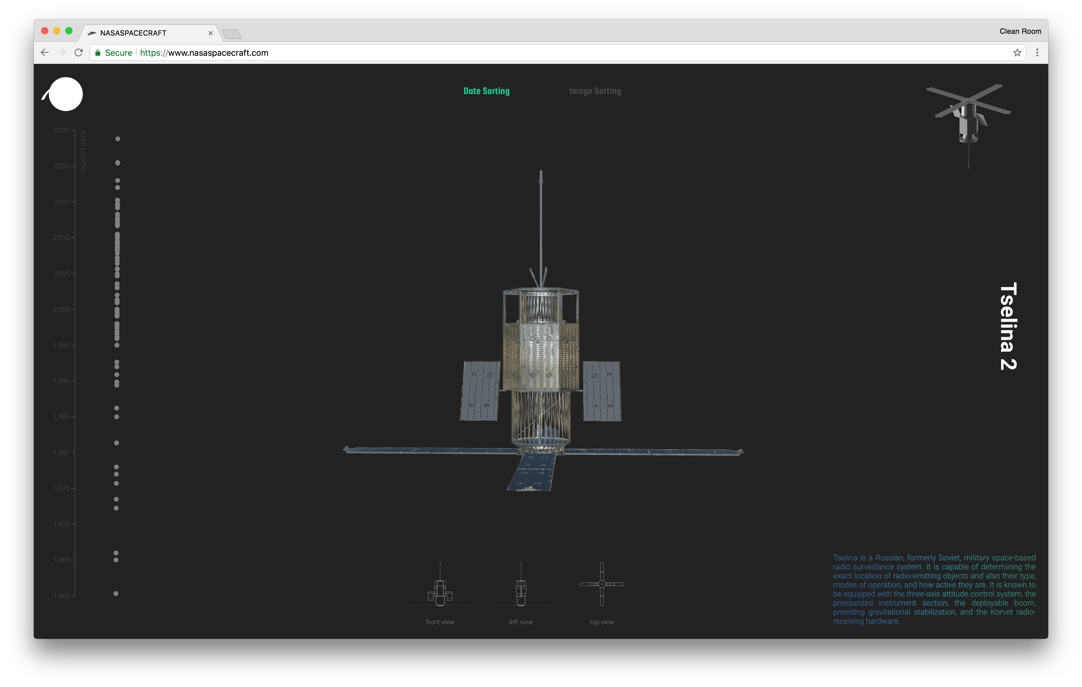
There are hundreds of spacecrafts on the microsite, making it impossible to go through each one in a single sitting.
Microsite #12 - The Alienist by TNT
To promote The Alienist, the newest TV series by TNT, they’ve created an interactive microsite that helps their viewers to familiarize with the main storyline, setting and the characters.
The Alienist is a crime drama set in New York in the late 1800s, so the overall theme of the microsite is quite dark and gloomy. The microsite has videos which contain interviews with cast members who share their perspective on the story and the character that they are playing.
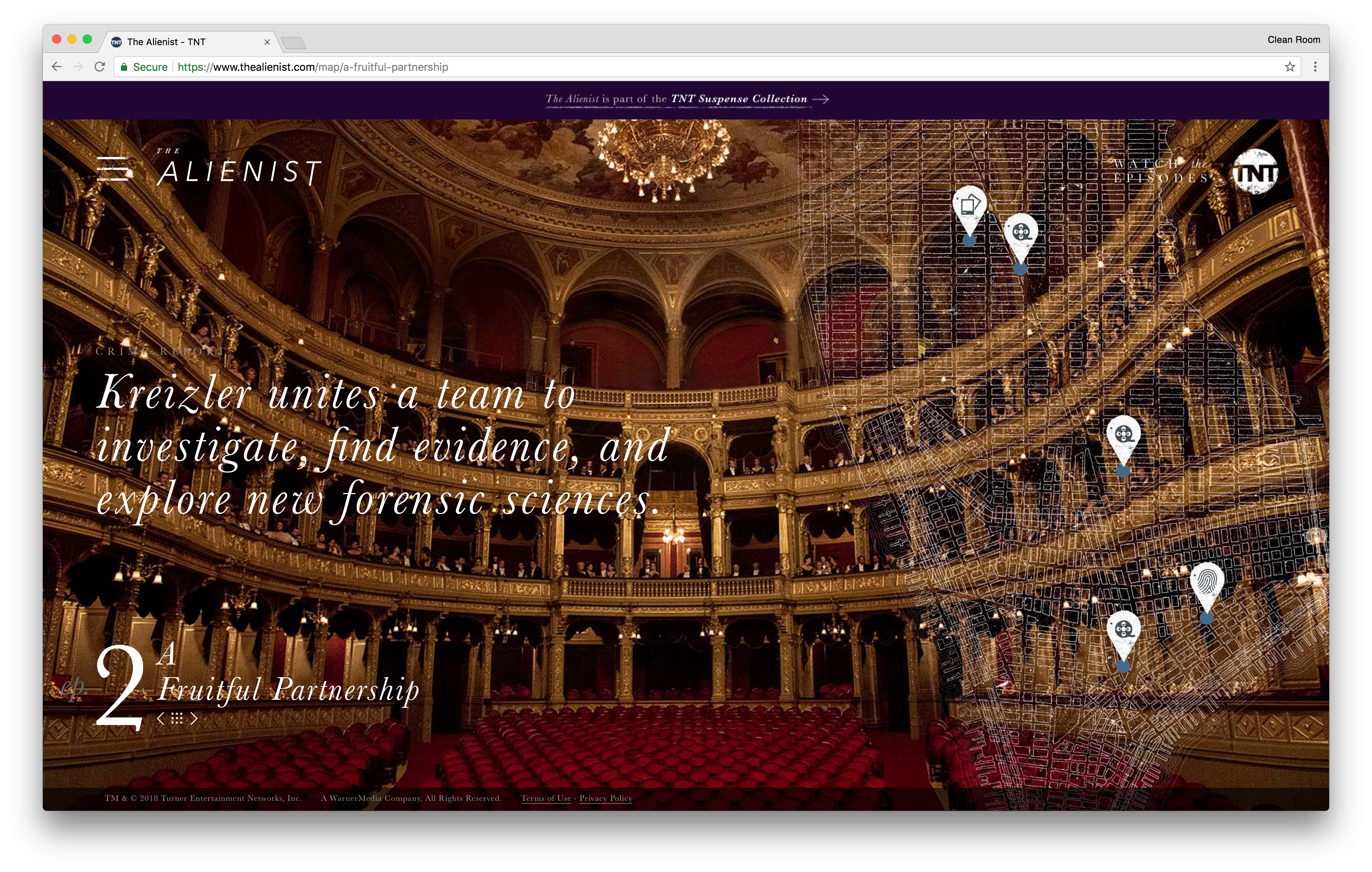
Users can even watch the premiere episode of the TV series. If the user wants to watch more episodes, they will be directed to the Turner International’s home page.
Microsite #13 - Tillamook Cheese Sauce by Tillamook
Fans of cheese sauce will adore this microsite. Tillamook aims to inform and engage their audience by showing them how to make cheese sauce with Tillamook’s own brand of Sauce Starter packs.
Consumers are encouraged to scroll down the microsite page, and as they scroll down, a video plays in the background showing you how to make the sauce very quickly and easily. The footage is intuned with user scrolling up or down the page. So if the user scroll downs, the video plays forward and vice versa for when the user scrolls up.
As the visitor scrolls down, they are presented with descriptive text which explains what is going on in the video while subtly selling the product at the same time.
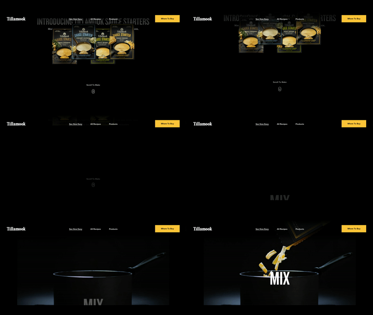
Towards the end of the site, the visitor gets the option to explore other recipes that they can make using Tillamook’s range of Sauce Starter packs.
Microsite #14 - The Blue Heart by Patagonia
Patagonia has created a microsite that resonates with their target audience. As a seller of outdoor goods and equipment, they knew their target market appreciates and values beautiful landscapes and outdoor adventure.
So to help raise brand awareness and to connect with their target audience, they started The Blue Heart campaign, which has been named after the Balkans region in Europe where the last of the wild rivers are being threatened by hydropower dams that are either being proposed or in the process of being built in the area.
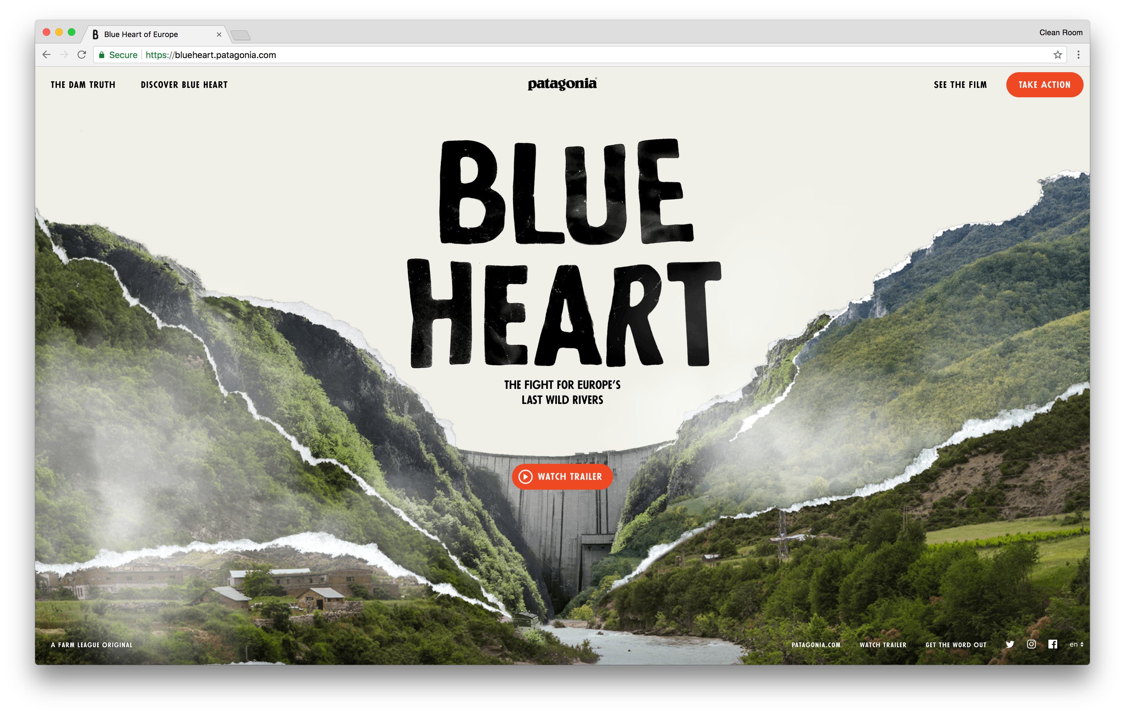
For anyone who loves the great outdoors, this microsite will definitely relate to them. Visitors are informed of how hydropower dams can affect the local community, wildlife and the environment. At the same time, it has mesmerizing pictures of the Balkans’ landscape which does an excellent job of enticing their visitors to explore the region, while supporting the cause.
Microsite #15 - Sounds Like You by Pandora
The reason why Pandora became one of the most recognizable music brands in the world is down to one thing: personalization. Pandora is well-known for being able to create music playlists that match your taste perfectly.
Pandora took this idea a step further and created a microsite that allows their consumers to compose a unique song that is based on their musical taste. Sounds Like You is an experimental music composition interface that is designed to boost customer engagement and generate new leads. microsite marketing at it’s finest.
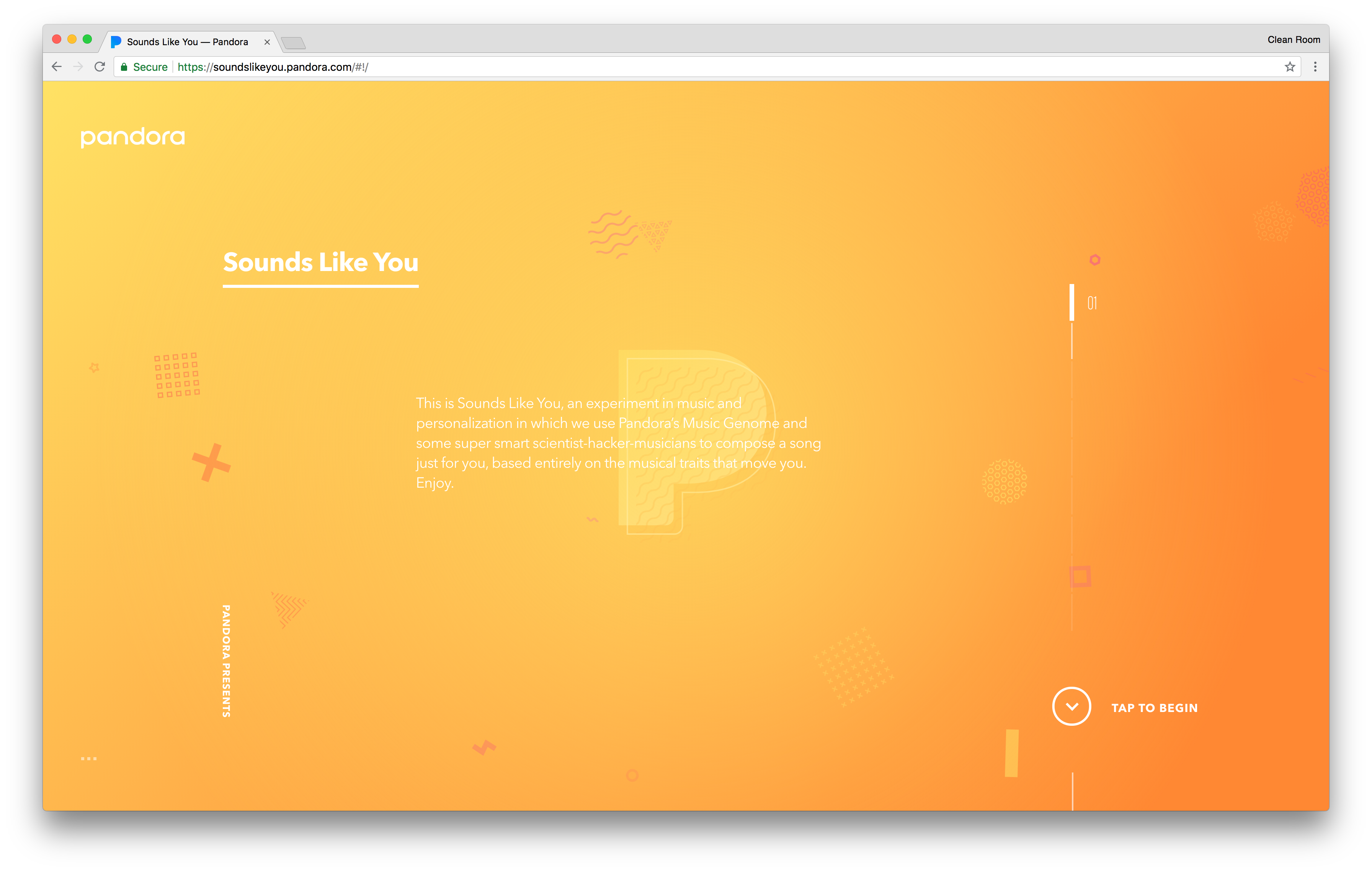
On visiting the microsite, consumers are promptly asked for their name and email address before they start composing their own track. Customers are then asked to choose 3 character traits which resonate with their personality, and 3 songs they like best. Using this information, Sounds Like You composes a song which represents your own personal sound.
Microsite #16 - Layered Defense by SimpliSafe
As part of their content marketing strategy, Simplisafe wanted to inform their consumers that their home is their most valuable asset and must be protected. The Layered Defense microsite does precisely that by informing their customer how they can further protect their homes.
The microsite introduces the customer to a narrative of how castles rely on layers of defense to keep attackers at bay and advises how they can apply similar layers to your home.
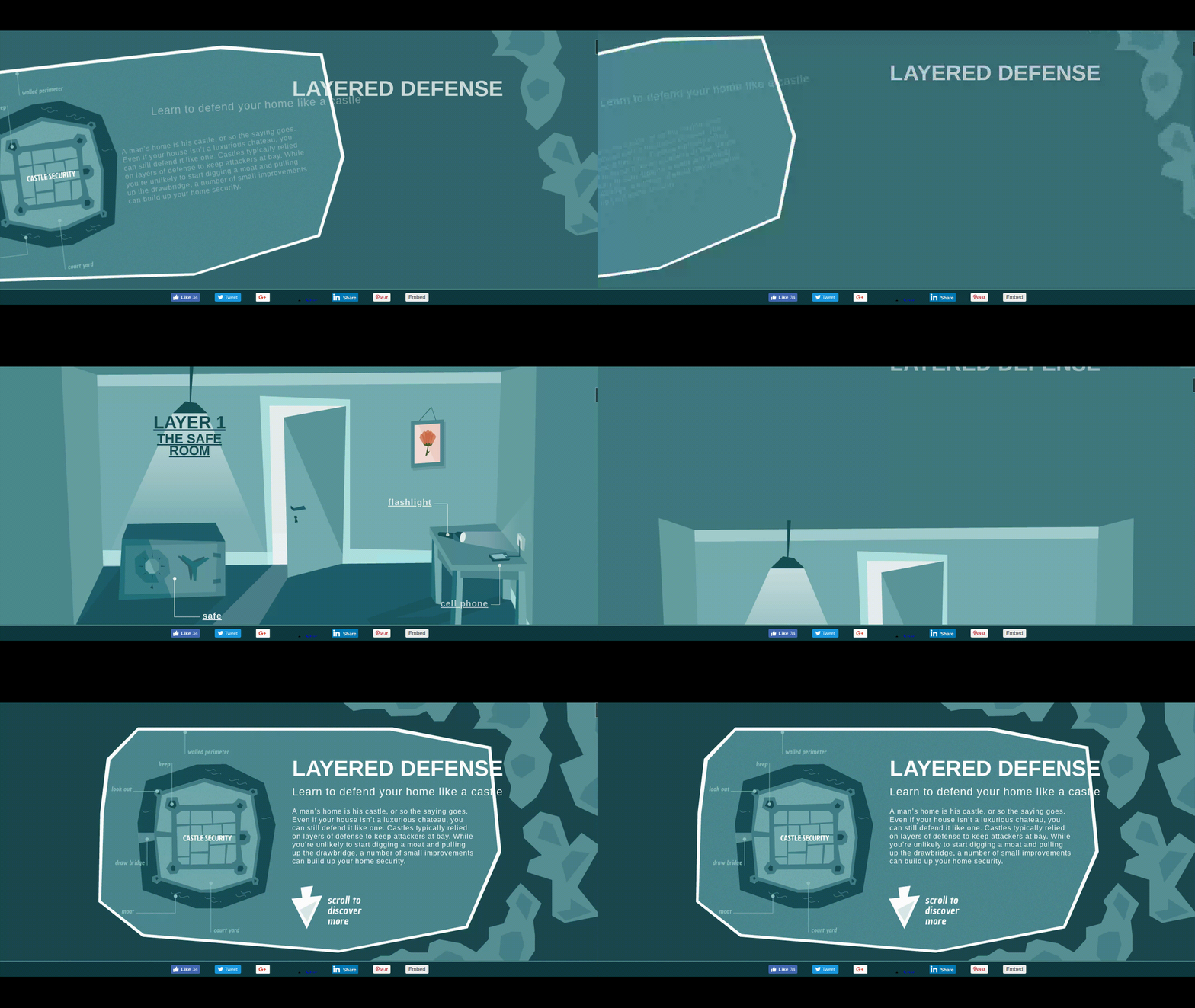
As the consumer scrolls down the microsite, they are guided through each layer of defense. Starting with the first layer, which is the safe room, visitors can select different objects that can help boost your defense from theft.
Scrolling further down, the user is then introduced to more layers of defense and follows the same interactive elements. There are 6 layers in total.
Microsite #17 - Do You Want to Build a Snowman by DBS Interactive
DBS Interactive is a marketing agency based in Louisville, Kentucky. As part of their customer engagement campaign during the holiday season, DBS Interactive created a microsite application where their visitors were able to build their own snowman.
It is an enjoyable and entertaining platform. Users can choose from a range of accessories and templates to build their own unique snowman and then share it on social media.
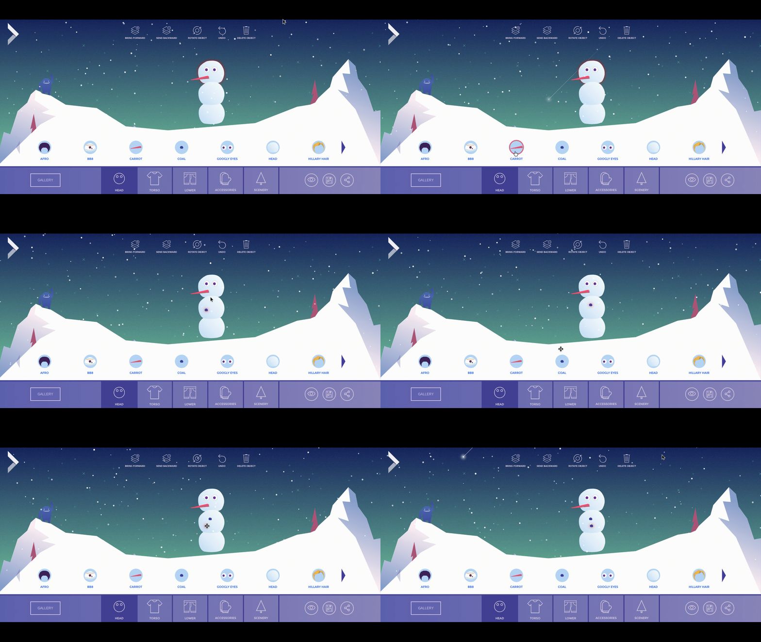
The reason why DBS Interactive created this platform is because they wanted to introduce underprivileged children to the digital age. They believe children who are not given access to proper digital training is both a “disservice and a disadvantage”. So they created this snowman builder app to serve as a fun and interactive educational tool.
The interactive snowman builder can help young children (pre-school age group) gain key digital skills in:
Using a mouse to point, click and select objects
Scrolling
Manipulate images
Preview and save progress
Add text
Follow instructions
Microsite #18 - Willitblend.com by blendtec
There is a rather strange trend that has emerged over the years: watching destructive videos. The urge to wanting to know what happens to an ordinary object (whether it is a laptop, a toy or a golf club) when it gets destroyed is a bit of a cultural phenomenon.
Maybe we’re curious creatures that have a subconscious interest in watching things getting incinerated. Whatever the reason, this allure of seeing objects getting smashed is quite widespread. Hydraulic Press, a YouTube channel notable to crush everyday objects under a hydraulic press has over 1.9 million subscribers.
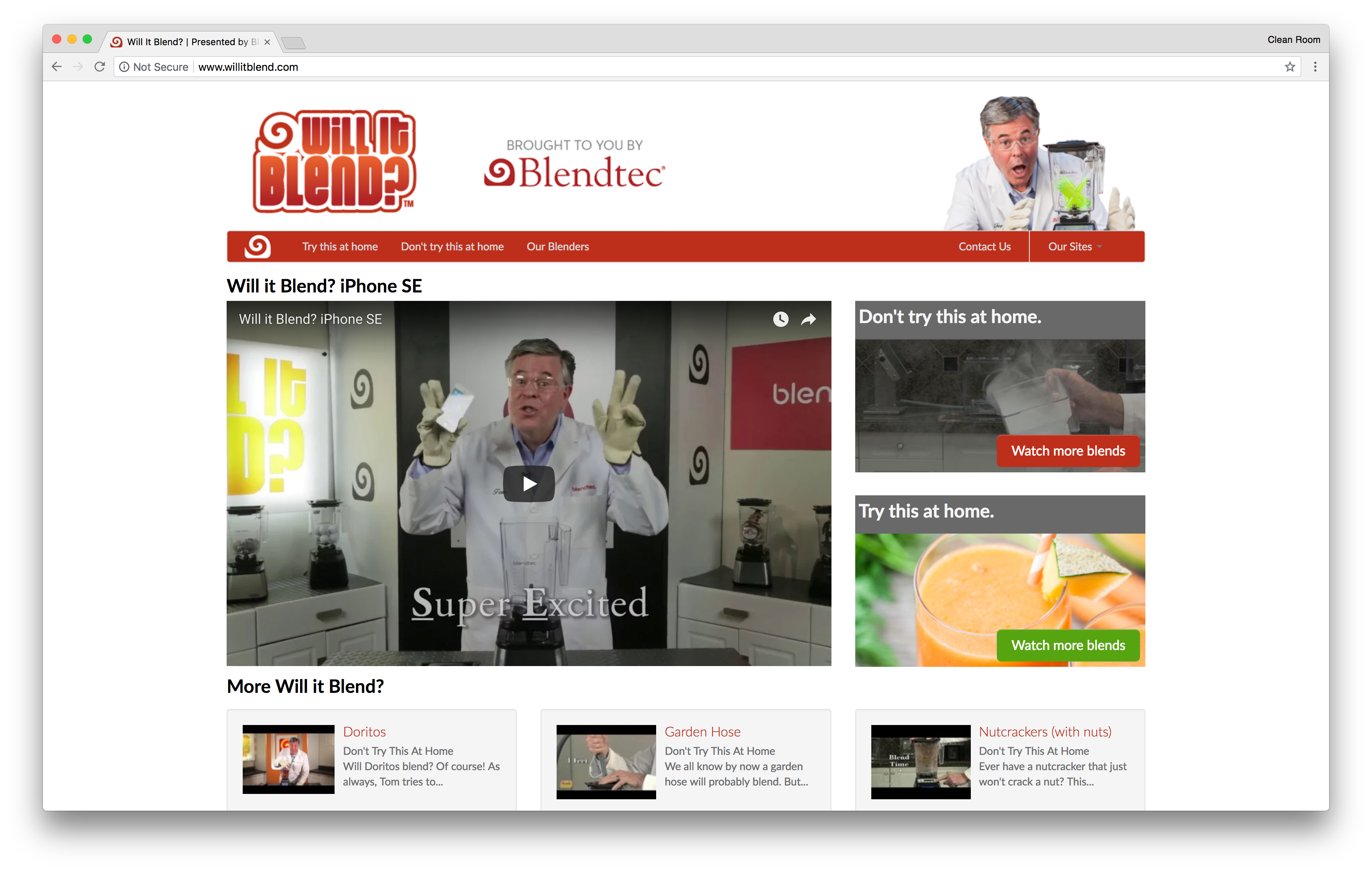
So it comes as no surprise to see blendtec jump on the bandwagon by showing their consumers what their blender can blend. Willitblend.com is a microsite that aims to promote their YouTube channel “blendtec’s Will it Blend?”.
Their videos are presented by Tom Dickson, who performs as a somewhat crazy scientist who starts each video by saying “Will it blend, that is the question?” Tom blends a range of objects from iPhone SE, golf clubs to solar lamp.
The videos help to feed their consumers curiosity in seeing what happens when things get destroyed while showing the powerful blending capabilities of blendtec’s appliance.
Microsite #19 - Domino's Pizza Delivery Vehicles by Dominos
Back in 2016, Domino’s launched a new range of delivery vehicles called the DXP (short for Delivery ExPert). These pizza delivery vehicles come with a built-in pizza oven to help keep the pizza warm during transit.
Domino’s wanted to deliver piping hot pizzas to their customers consistently. In developing this car, they got their employees, customers and the best automotive engineers involved. The car only seats one person, which is the driver. The rest of the space is used to store the food items carefully.
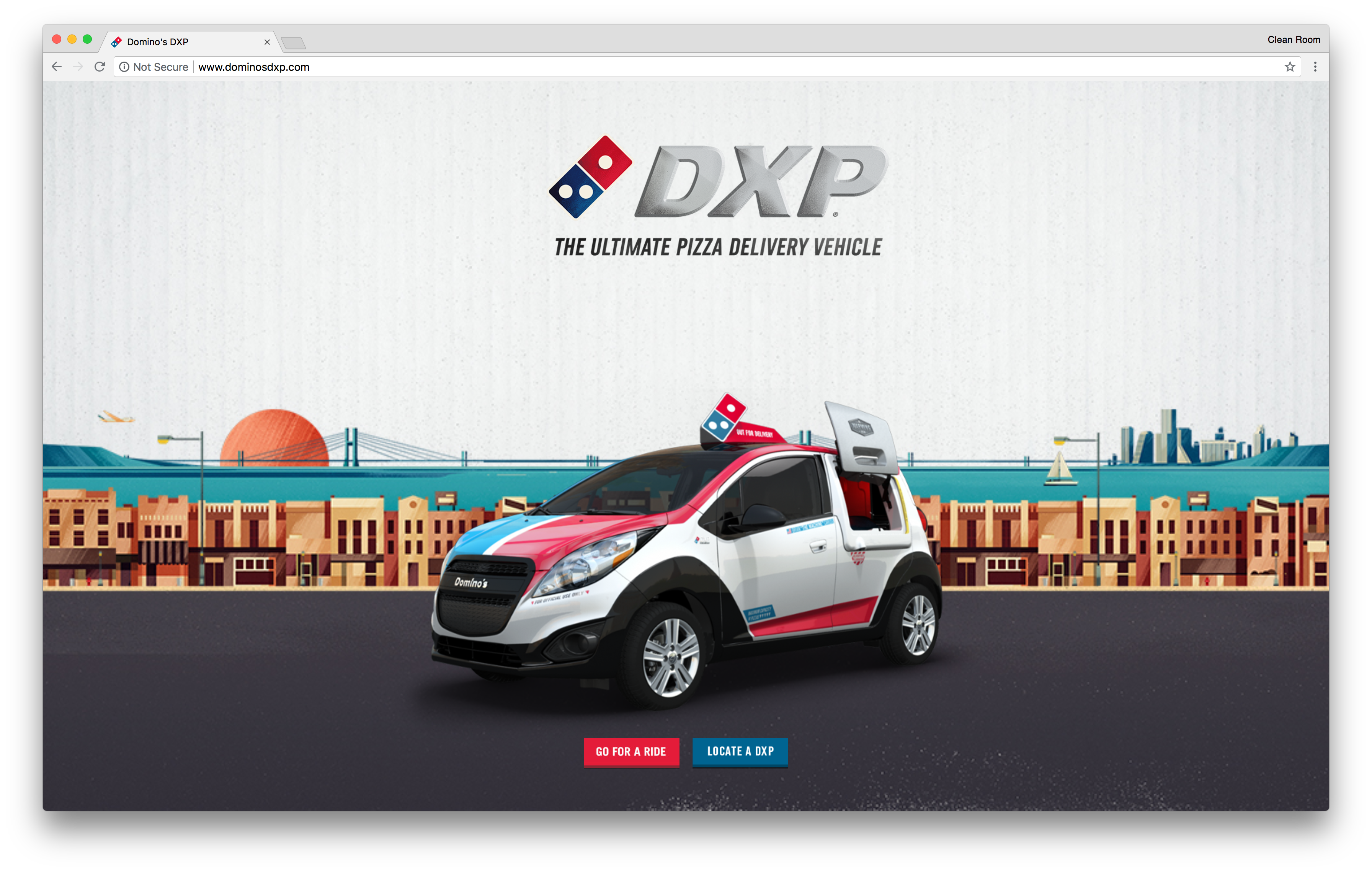
To promote the launch of their DXP vehicle, Domino’s created an interactive microsite where you can “Go For a Ride” with the DXP vehicle. Consumers take control of the car via the arrow keys on their keyboard. As the user drives the car, they are given descriptive information which explains the features of the vehicle.
When the customer reaches the end, consumers have the option to find their nearest DXP vehicle by entering their zip code.
The microsite only works on a wide screen. So if you try it on your smartphone device, it will instruct you to rotate your screen.
How to Create Your Own Microsite
Hopefully by now you’ve gain an understanding around what a microsite is and how marketers use it to amplify engagement. Using a few of the cool microsite examples above, take a second to muster up some inspiration or purpose behind creating your own. Here are 7 simplified steps that you can take to get your own microsite mini website design going:
- Choose a Topic/Area
As we have mentioned before, a microsite is singular-focused. So take the time to brainstorm on an idea or area you would like to focus on. And make sure you stick with this topic or idea right throughout the development process.
- Pick a Domain
Having the right domain name can help your mini site achieve higher levels of visibility. To give you an example, if your microsite is going to be confined to a specific area, then you might want to incorporate the name of your town or city in your domain name. Remember, Google loves local searches and adding a geographical location to your domain is a good idea.
- Choose a Platform
There are a number of platforms, including our platform Zesty.io that you can use to create your website. Whatever you decide, take some time to research the pros and cons of different platforms. The more developer friendly a platform is, the quicker your microsite will be made.
- Designing Layout and Navigation
With your developer, you need to agree on the layout and design. You can pick a themed microsite template or work with your team in-house to select the right minisite design. And you also need to decide how your visitor will navigate through your site. Take a look through the examples above so you can get some ideas.
- Development
Once the design and layout have been agreed, it is time to develop. Depending on which platform you use, the development time will vary. SaaS CMS platforms, like Zesty.io, are incredibly user-friendly and help reduce development time.
- Testing
This is a crucial step. You need to make time to rigorously test your microsite to ensure it performs to the agreed requirements. The testing phase is a perfect time for you to iron out any errors and issues that could disrupt the user experience. With Zesty.io, it comes with a WYSIWYG editor so you can preview and test your site almost instantly.
- Launch
When you’ve added all the finishing touches to your microsite, and you’re completely satisfied with the end result, you can launch your mini site!
The Right Microsite Consistently Delivers User Experience
Microsites are all about user experience, and these seven sites are excellent examples of Microsites that offer high quality user experiences. People want to be entertained, and engaging content is what will keep them coming back for more. By providing the right CMS platform for your developers and content producers, they will be able to push content to your Microsite easily and seamlessly, and produce new Microsites as quickly as you can envision them.
